This Dark, Cavernous DC Home Became a Bright and Airy Modern Abode Thanks to an Investment Feature
The dedicated renovation turned this family home into a lofty and airy space
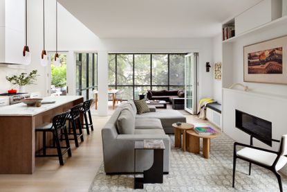

This dark and dated Tudor-style home located in the Chevy Chase neighborhood of D.C. would have never been able to predict its future. The dark wooden flooring has had an overhaul, the mock Tudor exterior has been replaced with a modern screened porch, and the once dark and cavernous interior is now a bright and airy space thanks to a special investment feature.
Interior designer and homeowner Lauren Sparber collaborated with her architect neighbor Colleen Healey to transform her family home. Both women took upon the project and, with their combined expertise, transformed the 1920s property into a contemporary space fit for family life.
The primary ambition was to open up the interior to create more space. 'The original first-floor footprint was very tight with no space to gather or host or store anything,' says Lauren. 'Colleen's designs incorporated storage into all of the new spaces from the tall kitchen cabinets to the mudroom storage cabinets.' The renovation also included some larger architectural commitments which means that the once gloomy space is now a modern home flooded with natural light. Here's how Lauren and Colleen achieved it.
1. Split skylights to maximize sunlight
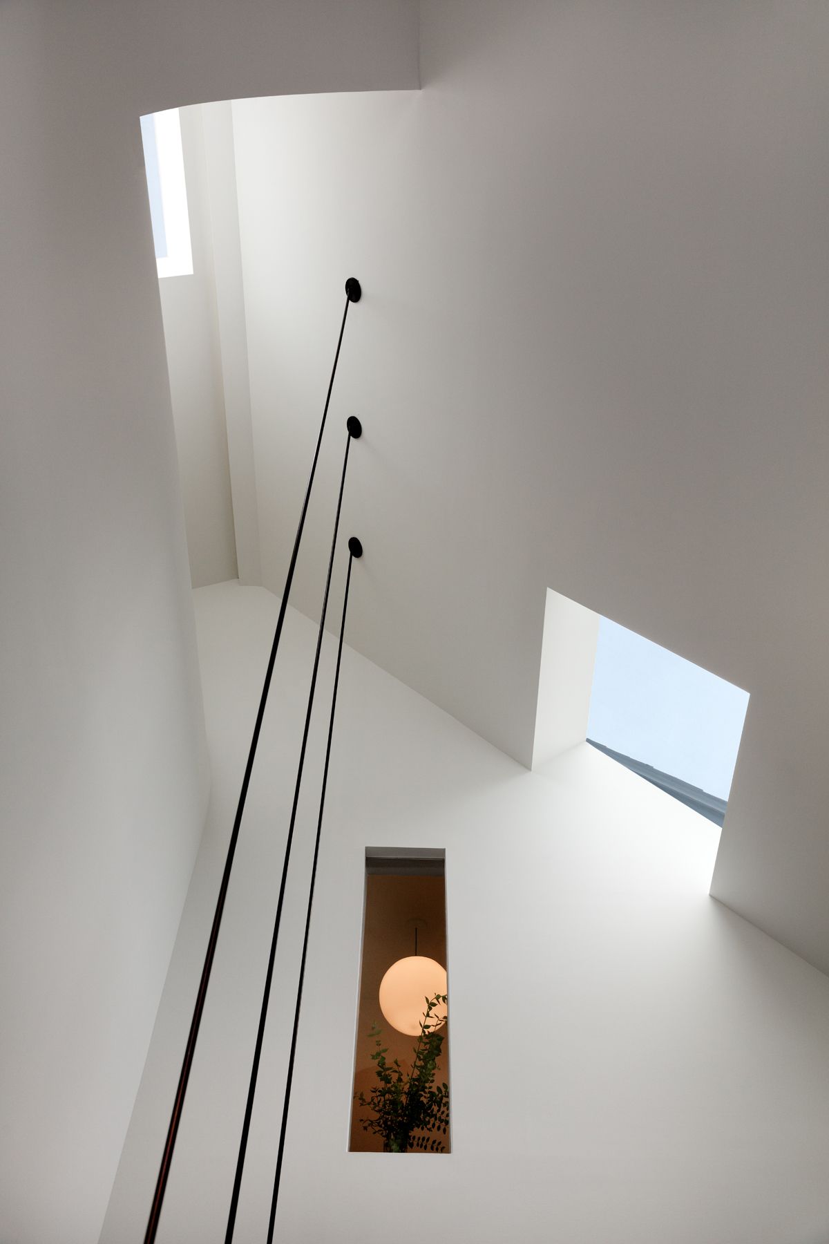
Having a skylight in your house automatically makes it more bright and positive, and gives the effect of a larger space, so Colleen helped Lauren to incorporate two skylights to flood the primary bedroom with light. One skylight faces east and the other faces west and, in order for the double-height space and the bedroom above to benefit from light all throughout the day, they sculpted the diving wall to pull light from the opposite side down into each room.
The result is a soft light reflecting off the white walls into the space below. 'In working through a physical model that we made in the office, I devised a scheme to get us both north and south light by borrowing and bouncing from the south with a lightwell,' says Colleen Healey of Colleen Healey Architecture. The addition of a screened porch at the rear of the home also helps to invite more light inside while modernizing the home.
2. Monochrome for the Win
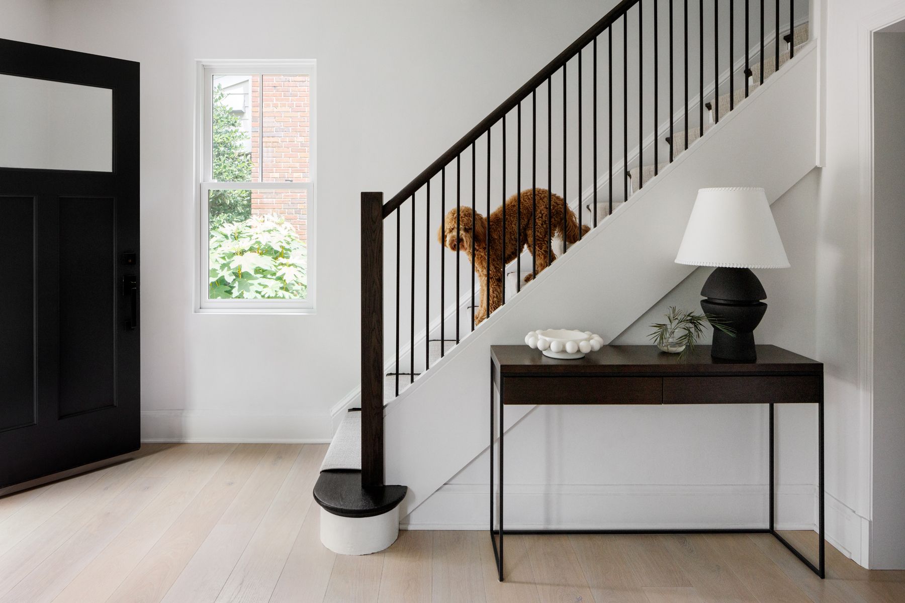
Lauren Sparber, interior designer and co-owner of Jodi Macklin Interior Design, doesn't use a lot of color in the houses she designs, just accents. She wanted something similar for her own house as well, and her monochrome entryway with its pared-back color palette makes the perfect welcoming space.
'I wanted to walk into a sense of calm,' she says. 'We only put new floors on the main floor so we used an ebony stain on the existing wood on the steps to the second floor. That black and light combo also helped set the tone.'
3. Double Height for More Space
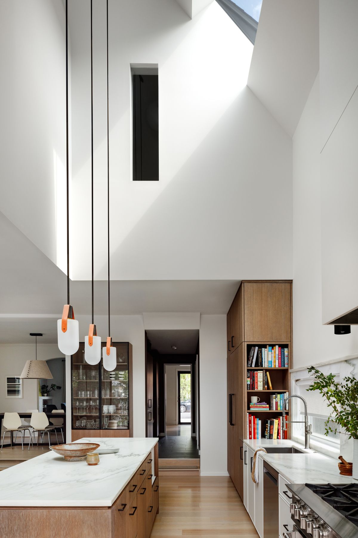
Since the house is situated on a narrow plot, Colleen wanted to give it the effect of being more spacious and airy, so she doubled the height of the ceiling in the kitchen. 'The kitchen, family room, and spaces above are all new structures added to the original house, so we had the potential to manipulate the light through various openings in the new roof,' says Coleen.
'The double height space above the kitchen took some convincing because it meant a sacrifice of square footage on the second floor, but we were able to create a good balance to create an airy feeling without compromising spaces on the second floor,' she adds. The heightened extension now gives the narrow house vertical relief and provides light for the primary bathroom which has a small internal window to borrow light.
4. A Modern Face for the Tudor Body
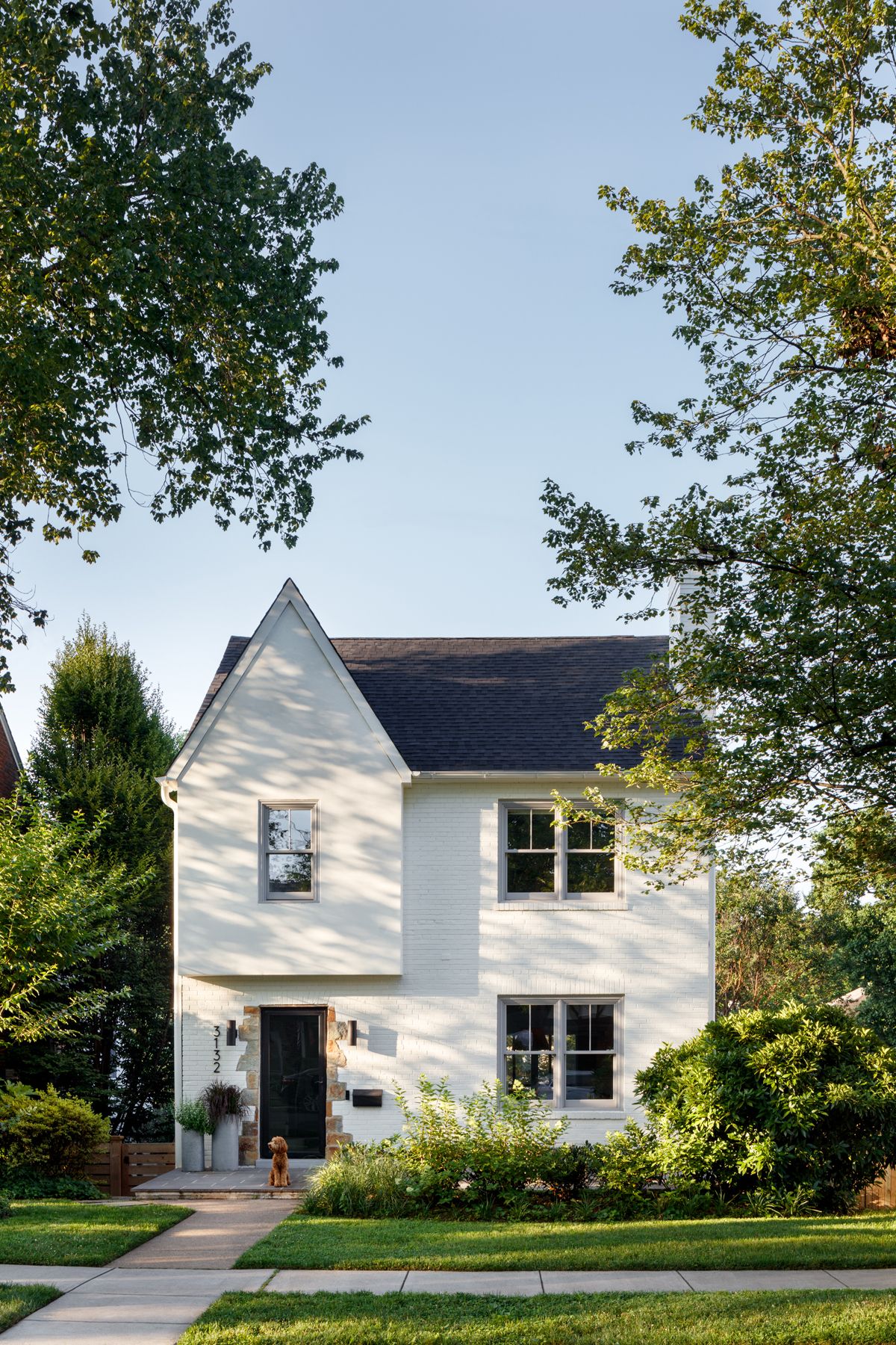
To really make Lauren's home her own before right from the front door, the front facade was also given a facelift, removing an overhang and some of the heavier Tudor elements on the facade and painting the brick. New windows in a pale gray are softer than a more common black window and set the tone for a natural palette on the interior. ‘We wanted a cleaner look but something classic enough to fit in with the other nearly 100-year-old homes on our block,’ says Lauren.
'Tudor styles also work better on a larger house,' adds Colleen. 'The scale of the house seemed better suited for something simplified in material palette.'
5. Attention to Architectural Details
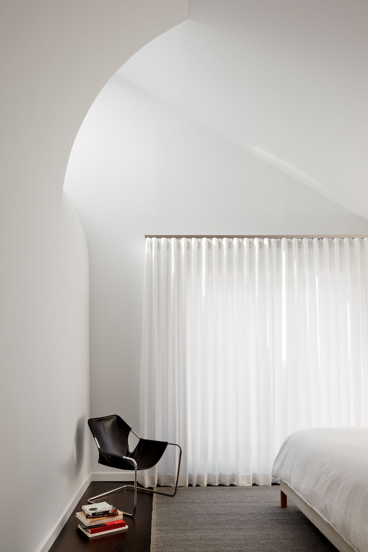
Colleen didn't shy away from making several changes to the basic structure of the house to incorporate modern elements while still honoring the Tudor style. Beautiful sinuous curves soften the corners of spaces to help direct natural light while also casting clever shadows.
'The clean lines and curved arches provide a canvas for the light to bounce around in different ways as the season and time of day fluctuate,' Colleen says. 'The width of the house is relatively narrow, but with the volume above the kitchen as well as the added height in the primary bedroom ceiling, the rooms breathe with a generosity typically found in a much larger home.'
6. The Cozy and Durable Decor
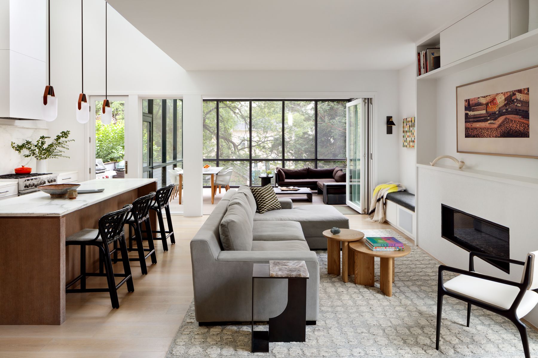
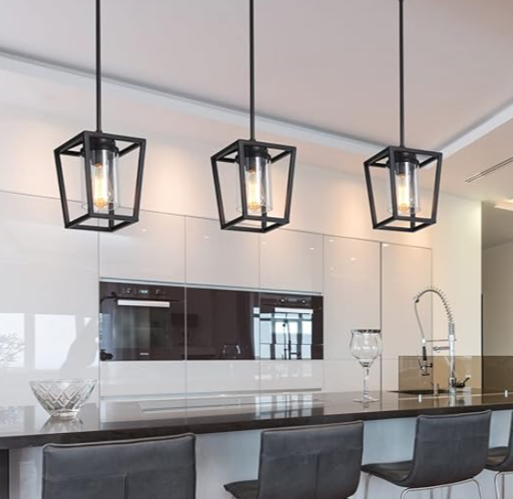
Lauren wanted the home to feel light and airy without being a museum. Bar stools are from McGuire and Allied Maker light fixers hang in the kitchen, and the home also features a mix of high and low furniture from notable vendors such as West Elm, Maiden Home and Holly Hunt. 'The furnishings and rugs are in soft neutrals,' says Lauren. 'The windows and large doors to the screened porch allow the surrounding trees and landscaping to add another layer of color and texture to the interior space.’
Along with that, she also used the Samsung frame TV to disguise the screen over her fireplace. 'The product allows for artwork to be shown instead of a television when the TV is turned off,' Colleen says. 'We like to use this type of TV if it's going to be in a main space, but sometimes we do build cabinets to cover them as well.'
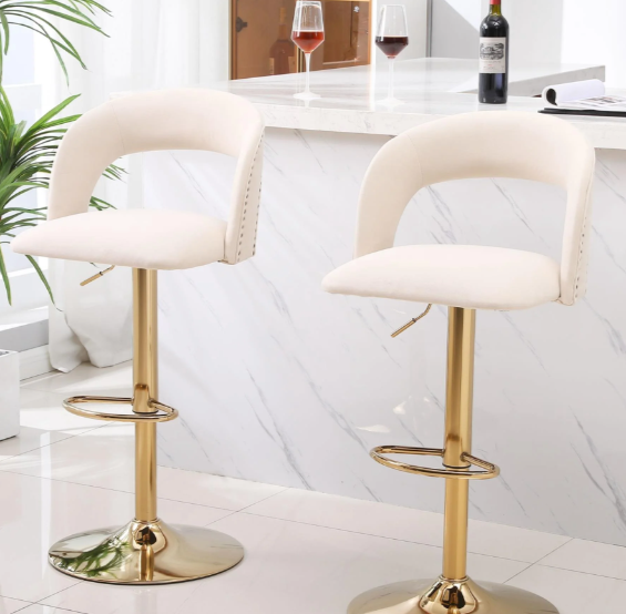
Price: $89.98
Quantity: 2
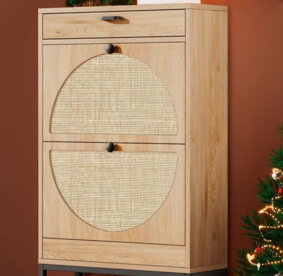
Price: $59.99
Quantity: 1
Price: $126.99
Material: Rattan
Be The First To Know
The Livingetc newsletter is your shortcut to the now and the next in home design. Subscribe today to receive a stunning free 200-page book of the best homes from around the world.

Devangi is currently pursuing an MA in Magazine Journalism from City, University of London and aspires to be a lifestyle journalist after finishing the course. As an up-and-coming talent in the industry, she has quickly adapted to the world of interior design and reports on all the latest news and trends.
-
 What are the Most Comfortable Pillowcases? From Temperature Regulating to the Best for Your Skin
When you're looking for comfort in your pillowcases, material matters. These are the best you can buy
By Faaizah Shah Published
-
 5 Simple, but Genius Bathroom Layout Tricks That Will Make Your Space Work so Much Harder
Small switches to how you lay out your bathroom that help make the most of a small space
By Luke Arthur Wells Published
