Can a family of 5 really fit in a 700-square-foot home? How a designer made this small New York apartment work
Interior designer Ahmad AbouZanat used clever space-saving tricks to make compact living work for this family


Designing and decorating a city apartment with limited square footage can seem like a grueling task. You require optimal furniture arrangements that maximize functionality without looking overly cluttered; plus the color scheme is of great significance, to make the home look airy and breezy. But these challenges are only amplified when you're designing a space for more than one or two people. How about for a family of five?
Case in point: this cleverly designed, homely yet stylish New York apartment. 'This one bedroom, pied-a-terre of 715 square feet is located in Manhattan’s iconic Richard Meier & Partners 685 First Avenue building; one of the tallest buildings in New York City,' says interior designer Ahmad AbouZanat of Project AZ. 'The client wanted a space that felt cozy yet fun. Additionally, it was important for the homeowners that the design included the favorite color scheme of each family member (made up of parents and three children) as this home would be used by all family members at once on certain occasions and oftentimes separately in smaller groups.'
To design a home filled with a strong personality and loads of practicality, Ahmad brought in a curated mix of furniture, objects, and palettes, all of that contribute to making this modern home feel like a calm, serene abode, in spite of its compact nature.
1. Living room

The living room color scheme, its elements, and the furniture pieces are specially picked to suit the size of space and the mood the designer wanted to create.
'As you enter the apartment, situated on the 31st floor with north exposure views, the floor-to-ceiling windows reveal spectacular close-up views of New York’s iconic Tudor City buildings and their ornate facades,' says Ahmad. 'In the background is the United Nations building and Louis Khan’s Roosevelt Island Memorial. It was important for us to create an inviting living room space that doesn’t distract from the views.'
'To play off the mix of historic and modern architecture outside the windows, we paired shades of grey and neutrals with different upholstery textures (leather, fabric and hide), introduced walnut wood (coffee table, side chairs frame), and even placed a white plaster finish floor lamp,' Ahmad adds. 'Somehow this lamp mimics the shape of the spires in the background creating an illusion of depth as if it all belongs with each other.'
'In this space, we used two African masks that my clients brought from their home in Cameroon, a nod to their heritage,' says Ahmad.
The Capriccio sofa bed is from Natuzzi Italia, while the upholstered chairs are from Uultis Design via 1stdibs. The Soumak weave area rug is from JD Staron and the coffee table is from &Tradition via Matter.

'Working with smaller spaces can be challenging, and has both advantages and disadvantages,' says Ahmad. 'I personally love a challenging project; one where I’m able to create different moments within one space with various moods. Fortunately for this project my clients preferred a modern and minimalist approach, which means I was able to create individual spaces with unique features while making sure it all felt cohesive.'
2. Kitchen

In the small kitchen, a white color palette, and minimalist surfaces allow other colors to pop.
'As this is a new construction, we worked with a beautifully designed all-white kitchen that was existing in the home,' says Ahmad. 'This blank canvas allowed us the freedom to make the dining area a colorful spot. Since my clients wanted to everyone’s favorite color to be included in the home, I thought the best place to do so was in the dining area; a place where they all gather around the table to spend quality time while having a great meal.'
3. Dining room

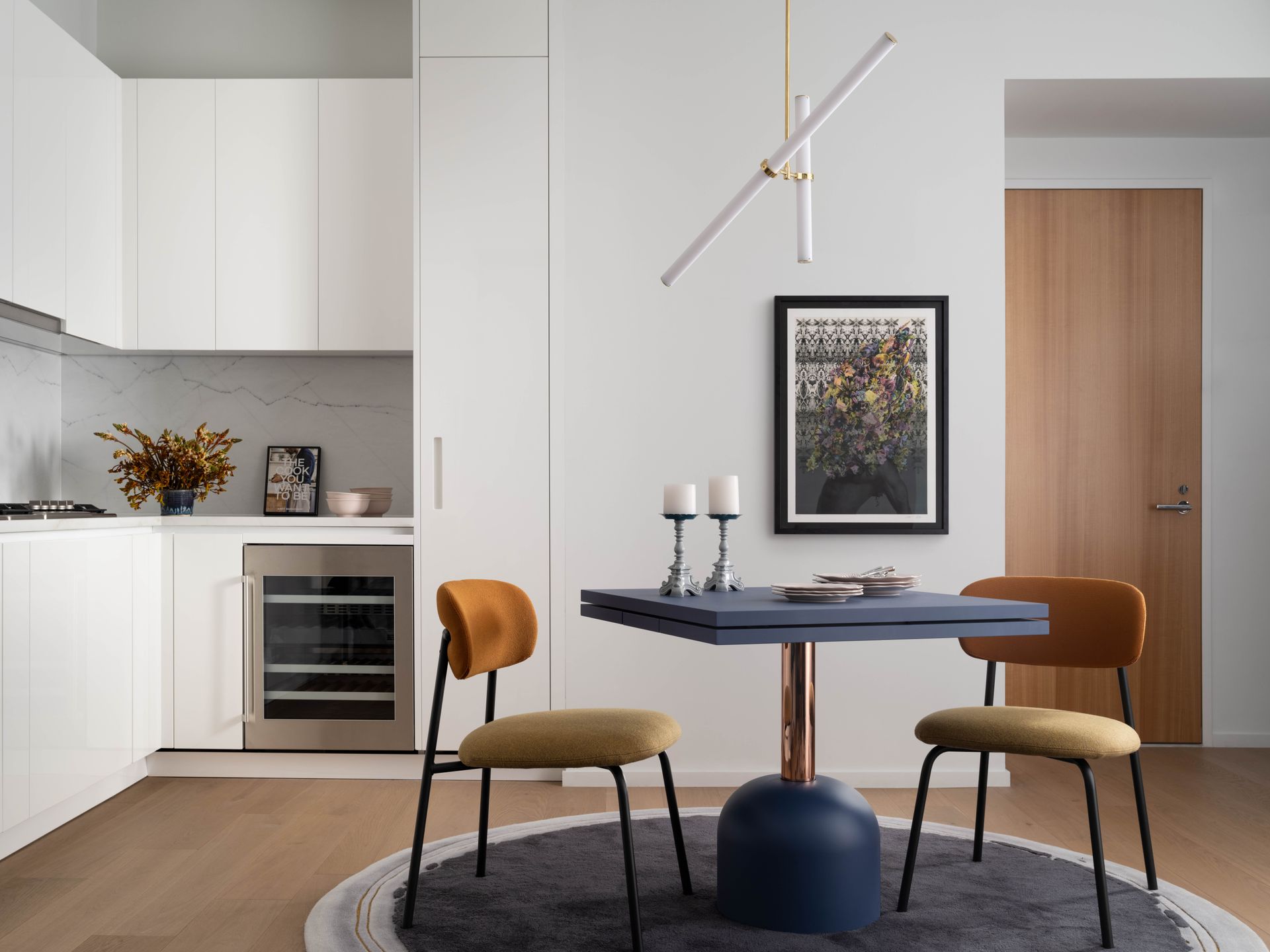
In the small dining room, a sort of magic unfolds with the specially chosen furniture.
'The dining table was probably the most challenging item to find for the space,' says Ahmad. 'I had to convince my client to steer away from a table of six as that would be too large for the space. The ideal shape was either a circular table or a square one. A rectangular one would just not work. Non-rectangular extendable tables are very limited and most of them don’t fit the aesthetic we wanted.'
So what was the solution? 'Once we found the Illo Plus Table by Miniforms Lab, I knew immediately it was the right fit for the space and my clients were onboard and didn’t mind the lead time,' Ahmad tells us. 'For everyday use, the table is placed with four dining chairs on top of a round rug. On rare occasions when all five members are present, two extensions pop up and the table becomes a rectangular one that comfortably seats up to six people.'
'We chose four dining chairs to be placed at all times with the table, and added two different ones by the console,' says Ahmad. 'This way the extra chairs don’t feel like two dining chairs that didn’t fit and had to be placed away. On their own, the two accent chairs with the console become their own moment, complete with black and blue velvet.'

Material: Engineered wood
Price: $480
Want an extendable dining table for your city apartment? Consider this piece that stretches out to accommodate two more seats. It is easy to clean and can fit into any interior style.

Dotting the small yet elegant apartment dining room are artworks and a round rug. 'An organically shaped rug, in this case, a round one in a square-shaped space adds a lot of softness and warmth to the space,' says Ahmad. 'If used in an open floor plan it defines a certain area with distinct function. In this project, we wanted the rug to be dark and more textural to ground the colorful furniture selection in the dining area.'
'As for the artwork, we decided to go with something more colorful and dynamic,' says Ahmad. 'The main highlight piece is Head Dressed by Nick Cave, with a modern black frame [not pictured]. The second artwork in the space (above the console) was intentionally chosen as a minimalist piece that picks up the colors from the dining area and ties the space all together.'
The dining table is the Illo Plus table from Miniforms Lab via 1stdibs. The Aloa Chair is by Khodi Feiz for Artifort via 1stdibs. The Light Object 019 is by Naama Hofman for Galerie Philia, while the Halo Area Rug is by Ahmad AbouZanat for JD Staron X IC Capsule.
4. Bedroom

The modern bedroom is drenched in moody hues, with the window views stealing the focus. Earthy tones ensure the space always feels calming and welcoming, no matter its size.
'During the initial interview with the homeowners, my clients asked if it was possible to introduce different colors in the home,' says Ahmad. 'They are a family of five and only two members share a favorite color so we ended up with a list of four tones to work with.'
To bring that into a smaller space without the colors dominating, the selections we made included neutral tones, in both natural and grey colors. 'This helped create a cohesive look and allowed the selection of colors to stand out and make a statement,' Ahmad says.

'In this space, we kept mostly dark neutrals but we continued the theme of mixing grey and neutral shades,' the designer adds. 'For example, we opted for a darker wood stain for the headboard and nightstands. We also introduced a deep cinnamon color for the bed linen to pick up the accent color of the area rug. Together, the warm tones of the linen and area rug bring a soothing and calming effect to the space.'
'Large black and white artwork photography fill up the two main walls of the primary bedroom with a smaller piece staged against the headboard on top of one of the nightstands,' says Ahmad. 'We wanted to keep the bedroom less colorful as colors can be a source of high energy.

Recommended Primer & Undercoat: Dark Tones
Price: $40 for 0.75 liter
To give your bedroom a warm, moody vibe, consider this dark lead grey paint color with blue undertones that can give your space an edge and fill it with character.
5. Bathroom

The small bathroom layout is all in white, to open up the visuals and to make it seem larger than it is. Clean, sleek fittings and a compact marble sink dot the space.
'My general approach to designing is layering textures and materials,' says Ahmad. 'I believe this theme, regardless of whether it is modern, transitional, or traditional home, always creates a sense of warmth. I knew for a smaller project that introducing these layers in a thoughtful, intentional way is key to its success.'
More projects by Ahmad AbouZanat of Project AZ
Be The First To Know
The Livingetc newsletter is your shortcut to the now and the next in home design. Subscribe today to receive a stunning free 200-page book of the best homes from around the world.
Aditi Sharma Maheshwari is an architecture and design journalist with over 10 years of experience. She's worked at some of the leading media houses in India such as Elle Decor, Houzz and Architectural Digest (Condé Nast). Till recently, she was a freelance writer for publications such as Architectural Digest US, House Beautiful, Stir World, Beautiful Homes India among others. In her spare time, she volunteers at animal shelters and other rescue organizations.
-
 What are the Most Comfortable Pillowcases? From Temperature Regulating to the Best for Your Skin
When you're looking for comfort in your pillowcases, material matters. These are the best you can buy
By Faaizah Shah Published
-
 5 Simple, but Genius Bathroom Layout Tricks That Will Make Your Space Work so Much Harder
Small switches to how you lay out your bathroom that help make the most of a small space
By Luke Arthur Wells Published

