Before & After: See how a dark study became a chic and cosy kids office
We have home office envy...
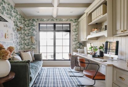

A formerly dark and uninviting study space has been transformed into a bright, airy and welcoming kids office, the perfect spot for concentrating on homework, and online classes during lockdown.
When the couple behind the blog Chris Loves Julia moved into their new home last summer, they dedicated this ground floor office space for their daughters.
It's the perfect spot for a kids office, as it sits on the ground floor and has a wide open doorway, so parents Chris and Julia Marcum could peek in and help when needed.
With schools closed for part of this year, and the kids based at home full time, there was never a better time to dedicate to creating a more cosy and inviting scheme.
Before
It’s one of the first rooms you pass when you walk in the front door, and it desperately needed a revamp.
Previously, the cabinets were a dark cherry with matching wainscoting around the perimeter of the room and a different tone of wood on the coffered ceiling.

When they first moved in, they replaced the floor and window as part of the rest of the home's transformation, but the rest of this office space stayed as it was.

And while it was functional, the office felt cold, dark and uninviting.

The Process
Chris and Julia added vertical tongue and groove to the wall behind the desk and even carried it into the back of the bookshelves. They then sanded down the dark cherry stained wood desk to a more natural colour before painting.

A few passes with the palm sander showed a much lighter wood that was easier to work with – and one that matches the floor a little better.

Because the doorway to this room is a cased opening with no doors, the couple wanted a seamless transition of skirting and colour palette.
The couple covered everything in a warm off-white, matching the rest of their home so that the space flows.


It's amazing what a difference colour can make – the woodwork, skirting, desk and cupboards all stayed in place but received a fresh coat of paint and new hardware.


After
Then – the piece de resistance – the Sandberg Raphael wallpaper, completing the finished look.

See Also: Before & After – see how a cluttered hallway was transformed to a chic play room
It's not just a pretty room, it's functional too. Instead of hanging art, they went for a big pin board where the girls could put up their own artworks.


Hooks were mounted in the corners for hanging up school backpacks.

It was the perfect spot for all of the papers that come with kids and they do their homework in there, too. But it has also become a spot for creating. The cabinets are stocked with art supplies and paper and crafty things.


The shelves are filled with everything they use often. Below, markers and pins (in the little wooden box) sit atop the girls’ secret stash of collectables.

From a lower angle, you can see the box which the father Chris Marcum built under the desk for all of the cords and electronics, cables and modems – it’s a hard-working hub.
A basket or tray is the easiest way to make things that would normally look like clutter feel intentional instead.

It's a striking improvement on what it was before – and a great example of how you can achieve a lot with just a lick of paint.

See Also: Before & After – A Terraced House in Hackney Gets A Modern Make-Over
Be The First To Know
The Livingetc newsletter is your shortcut to the now and the next in home design. Subscribe today to receive a stunning free 200-page book of the best homes from around the world.
Lotte is the Digital Editor for Livingetc, and has been with the website since its launch. She has a background in online journalism and writing for SEO, with previous editor roles at Good Living, Good Housekeeping, Country & Townhouse, and BBC Good Food among others, as well as her own successful interiors blog. When she's not busy writing or tracking analytics, she's doing up houses, two of which have features in interior design magazines. She's just finished doing up her house in Wimbledon, and is eyeing up Bath for her next project.
-
 How to Thaw a Frozen Pipe — Learn Everything You Need to Know in 5 Minutes With This Guide
Winter storm caught you off guard? We asked an expert — just how do you thaw a frozen pipe?
By Hugh Metcalf Published
-
 The 12 Very Best Silk Bedding Pieces — As Our Style Editor Says: 'It's What Dreams Are Made Of!'
Slumber in lustrous luxury with the very best silk bedding sheets, duvets, pillowcases, and more — your sleep score will thank us later
By Julia Demer Published
-
 The simple way to a more sustainable and stylish life with Fisher & Paykel
This incredible new tech saves time, energy and has become the washing machine you need to know about
By Sponsored Published
-
 Forget Cottagecore - Flora Fantasia by House of Hackney is Cottage hardcore
House of Hackney's Flora Fantasia collection blends the romanticised rural aesthetic with riotous punk elements
By Jacky Parker Published
-
 Bert & May's new hexagon tiles collection is tapping into one of this year's biggest micro trends
Tap into the microtrend for hexagon tiles and make myriad patterns with this new collection from Bert & May
By Jacky Parker Published
-
 Matthew Williamson’s tip for renovating a house on a budget is so simple, but incredibly effective
Renovating a house on a budget? See the savvy ways to control costs when managing an interior redesign
By Jacky Parker Published
-
 The fabulous new Matthew Williamson furniture collection is a cocktail of color and print
This decorative Matthew Williamson furniture is the beautiful result of collaboration with Roome London
By Jacky Parker Published
-
 Out & Out's new furniture collection is full of stylish storage solutions
This stylish storage will have your home organised in a jiffy - whatever its size
By Jacky Parker Published
-
 Explore Sandra Bullock’s former coastal chic home in Georgia
Sandra Bullock has just sold her beautiful island beach house, giving us a glimpse at her coastal-inspired interior style.
By Lotte Brouwer Published
-
 On your marks: new H&M furniture, lighting and homeware for SS21 about to drop
The new H&M furniture, lighting and homeware collections drop on 4 Feb, so earmark your favourite pieces now
By Jacky Parker Published


