The 5 Most Impractical Design Trends We've Seen in 2023, and What To Do Next Year Instead
They’ve had their time and place, but now designers agree it’s time to move past these impractical design trends and choose some longer lasting alternatives


There are certain trends with such a tight hold on us that we choose to completely ignore the fact that they’re not the easiest to live with. They are picture perfect and make our homes look utterly cool and now, but they come with downsides. Light colored fabrics, delicate surfaces, impractical layouts… Too good to be true, it comes a time when as much as we might love the look, we need to let go of trends that don’t really serve us in the long term.
Don’t get me wrong, I’m the first one to fall for the latest and shiniest pieces of furniture and accessories that will instantly elevate the look of my home, but in time I’ve learned that balance is key and when it comes to passing trends, they’re best to be adopted sparingly, as a final touch, if you will, that’s easy to update, rather than a whole aesthetic you’ll get stuck with. Here are such impractical interior design trends interior designers advise to move past and tell us what to do instead.
1. Open floor plans

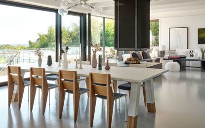
Open floor plans have been around for a while, and while the appeal is immediately apparent – a sense of generous space, allowing light to flow easily – the lack of physical boundaries can feel a bit overwhelming after a while. ‘While having two rooms adjacent can still be desirable (i.e. kitchen and family room), I think one large open floor plan has its drawbacks,’ says interior designer Erin Myers. ‘Noise carries, and you lose that cozy feeling you get with individual rooms. Walls enable you to treat each space a little differently and create a moment or a room with a specific purpose - and you don't have to hear the TV or smell the cooking,’ she adds.
It all makes sense. Ultimately, your home should offer you a sense of privacy, of retreating from the world in your own cocoon, and give you a designated space for an individual activity that you can then shut the door on when you want to move on to something else. An over use of the open floor plan makes that more difficult to achieve, and as for design, with everything in sight, the need for it all to work together just right takes away the opportunity to add a different touch to different areas. Stick to a balance of kitchen and dining room or kitchen and family room for your open space, with a separate living room, home office or library, and this way you can have the best of both worlds.
2. Fast furniture

It allows us to adopt the latest trends at an affordable price and with immediate effect, turning our homes into showroom worthy displays, but should be approached with caution. ‘Many people grab what is easy and inexpensive, but if it will be replaced in a few years, it’s just a waste, which makes it impractical,’ interior designer Ami McKay tells me. ‘Consider investing a bit more for pieces that are well made. If cost is an issue, you can watch for sales or floor models. Spend a bit more time searching, and you will be happier with your purchases’.
Ultimately, it’s all about making mindful purchases, with intention, and achieving a balanced mix of high and low. Think less expensive items for your home’s seasonal trend updates, that can be swapped out or donated with ease, and invest in bigger items that have a timeless appeal and you intend to keep for longer.
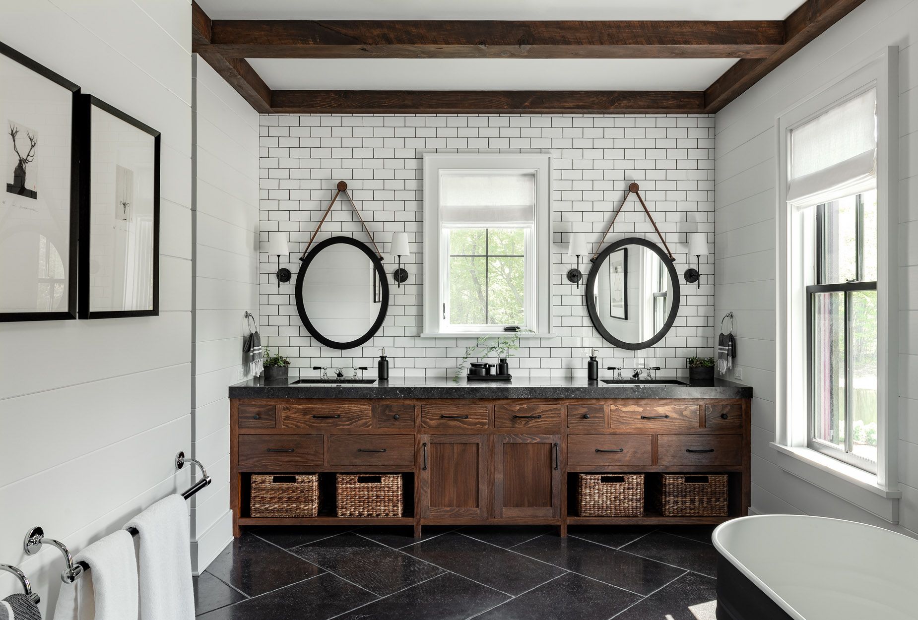
3. Shiny black floors

A shiny black floor looks very elegant while equally making a statement and it’s no wonder many of us would jump at the opportunity to adopt the trend. But as Ami points out, ‘shiny black floors are impractical as they show everything,’ she says. There are ways around it. ‘If you really want black, choose a stain instead of a paint and use matte instead of glossy. You don’t want your house to look like everyone else’s!’ she explains.
Black is a timeless color and if you do love the look of a black floor, but when it comes to which type of flooring is the most durable, just consider that it’s not the easiest to maintain. If that doesn’t put you off and you'd rather stick to it in the long run, make sure you’re mindful of your finish choices to ensure durability.
4. Overuse of pot lights

Now this is one trend that designers could not agree on more. A favorite lighting accessory of the newly built home, the pot light has its advantages, but we can definitely pace ourselves with it. ‘Pot-lights have a purpose, and they are very useful as task lighting especially in the kitchen, but don’t rely on them for all your lighting particularly if you don’t have them on dimmers. Overly bright lights remind me of an airport landing strip and are just as impractical as overly dim lighting’ says Ami.
When it comes to lighting it’s all about balance. Keep the pot lights in task focused areas like kitchens or utility rooms, but mix it up with warm, low-level lighting. ‘Make sure you have accent and ambient lighting including sconces and lamps so you can find the perfect ambiance,’ advises Ami.
5. Boucle furniture

This is probably going to hurt, but we need to collectively consider bringing the boucle obsession down a notch. There isn’t a bigger boucle fan than me, I promise you. It makes me feel like I’m living on a cloud, and I just love that, but the fact that I’m worried every time I sit with my jeans on my boucle accent chair, or anyone gets anywhere near with a cup of coffee takes the joy out a little bit. Not to mention the fact that everyone (and I really mean everyone) must have at least one piece of boucle décor in their homes… and so the design saga of how to be on trend but totally original at the same time continues.
‘This fabric has had its moment - it's been overdone and will feel dated in a short period of time,’ Erin tells me. But it’s not all doom and gloom and like with all good things in life (and design) restraint is key. Too much of a good thing ends up anything but good, but Erin’s advice is not to give boucle up altogether, but to embrace trendy fabrics in smaller doses, like a throw pillow or pouf. I, for one, will definitely keep it as a feature, and give up on the complete home takeover. If you do want to leave it in the past, a shaggier, wool version is replacing boucle and I think you'll love it just as much.

Price: $1,049
If you find it hard to let go of boucle, go for the latest update with this shaggy, shearling version that's more now.

Price: $29.99
Avoid over-using pot lights and opt for ambient lighting instead. White lamps are chic and set to be big in 2024.

Price: $6.10
If you love a dark floor, choose a stain on top of your wooden floor as opposed to a pre-made shiny alternative.
Be The First To Know
The Livingetc newsletter is your shortcut to the now and the next in home design. Subscribe today to receive a stunning free 200-page book of the best homes from around the world.

Raluca is Digital News Writer for Livingetc.com and passionate about all things interior and living beautifully. Coming from a background writing and styling shoots for fashion magazines such as Marie Claire Raluca’s love for design started at a very young age when her family’s favourite weekend activity was moving the furniture around the house ‘for fun’. Always happiest in creative environments in her spare time she loves designing mindful spaces and doing colour consultations. She finds the best inspiration in art, nature, and the way we live, and thinks that a home should serve our mental and emotional wellbeing as well as our lifestyle.
-
 5 Things People With Flattering Bathrooms Never Have — (And You Shouldn't Either!)
Designers say you should avoid these five things if you want a bathroom that flatters your reflection and therefore uplifts your mood
By Oonagh Turner Published
-
 How to Organize your Bathroom for a Better Morning Routine — 6 Steps for a Seamless Start to the Day
The ease of your morning routine can have a huge influence over the rest of the day, so make sure you optimize you space for a stress-free start to the day
By Lilith Hudson Published

