Should living room furniture match? These designers explain the problem with buying too much from one store
Matching furniture in 2024 has a very different meaning from the retro sofa suites of yesteryear. These designers explain how to approach it (or not) in your living room scheme
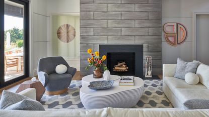

Have you ever wondered why living rooms are called living rooms? Most people spend the bulk of their time in the living room, second only to the kitchen. A space to relax and entertain, it’s at the heart of life in the modern home, so you don’t need me to spell out why this space demands such special attention.
Matching furniture sets don’t have the same prestige as they once did, or do they? Everything we see is constantly evolving, so perhaps furniture suites have evolved so that we no longer recognize them as such. The boom of big high street and online retailers, like Ikea, Target, and Wayfair, make furnishing our homes a breeze. With everything you need under one roof, you don’t have to look far to fill your space with the latest interior trends. We might not be knowingly buying furniture in a matching set, but I’d argue the likes of Ikea’s carefully procured living room gallery are a (not-so-subtle) nod in the same direction.
The big question is, is this one-stop-shop approach the answer to creating a cohesive living room of like-minded pieces? Or does this picked-straight-out-the-catalog method leave our homes looking somewhat ‘vanilla’? Time-saving and cost-cutting furniture shopping is a tempting offer in our fast-paced modern lifestyle, but is there a price to pay for cutting corners? We turned to the experts for answers.

Sophie is a home interiors writer and all-around design aficionado, currently studying interior design at London's KLC. For this article, she examines what 'matching furniture' means in the context of modern design, and asks designers whether it's a good idea for our homes.
What does matching furniture look like in the 21st century?
Interior designer Christian Bense paints us a picture of a typical matching furniture set: ‘It’s the three-seater sofa that matches the two-seater sofa that matches the armchairs. The coffee table that matches the TV unit, which matches the entrance hall table.’
It might sound a tad OTT, but today’s Target equivalent isn’t as far from that as we’d like to think. ‘Just like shopping for a living room sofa suite, putting all your interior design eggs in one online basket means everything in your space starts to look like it's been painted with the same brush,’ says Christian. ‘Even though the pieces may differ, they all have the same flavor.’ And it’s undeniably vanilla.
So, what's the verdict on matching furniture?
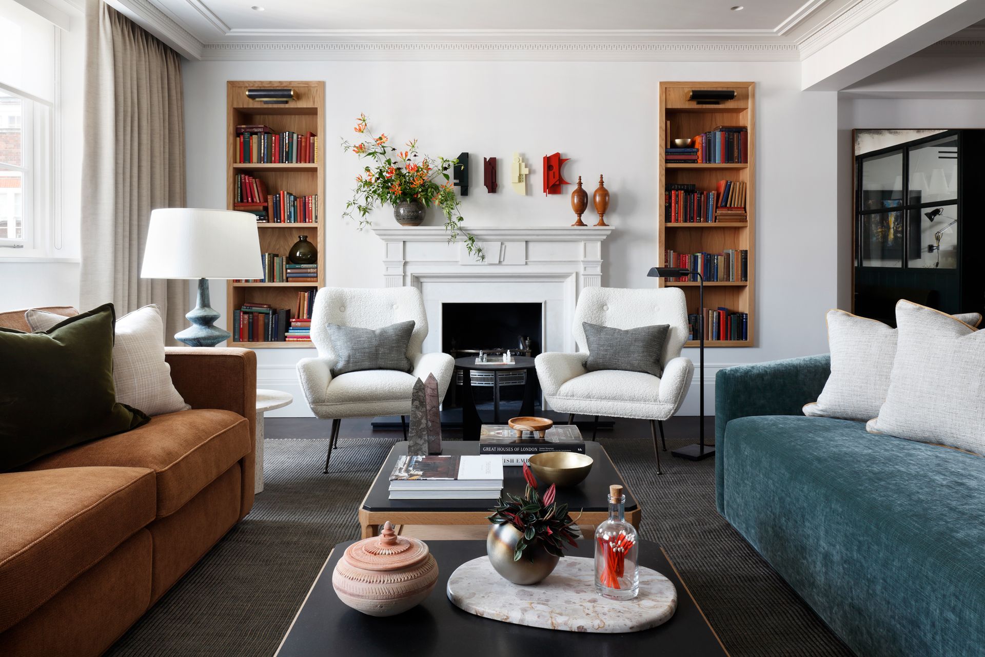
Interior designer Michelle Gerson sums up the general consensus amongst the professionals quite simply: ‘I do not think your living room furniture should match,’ she says. ‘Using different pieces and collections together in one space makes a room interesting.’ Repetition equals monotony, and monotony is the antithesis of the innate beauty that comes with being unique.
Christian agrees, ‘the best-designed spaces are the ones that look curated and collected, and this is achieved by variance,’ he says. ‘There are so many suppliers out there. You really don't need to buy your wall lights from the same place that made your sofa,’ he adds.
One-stop shopping removes the opportunity to discover exciting new brands, support emerging designers, and find those one-of-a-kind treasures that make your home, well, yours! To prevent your personal taste from being overshadowed by a retailer’s house style, Christian recommends increasing the variety of suppliers. ‘Not having the anchor piece in each room made by the same people works wonders,’ he says.
‘At ND Studios, our focus is to create homes that are a true reflection of our clients,’ says founder and director Natascha Dartnall. ‘This often involves incorporating items that hold meaning to the client and making them work within the scheme.’
Alexander Díaz Andersson, founder and design director at furniture design studio ATRA, often takes a similar approach. He enjoys telling the owner’s life story through furniture inherited throughout their life, ‘all connected with a certain taste and aesthetic, yet disconnected in their provenance and craftsmanship.’ Each piece tells a story, imbuing the space with narrative and character.
How do I co-ordinate 'un-matching' furniture?
Matching furniture is a firm no-no. So, how can we combine individual pieces to create a cohesive living room setup? For Michelle, the trick is to make sure ‘the scale of the pieces work together, and the fabrics and textures are complimentary.’ She also suggests using living room wall art and home accessories to create a sense of continuity and cohesion. For example, a rug can beautifully tie a scheme together through color and style and define zones in an open-plan space.
Natascha agrees, ‘even if the furniture doesn’t match, a fluid color palette will help to pull everything together.’ Rather than buying new, Natascha recommends using what you already have and reupholstering items with a more appropriate fabric choice. ‘Not only does this save you buying something new, but it also saves your existing piece from going to landfill!’ she adds.
For furniture designer Alexander, ‘it’s not only about the obvious: the color and material, but also the construction of the furniture pieces, like the joinery, the thickness of the wood, and the finishes,’ he says. ‘Decor is like a language, an alphabet… so, like with a language, all these elements will give some sense to the room.’
Get the balance right
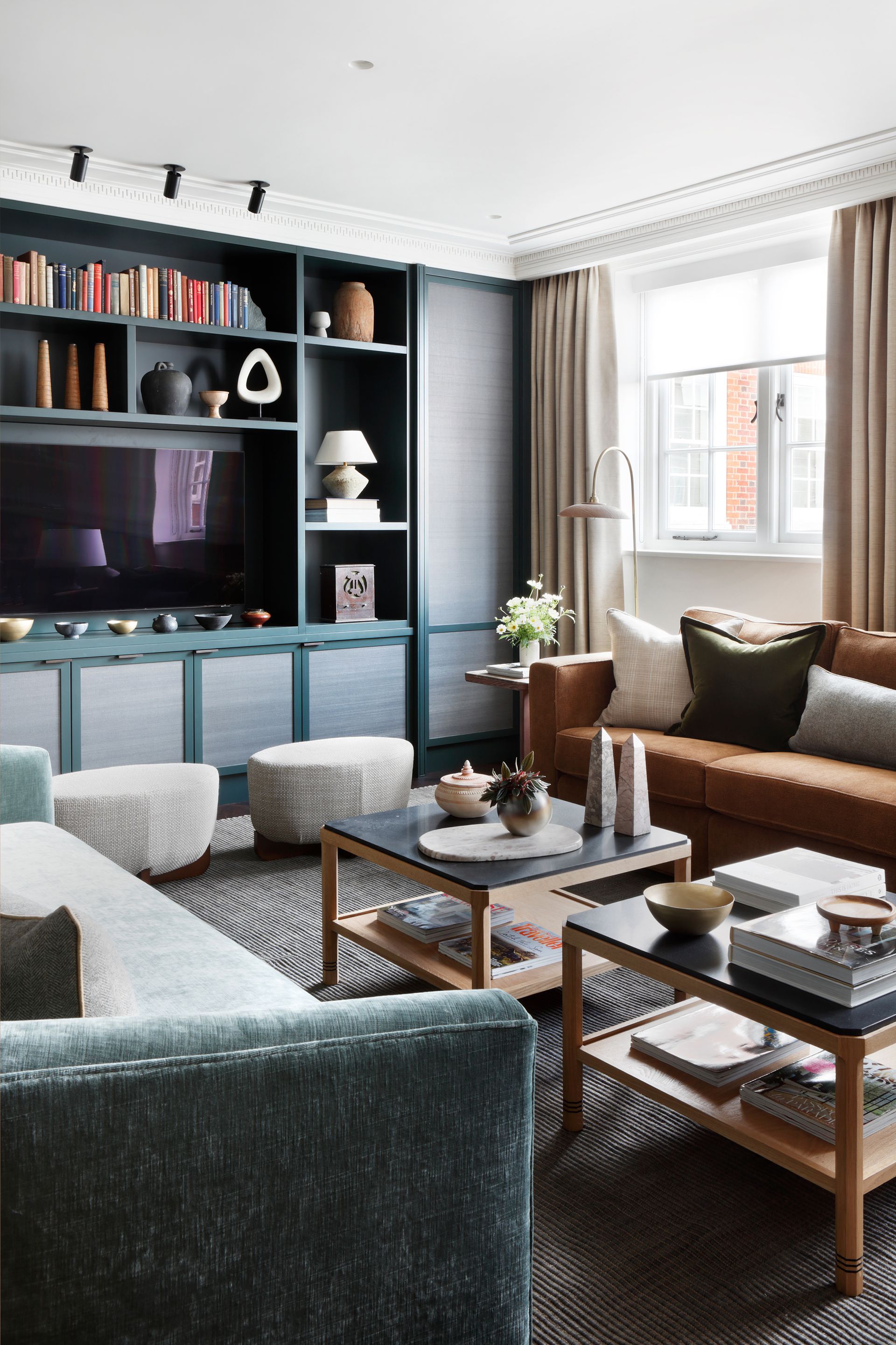
For Christian, it’s all about balance and ‘adding as much depth as possible with various finishes, materials, and styles.’ If you already own a mishmash of furniture and want to refine your selection to create a cohesive eclectic style, Christian suggests you follow one simple rule: ‘get rid of one, keep one, and reupholster one.’ ‘There’s no room for sentimentality if a room isn’t working. One needs to be able to edit,’ he adds.
So, it’s out with the old and in with the new. ‘When I shop, I tend to shop for opposites,’ says Christian. ‘For example, if I have a fully upholstered armchair on one side of the room, the next set I buy needs to be entirely different. So maybe with wooden arms and a different type of fabric. Opposites attract.’
Mix the old with the new
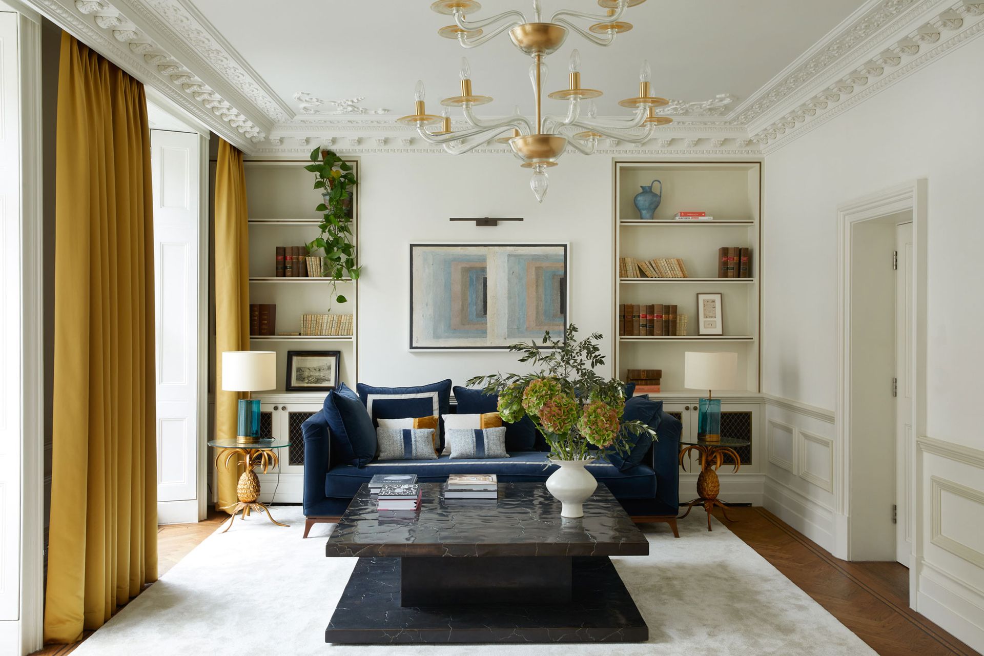
Christian takes a different approach when starting from a blank slate while maintaining his steady rule of three. Shop for ‘something masculine, something feminine, and something vintage… (or just something that looks old.),’ he says. ‘Ultimately what this menage à trois does is provide balance… which is the key to preventing your space from feeling like a suite,’ explains Christian. Could this be the holy trinity of interior design and the answer to our cohesive living room prayers?
‘Shopping in this grouping of three means that you eliminate the risk of all your pieces having the same personality, which is a risk you run when buying everything new over a short space of time,’ continues Christian. ‘It will also help you to pause and investigate the pieces a little more carefully before you buy.’ We’re all for conscious consumerism.
For Natascha, this eclectic approach is the key to bringing interest and personality to a space. ‘I prefer to add character and tell a story within the home by decorating with antique and modern pieces,’ she says. Michelle agrees and creates cohesion between the old and the new by ‘mixing different textures in the same color hues.’
Focus on scale, proportion and layout
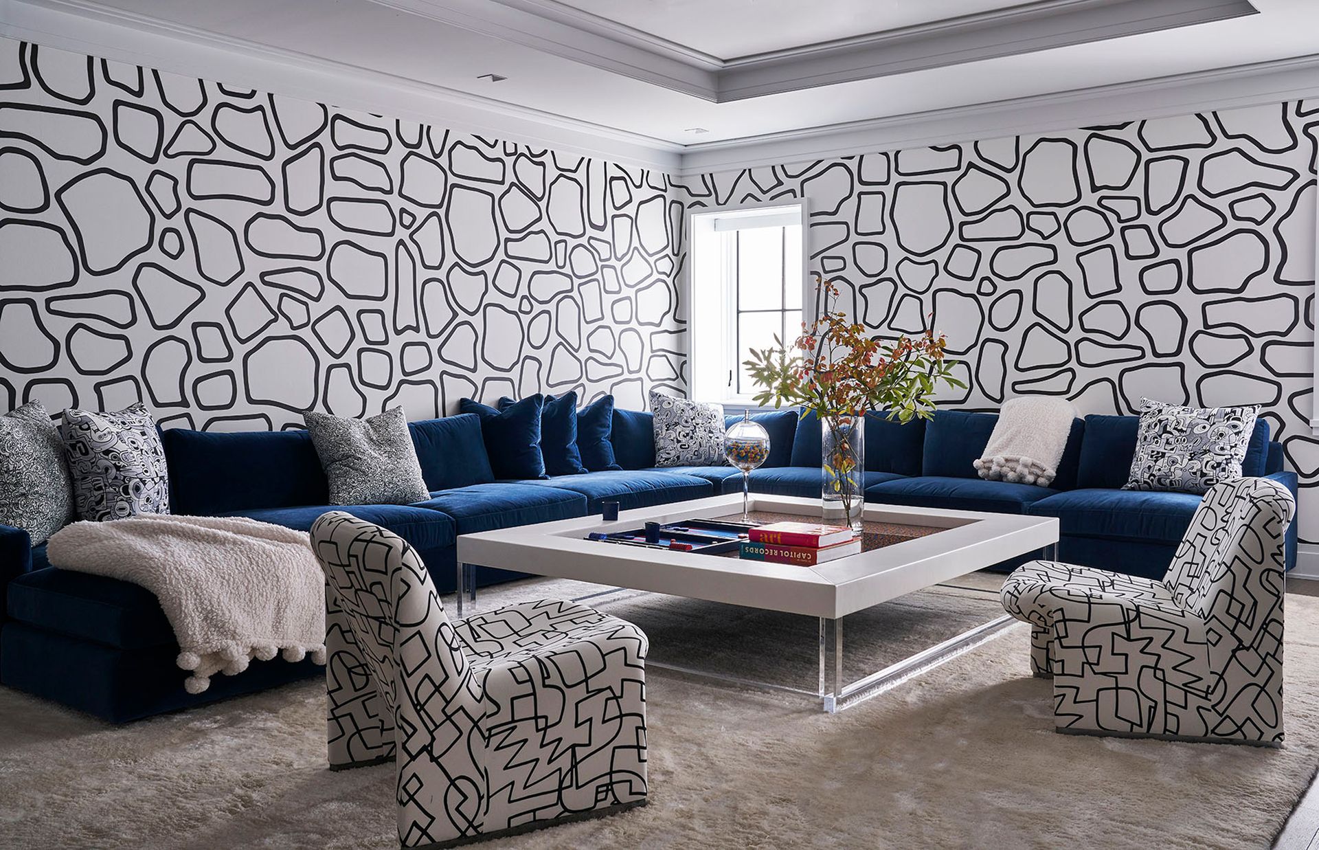
Scale and proportion are integral to a cohesive design. ‘If you start shopping for a room without a floor plan, you're going to fail,’ asserts Christian. Before shopping, you need to know what size furniture you’re looking for. ‘Not only will this limit options, but a well laid out room, regardless of style, is half the battle won,’ says Christian.
Alexander agrees, ‘living rooms are to entertain your friends, family, and lovers, and depending on if you’re doing it right or wrong, you can have the most fantastic time or an awkward evening,’ he says. ‘A comfortable sofa facing a pair of armchairs and soft lighting should be the priority. Good music and good wine are a must too!’
Be The First To Know
The Livingetc newsletter is your shortcut to the now and the next in home design. Subscribe today to receive a stunning free 200-page book of the best homes from around the world.

Sophie is a home interiors writer and all-around design aficionado. With a degree in History of Art and Spanish, she has a keen interest in the influence of art, history, and culture in design. Having lived in Buenos Aires for five years, Sophie is an experienced communicator in both English and Spanish with a professional background in public relations and marketing. Sophie is also an interior design student at KLC, paving the way to tell stories through interiors that inspire, serve and create experiences worth remembering. Sophie currently writes for Livingetc, Better Homes & Gardens, and Foter Magazine.
-
 These 12 Best Table Lamps for Your Desk — Perfect Glows for a Creative Home Office
The best table lamps for your desk is have a soft, targeted glow. Elevate your WFH set-up with these stylish picks endorsed by Style Editor Brigid Kennedy
By Brigid Kennedy Published
-
 The Nespresso VertuoPlus is 30% Off for President's Day, and it's Kim Kardashian's Coffee Maker of Choice
This sleek and stylish coffee maker was spotted in Kim's home bar, and you can currently save $60 if you buy yours from Amazon
By Lilith Hudson Published

