Should curtains be lighter or darker than walls? Here are the rules designers live by
There are a few tips interior designers use when choosing whether to curtains should go lighter or darker than your walls
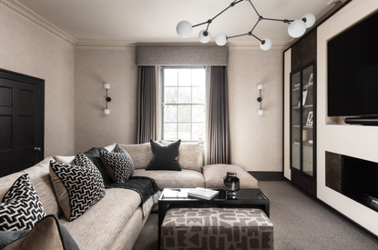
How many times have you gone back and forth over the right curtains for your room? And once you’ve decided on the style of curtains, then comes the deliberation over the color choice. Should your drapes stand out? Or blend in? And should curtains be lighter or darker than the walls they’re placed next to?
Deciding between the seemingly never-ending choice of modern window treatments is no mean feat. But the truth is, when it comes to choosing if curtains should be lighter or darker than walls there is no one size fits all approach. It very much depends on the type of vibe you want to create in your space and how big of a room you’re working in.
However, what we can do is give you the tools you need to make the right choice for the mood you're trying to create.
As multi-award-winning interior designer, Rachel Usher explains, 'Choosing the color of a curtain is not a singular choice. A balanced scheme should consider how the tones work together as a whole and how much natural light is desired within the space.
'I recommend looking at the other materials that will co-exist with the curtains in the same space and creating a family of tones. Let the desired emotive feel for the finished room lead the choice. It is not wrong to go dark or light in contrast to the walls, it is a matter of playing with the senses and our interaction with the light, mood and ambiance.'
To help pick the right shade of curtains to help complement your room, here's the rules that designers live by.
Go lighter when you want an airy space

If the mood you're going for is airy, light-filled and fresh, then go for curtains that are lighter than the walls. Here in this modern bathroom, the drapes are just a toucher lighter than shade of the walls. They feel tonally matched and lead to an end result of making the room seem breezy. This neatly follows current curtain trends for drapes that blend in.
Marie Flanigan, an award-winning interior designer based in Houston, says, ‘When keeping the window treatments light, I don’t go much lighter than the wall color. With a darker wall, you can go both light or dark depending on the look you want to achieve.’
Go darker when you want a sophisticated space
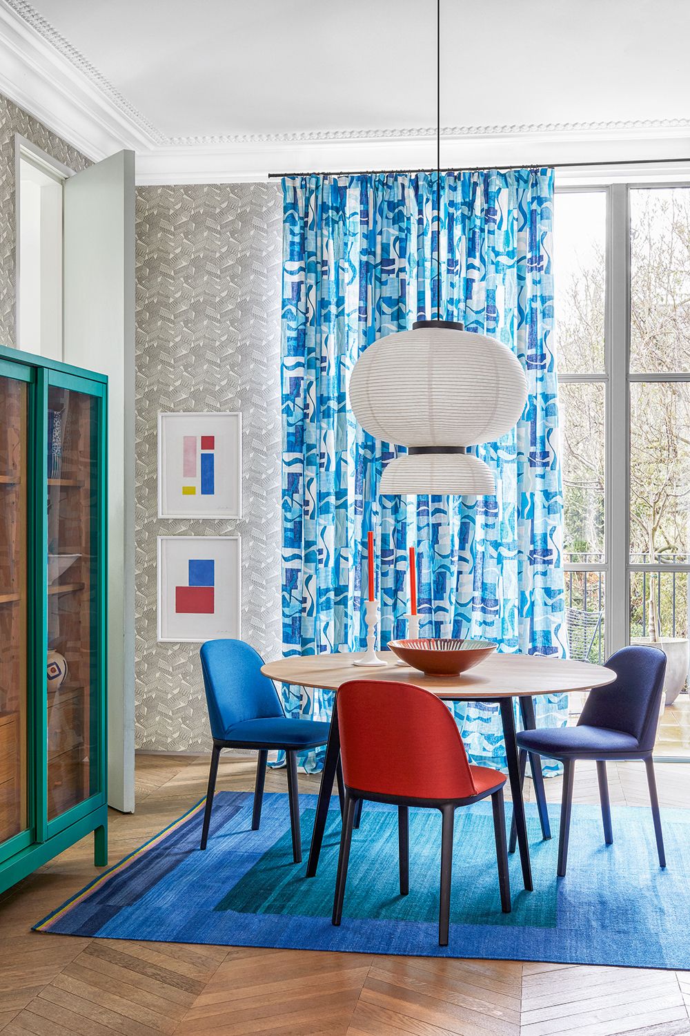
What curtains do when they're darker than the walls is pull focus to the windows, or to the corner that the curtains are in. This is an ideal approach for a sophisticated space that is multi-functional, and that you'll be using in both daylight and at night.
'I love darker curtains against lighter walls for a dining room or area,' says Livingetc's editor Pip Rich. 'It helps to create a little zone where the table and seating seems separate from the rest of the space, as your eye is pulled towards it. For breakfast or lunch, dining here is energizing - the vibrant curtains and light walls are uplifting. At night, with the richly-colored curtains closed they become a sophisticated backdrop.'
Mix and match colors for true modernity
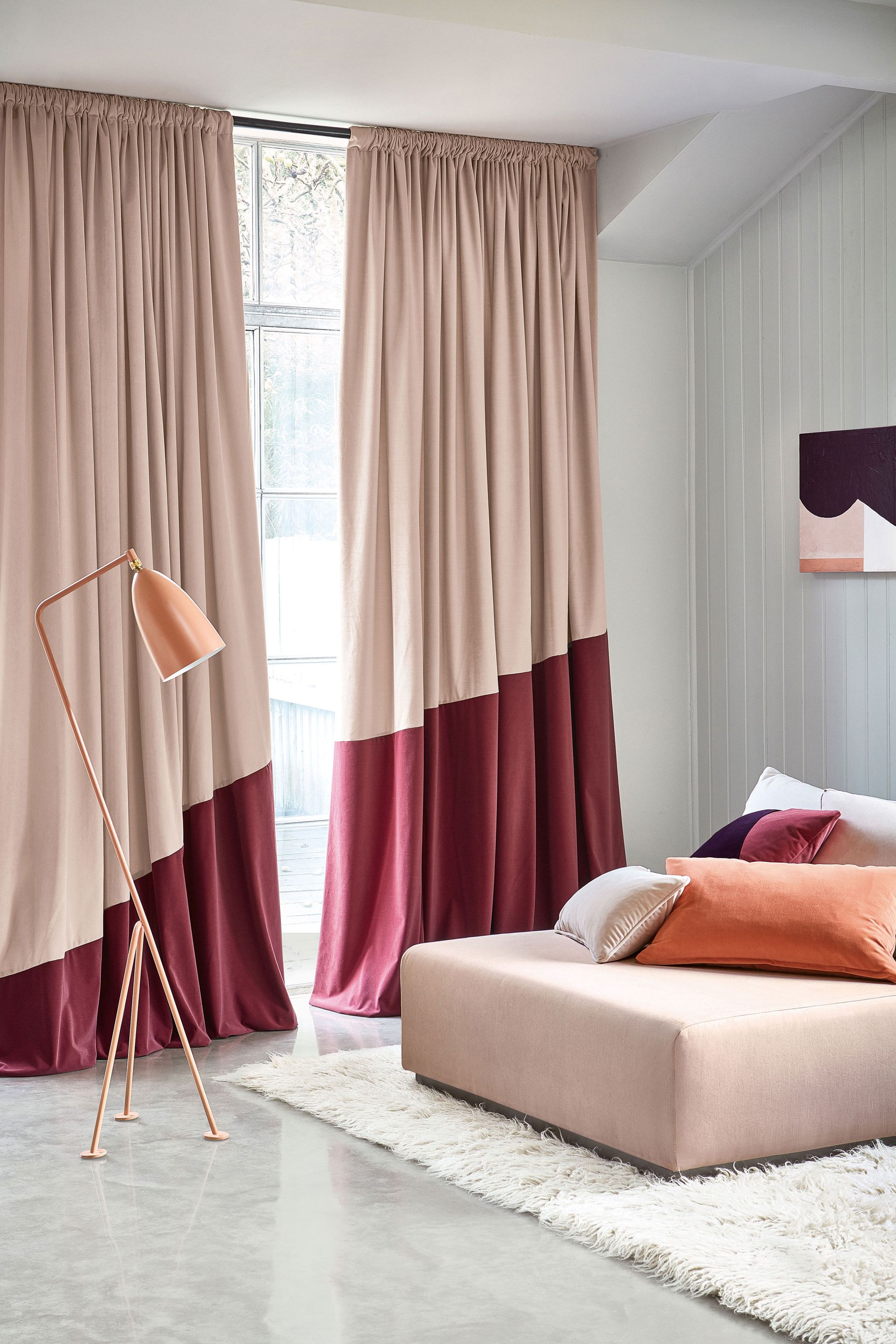
If you believe more is more and less is less, consider making your curtains stand out, not blend in. Marie says, ‘Typically I love for window treatments to make a statement in the room. However, the statement can be bold or nuanced within the space.’
Need some inspo? A fail-safe option is to opt for two-tone curtains, or a patterned drape that incorporates tones from colors of your walls. The trick here with these living room curtains is that the lighters of the two colors is just a shade or two darker than the walls, then the bolder color really stands out. Then as an extra layer, match the block colors of the curtain to what else in the room - this comes across like a professionally space. Here, both colors in the curtains match that of the pillows and artwork.
Match the curtains to the walls for true elegance

For a truly cohesive and effortless look, a modern approach is to go tonal and make your curtains blend in with your walls.
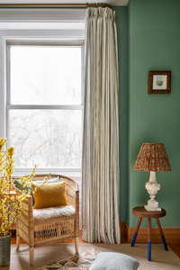
This is one design trick New York-based Crystal Sinclair of Crystal Sinclair Designs uses. She says of these bedroom curtains: ‘This prevents the drapes from drawing too much attention and creates a more textural look. However, there are times when we want the drapes to stand out, in that case, we usually opt for a lighter fabric. A lighter fabric brightens the space on either side of the window and visually expands the window.’
Wovn
If you're looking to shop for curtains online, you can find contemporary styles with a luxurious look from retailer Wovn. It's a simple made-to-measure approach that ships fully formed drapes direct to you door.
Do dark curtains make a room look smaller?

When you're working with a small space the last thing you want to do is make it look even smaller. But according to Marie, ‘Dark curtains don’t always make a room look smaller, especially when the windows are very large or tall.
‘Dark window treatments typically help anchor a space,’ Marie explains. ‘However, if you use very heavy curtains on small windows in a smaller room, it can have the effect of making things feel smaller.’
Be The First To Know
The Livingetc newsletter is your shortcut to the now and the next in home design. Subscribe today to receive a stunning free 200-page book of the best homes from around the world.
Becks is a freelance lifestyle writer who works across a number of Future's titles. This includes Real Homes, Top Ten Reviews, Tom's Guide, TechRadar and more. She started her career in print journalism at a local newspaper more than 8 years ago and has since then worked across digital and social media for food, fashion and fitness titles, along with home interior magazines. Her own interior style? She's big on creating mindful spaces in every corner of her home. If it doesn't spark joy or happiness, it has no place here. When she’s not writing, she’s reading and when she’s not reading, she’s writing.
-
 The 12 Best Table Lamps for Reading —I'm a Certified Bookworm (and Shopping Expert)
When it comes to table lamps for reading, I don't mess around. If you're the same, this edit is for YOU (and your books, or course — and good recommendations?)
By Brigid Kennedy Published
-
 "It's Scandi Meets Californian-Cool" — The New Anthro Collab With Katie Hodges Hits Just the Right Style Note
The LA-based interior designer merges coastal cool with Scandinavian simplicity for a delightfully lived-in collection of elevated home furnishings
By Julia Demer Published
