Iconic designer Matthew Williamson explains how to choose color for a surprisingly calm yet maximalist decor
Matthew Williamson talks to our editor Pip Rich about choosing color and styling a room to create a soothing - yet maximalist - scheme


World renowned designer Matthew Williamson started off as fashion designer in London in the 1990s, dressing Kate Moss, Jade Jagger and Alek Wek. He had stores all over the world, and was beloved for his vibrant use of color and motif.
His aesthetic was pure fun, made for people who didn't take themselves too seriously and who wanted to look outrageously fabulous. Gradually and naturally, Matthew began to switch to interiors, designing his stores, then his home, then other homeware collections for other brands and then other peoples' homes.
He now creates commercial and residential spaces, still known for his trademark brights, and is a leading figure in maximalism in interior design. He sells a charming mix of antique and modern pieces via his own website, and this month launches a collection of bed linens, soft furnishings and accessories for John Lewis.
I caught up with him to find out how he decorates with bold colors right now, and how to turn pink into neutral.
I think of my look as organised bohemia, which by it’s nature is a bit more calming to live with
Matthew Williamson

Matthew Williamson with some of his designs for John Lewis
How to do maximalism calmly

A bedroom designed by Matthew Williamson
Pip Rich: Hi Matthew, how’s life in Spain today?
Matthew Williamson: It’s good thanks, Pip. I’m just sitting on my terrace, drinking coffee, looking at the sunshine.
PR: It sounds so peaceful - which fits with my image of you. I’ve always admired how you’ve managed to use such vibrant colors but in ways that turns them into neutrals, that makes them seem calm. How do you do this?
MW: It’s true, I am no minimalist! But I’m not a cluttered hoarder, I think of my look as organised bohemia, which by it’s nature is a bit more calming to live with. It’s intended to look thrown together, but it’s simply not - I’m meticulous about curation. I don’t want anyone to move my cushion! When it comes to the colors, though, it’s got to be about balance, and although people might look at my work and notice the bright shades first, there are always contrasts at work. Sometimes, it’s just a border in a bold color, like a window frame in bright yellow next to a pale wall, or a neutral living room with a deep blue door.
Matthew Williamson's favorite colors to decorate with now

Mirror and lamp by Matthew Williamson for John Lewis
PR: What colours are you using to decorate with at the moment?
MW: I’ve always been drawn to pinks and greens together, they’re a comfy combination. The trick is to contrast them - a dark olive with a powdery calamine, a soft green with fluorescent flamingo. Pink is a neutral to me, it’s like beige but warmer. I’ve just done my lounge in my London house in a pink from Pickleson Paints, and a green bedroom. Mid tone green on the walls, darker green on the ceiling. Again, it’s about not pairing too many vibrants colors together - I wouldn’t do purple and orange.
PR: Really? But I think of Kate Moss walking down the runway in your clothes in the 90s, and that was all purple and orange, wasn’t it?
MW: Well, actually, that was orange and blue. And it was long time ago!
PR: True! You're totally allowed to have evolved your style since then! How else do you think your aesthetic has changed along the way?
MW: I’ve always started every design with ‘will this bring a smile to someone’s face? Is it optimistic?’ That was the starting point for the John Lewis collection. I suppose where this differs from what I’ve done before is that in the past I have been inspired by tropical motifs and moods, now my take on nature comes more from the hedgerow. A slightly more cottage-y take on design, but not just for people who live in cottages.
Put a room together from the ground up

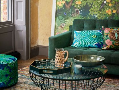
Cushions and footstool by Matthew Williamson for John Lewis
PR: As I’d expect from you, there are a lot of daring colours in this collab, and you talked earlier about curation. How do you put a room together with pieces that, on the surface, don’t seem to match?
MW: I think about the floor type first - it’s the most costly and perhaps the dullest think to focus on, but it’s got to be a large chunk of your consideration. It’s something you can’t change, or at least, not easily, and if you get a fantastic floor you can play endlessly with everything else in the room. Opt for a natural material, like bare floorboards, reclaimed wooden floors, stone or terracotta. All of these provide history and depth and give an anchor to the rest of your decor. Imagine to floor to be like the shoes to the outfit - you get them right and anything goes up top, it’s much easier to layer up above it.
PR: And now that your muse Sienna Miller has just bought a house, will you be doing her interior design?
MW: I will do my best to nudge her into decoration over a 20 minute coffee but that’s the problem with being a designer - all your friends want your help but they aren’t willing to pay!
Be The First To Know
The Livingetc newsletter is your shortcut to the now and the next in home design. Subscribe today to receive a stunning free 200-page book of the best homes from around the world.

The editor of Livingetc, Pip Rich (formerly Pip McCormac) is a lifestyle journalist of almost 20 years experience working for some of the UK's biggest titles. As well as holding staff positions at Sunday Times Style, Red and Grazia he has written for the Guardian, The Telegraph, The Times and ES Magazine. The host of Livingetc's podcast Home Truths, Pip has also published three books - his most recent, A New Leaf, was released in December 2021 and is about the homes of architects who have filled their spaces with houseplants. He has recently moved out of London - and a home that ELLE Decoration called one of the ten best small spaces in the world - to start a new renovation project in Somerset.
-
 The 12 Best Table Lamps for Reading —I'm a Certified Bookworm (and Shopping Expert)
When it comes to table lamps for reading, I don't mess around. If you're the same, this edit is for YOU (and your books, or course — and good recommendations?)
By Brigid Kennedy Published
-
 "It's Scandi Meets Californian-Cool" — The New Anthro Collab With Katie Hodges Hits Just the Right Style Note
The LA-based interior designer merges coastal cool with Scandinavian simplicity for a delightfully lived-in collection of elevated home furnishings
By Julia Demer Published

