Don't just settle for white gloss! These expert tips for styling metro tiles will guarantee compliments from guests
Get more out of your metro tiles with these expert tips on how to be bold with size, color, and style


Metro tiles, otherwise known as subway tiles, have been a classic choice for kitchens and bathrooms since their inception. Timeless though they may be, however, you'd be forgiven for tiring of the typical white glossy brick layout.
The good news is, they're extremely versatile. Not only are there a plethora of different variations for an intriguing tile design, but the ever-growing market now offers plenty of options to experiment with size, color, grout, and surface finish. 'Like jeans and a T-shirt, metro tiles are a classic, but we are seeing designers and homeowners wanting to take some more chances with colors, textures, and patterns,' explains Deborah Osburn of clé tile.
If you want an intriguing tile idea that will guarantee compliments from guests, you'll want to hear these expert tips. Besides the trending metro tile formations, they offer advice on how to be bold with size, style, and scale for a bathroom or kitchen tile idea that wows.
How can you make metro tiles more intriguing?

If you think metro tiles are overdone, you're probably picturing a standard white brick formation, but there's a whole lot more to them than that. Their versatility makes them the gift that keeps on giving, with countless subway tile layouts to offer intriguing patterns on your wall or floor.
'Metro tiles are wonderfully diverse, and can be installed in a multitude of layouts to create a unique and characterful space,' explains Lee Thornley, founder of Bert & May. 'However, experimenting with angles and color is an easy way to take otherwise plain metro tiles and add personality and character.' Here are three tips to consider when deciding on a metro tile design.
1. Play with color

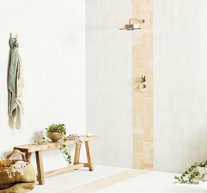
By far one of the easiest ways to play around with your pattern is with color. By default, many of us opt for a single tile color across our entire space, but the possibilities for pattern are endless once you add more to the mix. 'We love to combine Metro tiles in different colorways to create bold stripes and unexpected patterns,' says Lee. 'This adds visual interest to your scheme and a personal touch to plain tiles.'
Consider a stripe that runs horizontally along your kitchen backsplash, or a vertical stripe in the center of one as a focal point. You could also try recurring stripes, or simply alternate your standard layout between two colors for a two-tone effect. Zigzags are also an option that works particularly well with a herringbone configuration, or you could give color blocking with a basket weave a go.
2. Experiment with size

The size of your tile is also a great way to experiment with something new. 'Most people think that subway tiles only come in a 2:1 ratio as the original 3x6 inch white ceramic tile created for the New York subway did,' says Deborah Osburn, founder of clé tile, 'but there’s no hard and fast rule about any of that'.
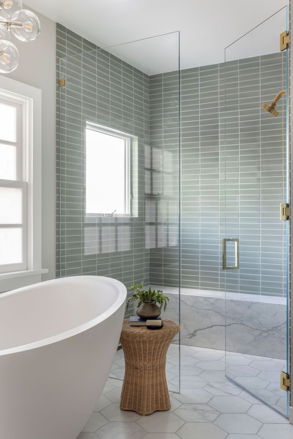
Slimmer variations have been particularly popular recently, offering a more elegant look that's great for heightening spaces when stacked vertically. 'Experimenting with scale can also give a contemporary edge to a traditional formation,' says Lee. To really play on this idea, oversized grouting can emphasize the size of your tile while offering a totally unique look. 'You could even play with the grout colors,' adds Deborah.
3. Don't just go for gloss

A surefire way to make a metro tile look unoriginal is to opt for gloss. Yes, it's a default choice for kitchen and bathroom tiles and it does have its practical benefits when it comes to cleaning, but a high-shine metro tile can look dull (figuratively speaking, of course).
'These days, subway tiles can come in a wide range of finishes,' says Deborah. 'They can be glossy, matte, or unglazed, and can even come in terracotta, brick, stone, and marble. By thinking a little more broadly, you can use the finish to make your installation more modern, more rustic and earthy, or even wildly sophisticated and glamorous.'
Matt's moment certainly isn't over, but the prevailing tile trend at the moment is an artisanal zellige style. These trending tiles, traditionally handcrafted in Moroccan from clay, feature variations in coloration and texture for a dimensional look that results in a rustic feel. They also come in both shiny and matt varieties. If you want the kind of tiled wall that stops guests in their tracks, they're a wise choice.
'For more visual interest, you can mix and match glazed and encaustic or marble finishes for subtle variation and an artful touch,' adds Lee.
What grout size should you use for metro tiles?
When it comes to grouting your metro tiles, a 1/8-inch grout line will give you a classic look, while a slimmer 1/16-inch grout line might be better for a more clean and modern look. Really though, the decision is all yours.
'What’s often overlooked is grout, the unsung hero of design,' says Deborah. 'Grout is an essential part of the whole “metro look”. The staggered grout joint is an essential part of the metro "tradition" and emphasizes the regularity and repetition of the shape, but grout joints can be narrow or wide, exactly matched to the tile, or a slight contrast.' You could even embrace an oversized grouting idea if you want to be bold.
All in all, don't just go for a default grout line. Incorporate it into your design if you really want tiles that win your compliments ever time.
A post shared by Natalie Paquin (@natalieapaquin)
A photo posted by on

Price: $15.19/sq. ft.
Size: 3" x 6"

Price: $36.68
Size: 3" x 6"

Price: $118.25
Size: 3" x 12"
Be The First To Know
The Livingetc newsletter is your shortcut to the now and the next in home design. Subscribe today to receive a stunning free 200-page book of the best homes from around the world.

Lilith Hudson is the News Editor at Livingetc, and an expert at decoding trends and reporting on them as they happen. Writing news, features, and explainers for our digital platform, she's the go-to person for all the latest micro-trends, interior hacks, and color inspiration you need in your home. Lilith discovered a love for lifestyle journalism during her BA in English and Philosophy at the University of Nottingham where she spent more time writing for her student magazine than she did studying. After graduating, she decided to take things a step further and now holds an MA in Magazine Journalism from City, University of London, with previous experience at the Saturday Times Magazine, Evening Standard, DJ Mag, and The Simple Things Magazine. At weekends you'll find her renovating a tiny one-up, one-down annex next to her Dad's holiday cottage in the Derbyshire dales where she applies all the latest design ideas she's picked up through the week.
-
 The 12 Best Table Lamps for Reading —I'm a Certified Bookworm (and Shopping Expert)
When it comes to table lamps for reading, I don't mess around. If you're the same, this edit is for YOU (and your books, or course — and good recommendations?)
By Brigid Kennedy Published
-
 "It's Scandi Meets Californian-Cool" — The New Anthro Collab With Katie Hodges Hits Just the Right Style Note
The LA-based interior designer merges coastal cool with Scandinavian simplicity for a delightfully lived-in collection of elevated home furnishings
By Julia Demer Published

