6 tricks for positioning mirrors that interior designers always use to make small spaces look bigger
Mirrors can help create the illusion of greater light and space, but you need to be strategic about where you place them
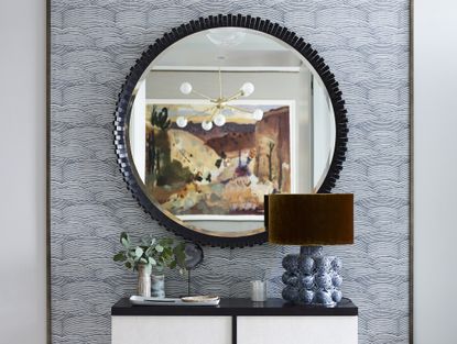

We all know that mirrors serve a practical purpose as well as an aesthetic one, but are you using yours to their full potential? If you want to create the illusion of greater space in your home, mirrors are the oldest trick in the book, but you'll need to know how to position them properly to reap the best benefits.
Whether you're stuck with a small living room or you find that your narrow entryway always feels too confined, decorating with mirrors is a must. Immediately, the reflection will give the appearance of a larger space and as well as more light, helping to transform your room into a brighter and airier one (on the surface, at least).
The only problem is, turning your home into a hall of mirrors by placing large wall mirrors on every bare surface isn't going to do your decor any favors. Instead, you need to be strategic about where you place them if you want to achieve the best illusory effect. Of course, interior designers have a few tricks up their sleeves, and here they share some of the best that you can apply in your own home.
1. Use mirrors opposite a source of light
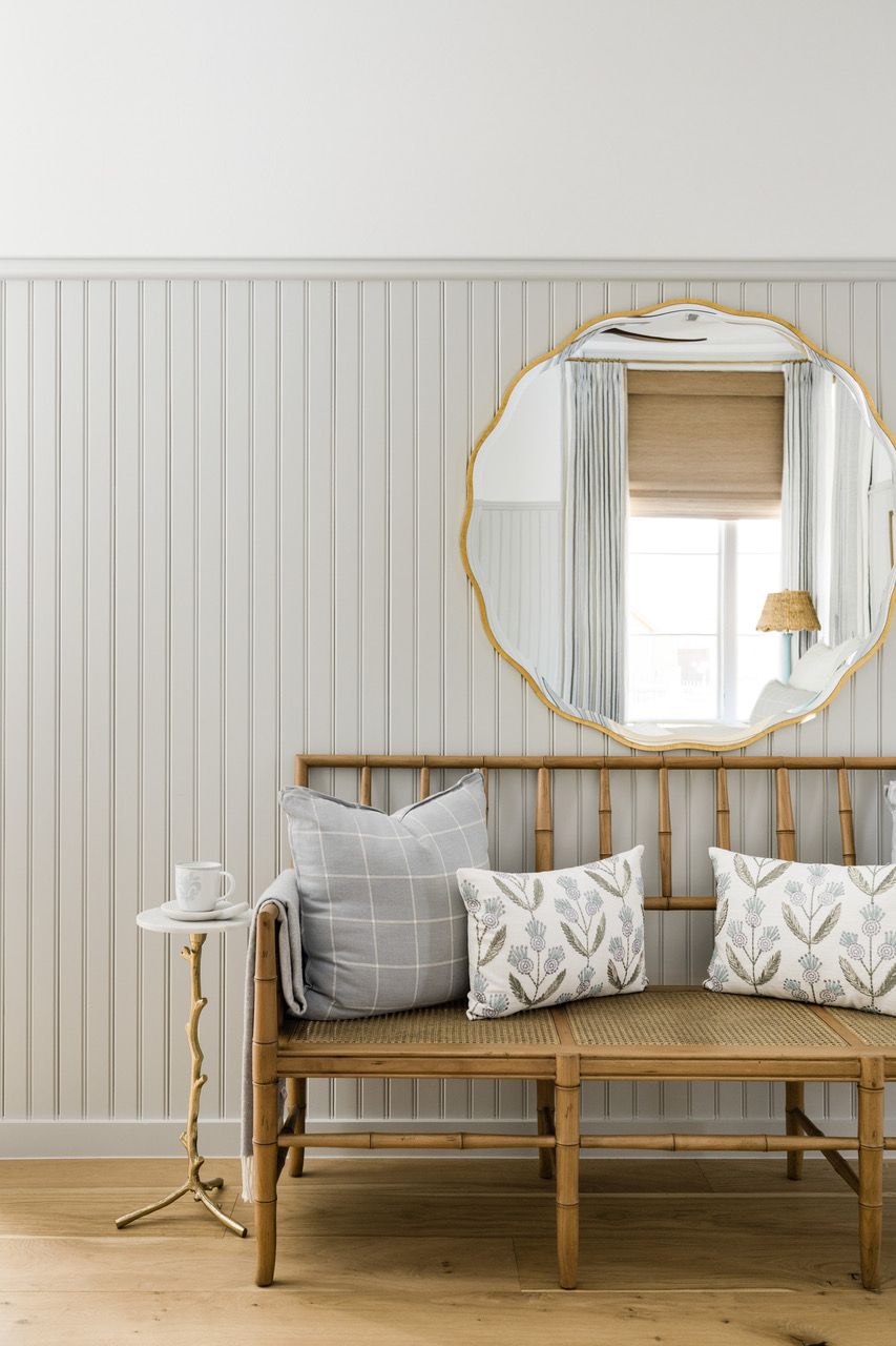
A mirror's main function is to reflect what you see back at you. That doesn't just include the visual image itself, but the light within it. That's why, if you have a particularly dark home with limited natural light, mirrors can be your best friend.
'Mirrors are so useful for bringing more light into a dark space,' says interior designer Bethany Adams of Bethany Adams Interiors. 'By positioning a mirror opposite a source of light - ideally a window, but in a pinch, a light fixture works too -you can effectively double the amount of lumens in the space.'
As Bethany points out, narrow hallways or entryways are especially prone to this kind of dimness, but hanging a mirror horizontally can help draw light out across the space. If you have a light source at one end, make sure your mirror extends all the way so that the light can carry across, instantly brightening the area and thus making it feel more spacious.
2. Use in place of art on the walls

Mirrors needn't be a glaring obvious statement that extends right across the wall. Instead, one of the subtlest ways to make a room feel larger is by interspersing smaller wall mirrors in place of where artwork or photographs would typically be.
'I love collecting mirrors of all shapes and sizes and hanging them as artwork on a wall,' explains Adriana Schor of ICONIQUE studio. 'Not only do you benefit from the extra source of light in the room, but they also add a beautiful artistic piece on the walls.' If you want to be creative, it's best to position the mirror somewhere where it reflects a contrasting colored wall or space so it acts as a point of visual interest (just like the image pictured above).
Designer Shelby Van Daley of Daley Home is also a fan of this trick. 'In one of our more recent projects, we had a busier wallpaper, so adding a beautifully framed mirror added way more to the room than a piece of art,' she says. Rememeber though, that what you see in a mirror depends on your specific vantage point, so make sure you position it at eye level and avoid hanging too high. 'We generally hang mirrors just a few inches above a bench or a dresser on a wall,' adds Shelby.
3. Use long mirrors in narrow spaces
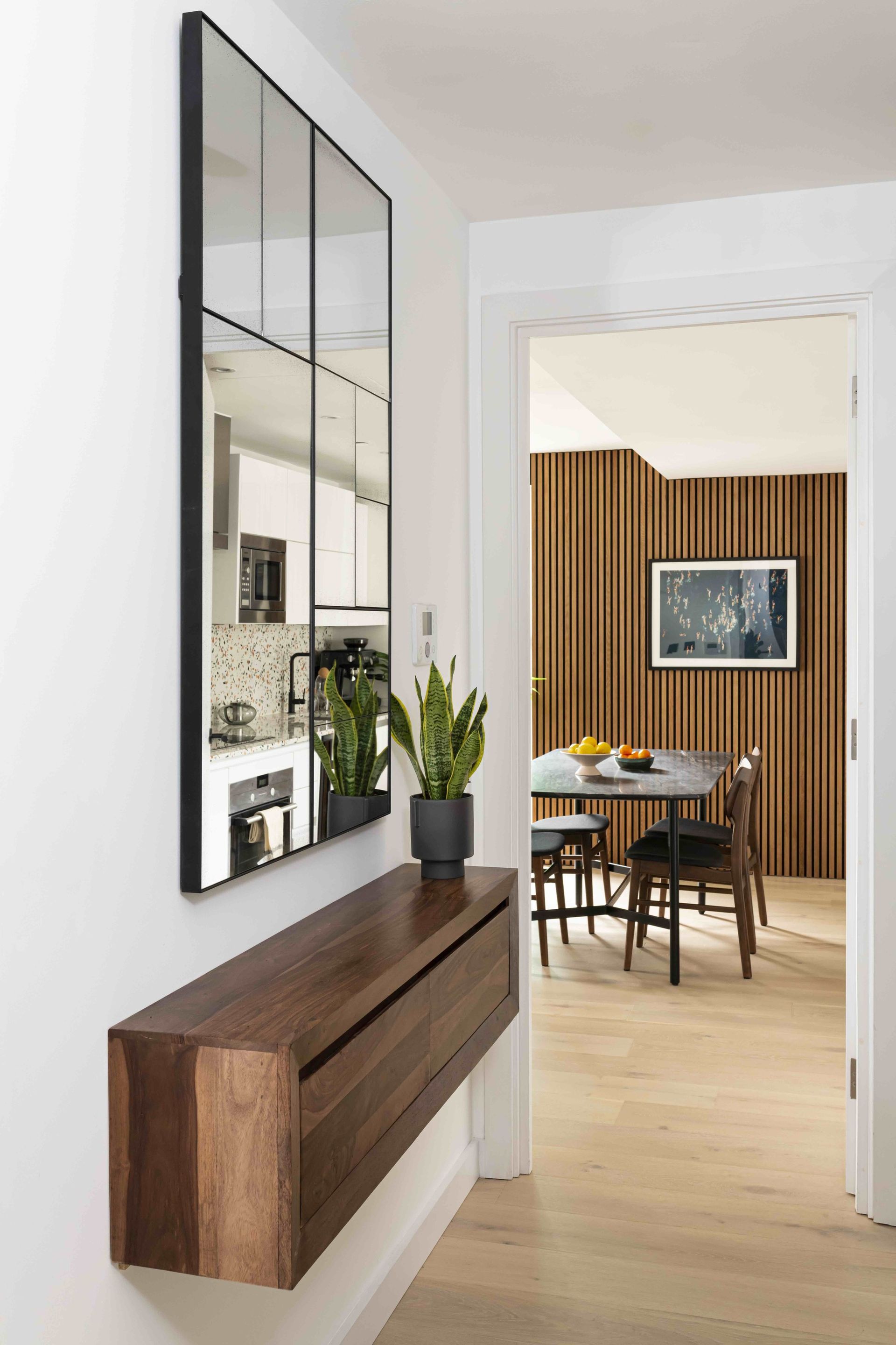
Narrow, corridor-like areas might be unlikely spaces where you didn't know needed a mirror, but they should certainly be on your radar. While mirrors here might be somewhat limited in what they can reflect back, they can be vital in making a passage feel less dark and confined by adding depth.
One space where most interior designers always include a mirror is entryways. Here, they help to brighten the room, welcome your guests, and maximize your design. 'Not only this, but they can also act as a functional way to check hair and make-up before you leave for the day,' says Shelby.
If you do have a more open space, consider positioning your mirror somewhere where it reflects an architectural point of interest. 'An entry above a credenza where it reflects a beautifully designed stairwell railing is a popular choice,' says Caroline Dedeker of Cedar and Oak Homes.
4. Use mirrors as a versatile finish
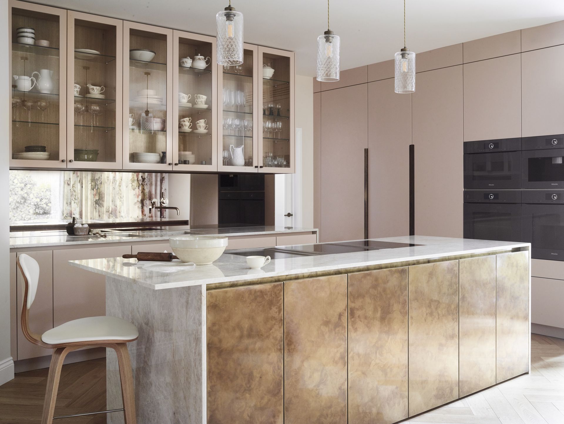
Wall mirrors aren't the only way to harness the power of reflections. You can easily introduce mirrors in more unlikely spaces like kitchen splashbacks, cabinet doors, or even the ceiling. 'I like to use them in Butler's pantries or home bar areas,' says Bethany. 'There are also so many different styles of mirrored glass available today, from clear, to smoked, to antiqued that you can really do some interesting things with reflections and not necessarily use your typical mirrored glass,' says Bethany.
According to Adriana, another way to use mirrors in an original way is through your joinery. 'Applying mirror cladding to the back of a cabinet or behind a shelf immediately extends the space, gives it a luxurious feel, and attracts light to areas that are generally darker,' she says.
5. As an architectural feature
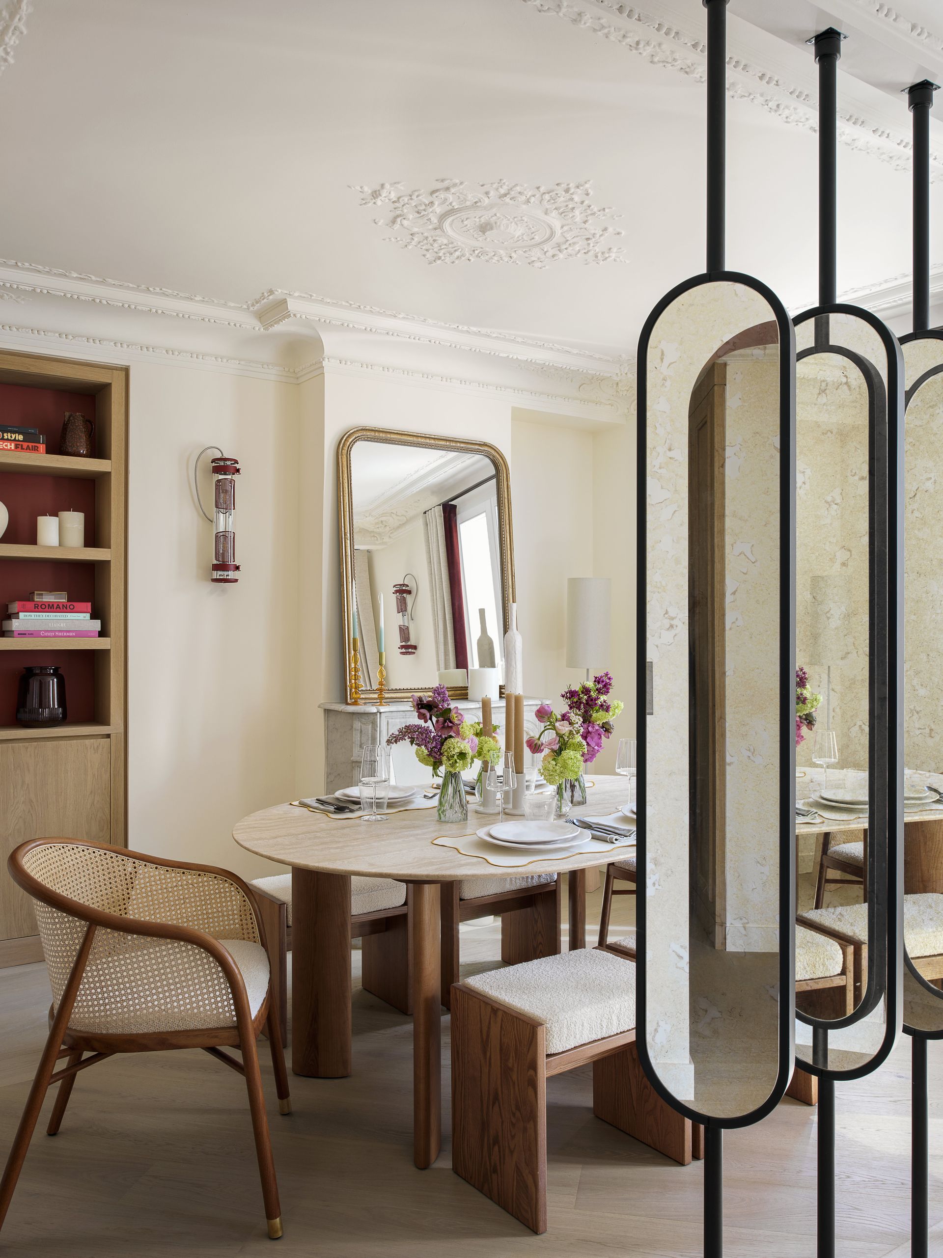
Finally, if you're willing to be a bit more daring with your design, consider integrating mirrors as a bolder architectural feature. For example, mirror-clad columns are an increasingly popular mirror trend. 'In some recent projects, we’ve had columns in the middle of rooms or spaces that needed to be used for different purposes,' says Adriana. 'It immediately blends into the living space and makes a beautiful source of light.'
In the image pictured above, Adriana also created rotating screens in the middle of the room clad with mirrors. 'This created a seamless divider in a space that is used both as a living room and a dining room,' she explains. 'I love mirrored screens of any kind as they act both as a piece of furniture but also serve an intriguing architectural purpose.'

Price: $18.98
Size: 16.14" H x 9.84" L x 1.18" W

Price: $599
Size: 31.5"L x 1.26" W x 72" H

Price: $60
Size: 16'' H X 18'' W X 4'' D
Be The First To Know
The Livingetc newsletter is your shortcut to the now and the next in home design. Subscribe today to receive a stunning free 200-page book of the best homes from around the world.

Lilith Hudson is the News Editor at Livingetc, and an expert at decoding trends and reporting on them as they happen. Writing news, features, and explainers for our digital platform, she's the go-to person for all the latest micro-trends, interior hacks, and color inspiration you need in your home. Lilith discovered a love for lifestyle journalism during her BA in English and Philosophy at the University of Nottingham where she spent more time writing for her student magazine than she did studying. After graduating, she decided to take things a step further and now holds an MA in Magazine Journalism from City, University of London, with previous experience at the Saturday Times Magazine, Evening Standard, DJ Mag, and The Simple Things Magazine. At weekends you'll find her renovating a tiny one-up, one-down annex next to her Dad's holiday cottage in the Derbyshire dales where she applies all the latest design ideas she's picked up through the week.
-
 What are the Most Comfortable Pillowcases? From Temperature Regulating to the Best for Your Skin
When you're looking for comfort in your pillowcases, material matters. These are the best you can buy
By Faaizah Shah Published
-
 5 Simple, but Genius Bathroom Layout Tricks That Will Make Your Space Work so Much Harder
Small switches to how you lay out your bathroom that help make the most of a small space
By Luke Arthur Wells Published
