How to make a kid's bedroom feel bigger – even if they're stuck with the smallest room in the house
These tricks will make your kid's tiny bedroom feel bigger and brighter


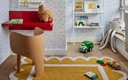
Children often get lumbered with the tiny box room, but that small space actually has a lot more potential than you give it credit for. But with clever storage and space-saving ideas, you can switch up the narrative and turn a tiny, boxed-in space into a cozy sanctuary and peaceful escape that your little one will love. As with all children's rooms, there are difficulties along the way.
'Designing kid's bedrooms can be challenging as it’s important to let their personality shine through while also creating a space that they can grow into,' says Angela Hamwey, founder of Mackenzie & Co. 'Not to mention, it should be a comfortable and liveable space to accommodate various activities such as playing with toys, sleeping, reading, drawing.'
To help your small space work harder, we've spoken to the designers to find out their top 5 pearls of wisdom for making that box room your child's favorite place in the house.
1. Go for closed versus open storage

There is no getting away from it, kids' rooms are messy zones, and no matter how much storage you can put in, toys end up scattered to the far corners of the bedroom and clothing ends up as more of a floordrobe than a wardrobe. The fact is that children's possessions aren't the most aesthetic either - all that colorful plastic and mismatch of toys will hardly make for a beautiful vignette on a bookshelf. So help yourself out by storing stuff out of mind and out of sight and getting clever with kids' toy storage.
'Since kids' rooms often have lots of stuff, closed cabinets vs open shelving can instantly make the space feel tidier and less cluttered which inherently makes the space feel bigger,' says Melissa Warner Rothblum of Massucco Warner.
'Reducing the visual clutter helps you focus on the design, and ensures everything
- toys, clothing, gear, and books - has a designated place that sets the kids up for success in keeping their rooms in order,' says White Arrow's co-founder and design principal, Keren Richter.
2. Use paint in a clever way

Bedroom paint is an interior designer's number one rule for creating an illusion of space and size. A clever use of paint can do wonders to make your room feel bigger. Either embrace the size and go cocooning, with warm earthy tones like a mustard yellow - as shown here, designed by A New Day, or rosy pink, or keep things light and breezy with a pale blue.
'We opted for a really earthy yellow to create a room that can feel like a dose of sunshine on a grey day, but is balanced enough to feel cosy and cocooning at bedtime,' says Andrew Griffiths of A New Day. 'Yellow can be an intense color in heavy doses, so keeping it to the lower section of the wall and pairing it with a yellow-toned neutral helps it feel more restful on the eye.
Avoiding a really primary color palette means the room feels harmonious with the more grown-up parts of the house, but still brings plenty of joy to its lucky little occupant.'
'Enveloping the room (walls and floors) in a similar hue in a monochromatic way is another clever trick and is helpful to the eye in opening up the space to make it instantly feel more spacious,' says Melissa.
‘Painting a darker wall will help to create depth in the room,’ adds Elise Wiart of Peggy Bels Interior Design.

Sudbury Yellow by Farrow & Ball
If you're looking for the perfect shade of yellow, this earthy tone from Farrow & Ball looks warm and cozy in darker lights, and bright and airy in sunshine - perfect to transform that small room and give it a new lease of life.
3. Emphasize the height, not the size of the room

'Design verticality,' encourages White Arrow's Keren. In doing so you will help draw they eye upwards instead of allowing it to set and rest on the floorplan. 'I like tall bookcases and armoires that guide the eye upwards and bunk beds that go to the ceiling.'
Going built-in might be a way to seamlessly guide the eye to the bedroom ceiling and make up every inch of space. 'Think thoroughly about the layout and small storage solutions and use a recessed corner for built-in wardrobes,' encourages Elise.
4. Think about the bed

The bed typically tends to be the focus of a bedroom and is often placed in the center of the room. But when you are dealing with a small space, this oft-used layout simply doesn't work, and you're better off keeping your bed flush against the wall to create the illusion of more room.
You'll also want to think about the bed you go for as well as placement. You might not have space for a double bed for your child's bedroom, and ultimately if your child is of a young age, they might not need so much space at this point of their lives, so go for something smaller that doubles up. Bunk beds are great if there are two children in the room, or beds that have a reading den or homework zone underneath also do the job.
'I love a daybed for a small bedroom,' says Prospect Refuge Studio's founder, Victoria Sass. 'Not only do they look great, pushed up against a wall, and they do double duty as both sleeping and lounge space.' If you want to be super smart, look for one with a trundle for sleepovers, a pull-out bed that can be slotted back again when not in use.

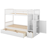
Euroco twin bunk bed
If you're looking for the perfect bargain bunk bed, this from Walmart is a great option for a small bedroom. With storage space as well as two beds, you get a lot of bang for your buck in such a small surface area. And it's on sale and under £600!
5. Use window space to your advantage

Think about how you use your window and the space around it. Perhaps you can create book shelving that sits above the pole, or if your window juts out, maybe it's about using the space as a clever window seat and place for your child to pick up their favorite read, all the while doubling up as a storage solution.
In this example from the children's bedroom interior designer, Eklektik Studio, the designer has gone for a built-in option to create storage along the bottom that doubles up as a seat, and aesthetic shelving that leads the eye to the ceiling. Painted in a neutral and calming sage and the small space feels cozy and tranquil, with plenty of clever storage on hand, not to mention a beautifully framed view.
Be The First To Know
The Livingetc newsletter is your shortcut to the now and the next in home design. Subscribe today to receive a stunning free 200-page book of the best homes from around the world.

Oonagh is a content editor at Livingetc.com and an expert at spotting the interior trends that are making waves in the design world. Writing a mix of everything and everything from home tours to news, long-form features to design idea pieces on the website, as well as frequently featured in the monthly print magazine, she's the go-to for design advice in the home. Previously, she worked on a London property title, producing long-read interiors features, style pages and conducting interviews with a range of famous faces from the UK interiors scene, from Kit Kemp to Robert Kime. In doing so, she has developed a keen interest in London's historical architecture and the city's distinct tastemakers paving the way in the world of interiors.
-
 Exactly When to Fertilize a Lawn After Winter — Experts Guarantee You a Beautiful Backyard All Year
if you know when to fertilize a lawn after winter then you can set yourself up for a well manicured and healthy backyard all year long
By Jacky Parker Published
-
 How to Make a White Bathroom Feel Warm — 5 Tricks Designers Use For a Cozier and More Restful Spaces
Give your all-white bathroom a glow-up with these tips for bringing warmth to the space
By Oonagh Turner Published

