How to choose a floor color – 8 expert tips for incredible decor from the ground up
Knowing how to choose a floor color is about understanding the light, the texture and the mood of your home. Experts explain how to get it right
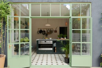

Knowing how to choose a floor color is one of the least talked about parts of decor. We focus on walls, on furniture, even ceilings. But the floors? The sort of thing you change once in the time you live in a home, they just don't come up that often.
Until now. The floor can serve as a canvas for injecting personality and style into a room. Colored flooring is a perfect way to show how confident you are - a chance to do something out of the ordinary and unexpected when it comes to your decor. Plus, it can be a wallet-friendly option to paint the floor yourself.
If you’re looking for a seismic shift in your interior design, or are just looking for smart ways to add height or create energy or calm, try painted or colored tiles. Learn how to contrast colors, choose the right finishes, and create an unforgettable experience with any floor type. Our experts are here to guide you.
'Painting your floor is not only an excellent way to seal and protect wooden floorboards, but it’s also a simple and effective way to add color and personality to a space,' Ruth Mottershead, creative director at Little Greene. 'Much like ceilings, flooring is often forgotten when planning a scheme, but using a coordinating color on the floor can create a harmonious finish.'
How to choose a floor color
1. Start with the floor color first

While usually, one looks at walls, ceiling, or the soft furnishings to anchor a room's color scheme, we suggest you look downwards and build the palette ground up. This will help you create a wonderfully layered scheme, where the floor paint hues will act as a foundation, upon which different colors can rest, complement, or contrast.
‘With the many components to balance within a room, flooring can often be overlooked and chosen as a final thought,' says Caroline Milns, head of interior design at Zulufish. 'As such, it is often a neutral feature that can work in harmony with the elements within the room but won’t be the show-stopping moment. Why not start planning your space around the flooring and instead opt for a striking tile design, perhaps combining a monochromatic pattern with a pop of a zingy color. This will give an instant lift to the room and work particularly well in hallways where tiles are the perfect solution for high traffic. Thread the color palette through the choice of accessories to complete the look.’
2. Choose colors based on the size of the room
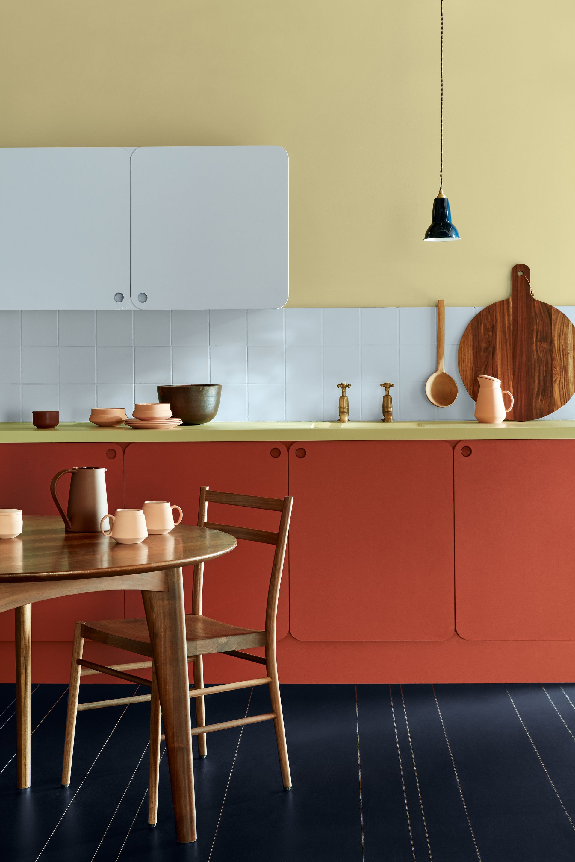
'In smaller rooms, highly reflective gloss tiles are a great way to create a sense of space,' says Diane Hyde of Craven Dunnill Jackfield. 'As light beautifully reflects off the glaze finish, it creates a wonderful sense of openness, making the room appear wider. Colour can also impact the sense of space in a room. While light, muted and natural tones make a space appear bigger, heavily patterned tiles in bold colors can make a room feel more enclosed.'
'Similar to how dark walls can transform a small room or a patterned wallpaper can bring interest to an otherwise dull space, a patterned floor is an inspired way to make a feature of a smaller room,' says Jodie Hatton of Brintons. 'It can help to add interest and character to the room.'
Interestingly, floor color can help adjust the visual perception of the height of a space. Want to drop the floor? Take a cue from your favorite swimming pool and saturate the ground with dark blues or blue-green laminate flooring. Go for diagonal patterns on the floor to open up the space and give the room breadth.
Also, neutral floor colors can quiet down a cluttered, small room. Go for a white-finished floorboard, close in color to the walls, and this way, the perimeter of the room gets diminished and the space opens up to present a feeling of calmness.
'You can trick your eye into thinking that the floor (and thus the whole room) is a bit bigger by painting the skirting boards in the same color as the floor,' says Ruth. 'The effect is much more dramatic with a contrasting color on the walls.'
3. Consider the lighting
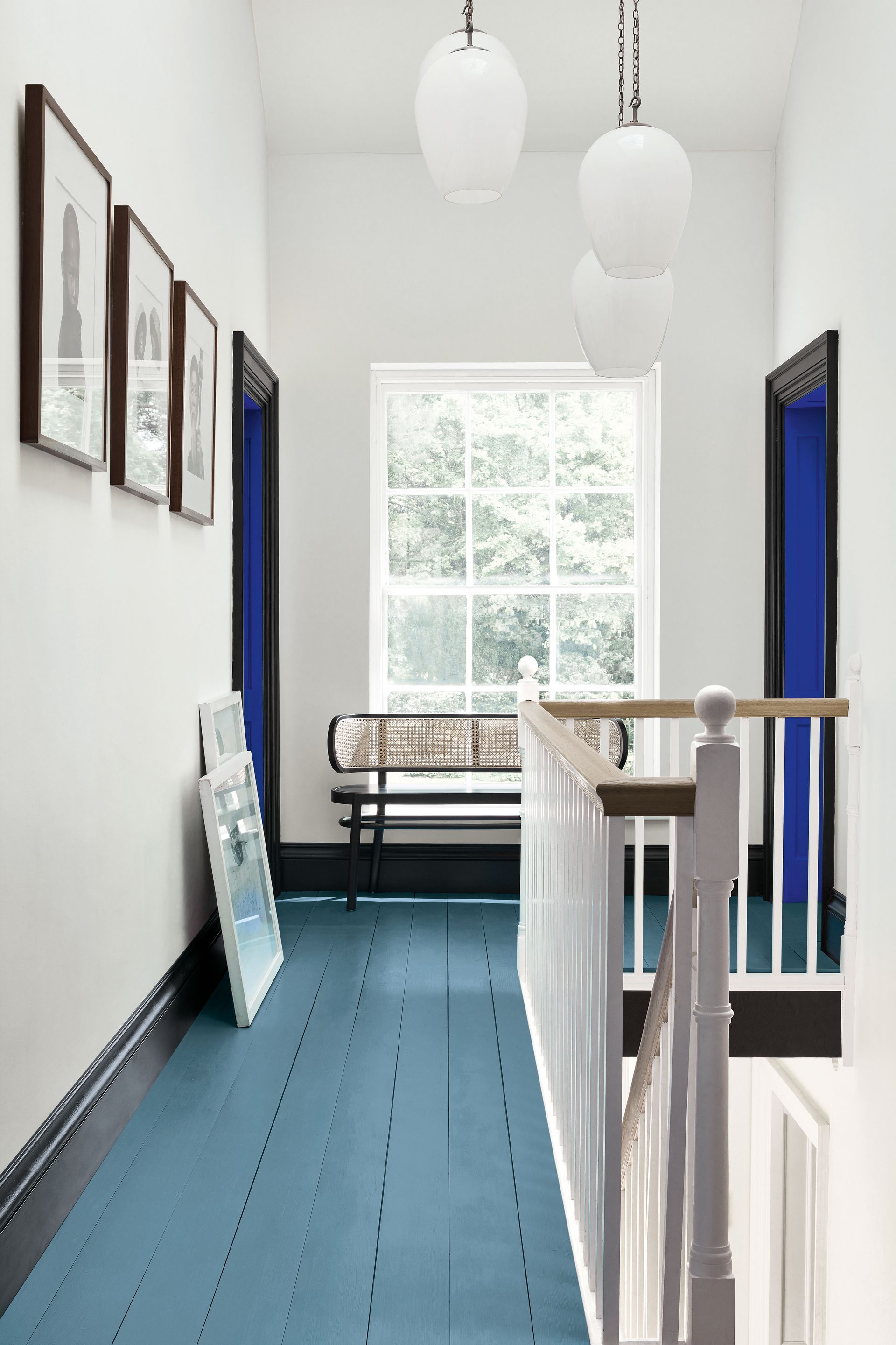
Largely, in dark rooms, go for a lighter floor color that will open up the space. And if the room is flooded with light, you have the luxury of choice. In the former, if you don't want to go for a plain, flat color, superimposing a large, organic pattern in white over clear wood flooring can also work, bringing in neutrals while expanding the space visually. Sticking to a simple white palette keeps the design from overpowering the space and drawing all of the attention.
Another great consideration can be warm or cool colors for the floor. In extremely cold climates, warm colors like red, orange, and yellow can raise the temperature and energy in a room; in hot climates, you can go for cooler tones of green, blue and purple.
'If you are choosing timber, look carefully at the other timbers in the room,' says Cat Dal, founder of CAT DAL Interiors. 'Either go for a similar tone or contrast it, so there is some definition in the space. For example, for a basement flat with little light, a wide plank of Nordic white/grey timber brightens up the space, whilst keeping the grain of the timber. Generally, we avoid timbers that go to yellow or orange.'
4. Play with paint finishes
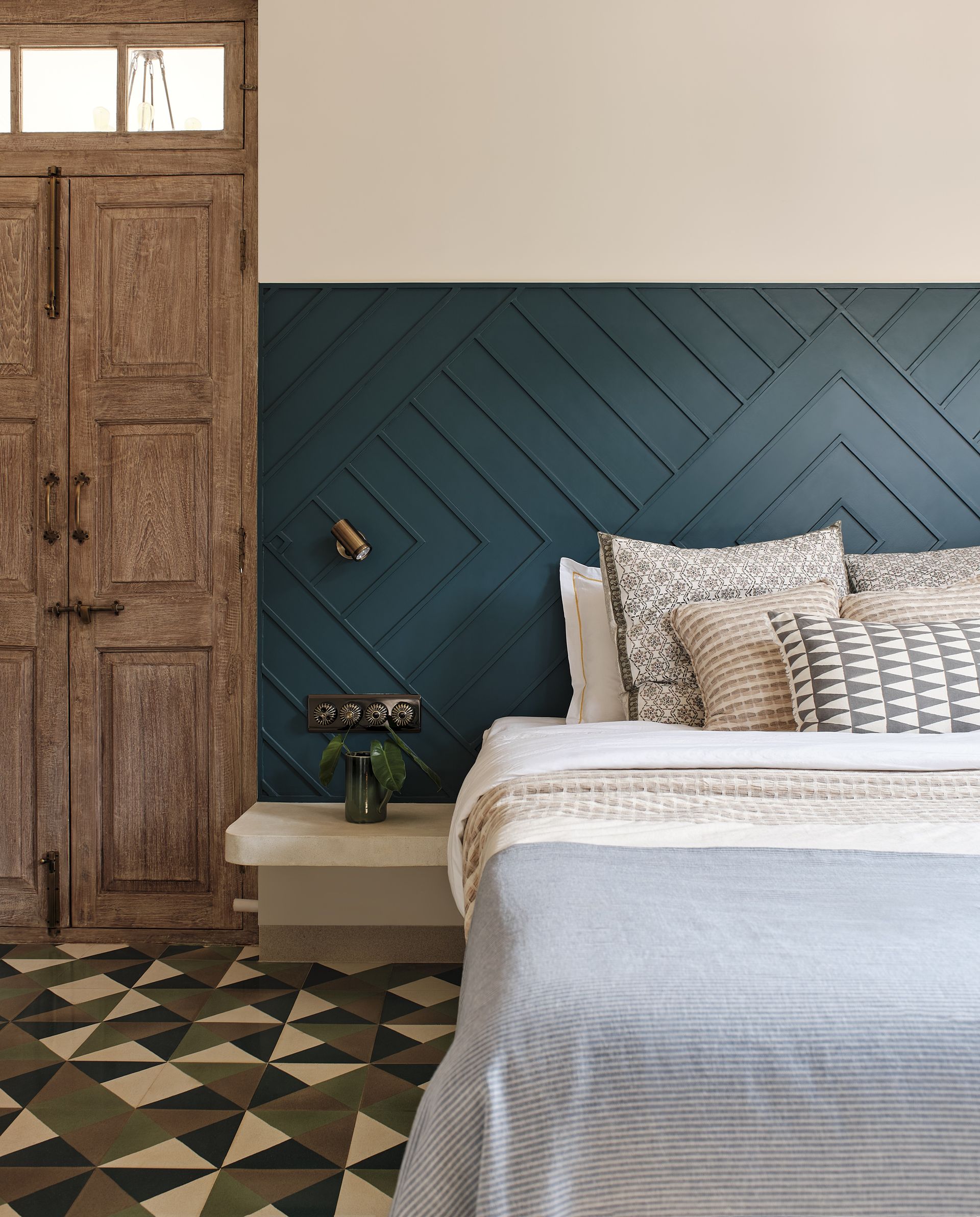
For the best wood floor colors, go for latex paints that offer stronger protection than oil paint finish, to protect the ground. You can also go for gloss, satinwood, or eggshell finishes.
'Floors need to withstand constant use, so it’s vital you choose a durable and hard-wearing finish such as our Intelligent Floor Paint, which is available in our full-color palette,' says Ruth.
If bright colors aren't for you, and if you prefer a subtler wash of hue, try using stain in interesting shades. Keep in mind that it's always best to test stain colors on the actual wood you plan to stain, as the result might vary. Pick a corner or inconspicuous area to test. Be sure to prep the test area first, as you would the rest of the floor, to get the most accurate results.
5. Be experimental with tile patterns, prints and veining
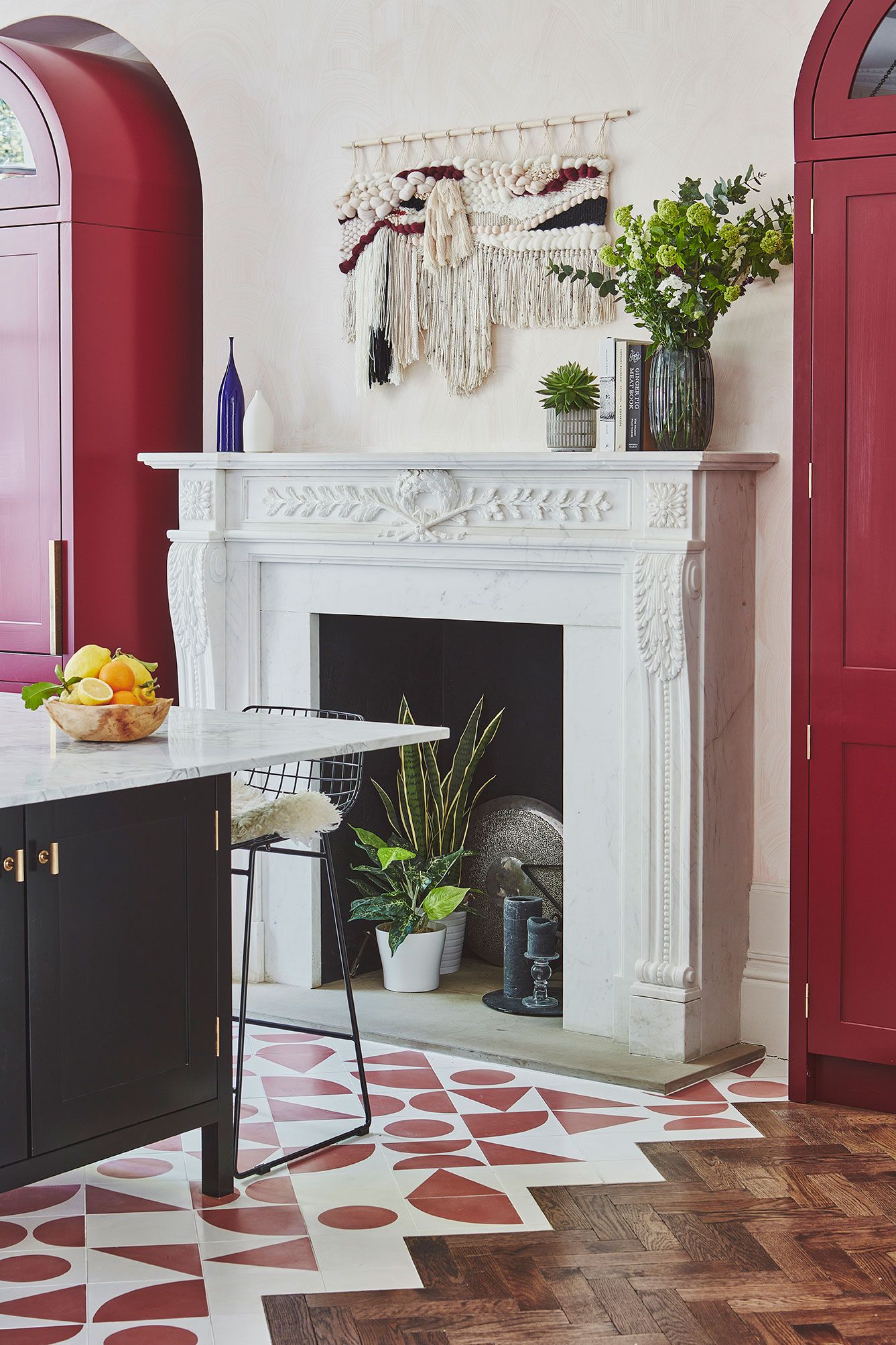
Give your entire home a personality with creative flooring ideas for every room. If you enjoy colors, patterns, and prints, then go all out.
Interestingly, when the flooring is stained or painted in unusual colors and used throughout the home, it becomes neutral. This may sound counterintuitive, but the more you use an unexpected color, the less out of the ordinary it becomes. Plus, a bold hue on the ground is less dramatic than one surrounding your peripheral vision.
Alternatively, chequered, chevron, or abstract patterns can be chosen for the floor instead of solid colors. This will also bring movement to the interior scheme.
'A plethora of tiles are available to create a space with the perfect balance of eminence and splendor,' says Rajesh Bhandari, director at A-Class Marble. 'Various tiles in materials in natural stone can zest up small spaces by bringing in the excellence of patterns and geometry. Illustrious stone tiles with unique veining are another impactful alternative to bringing in drama. Choose tiles available in pastels to prints, mosaics to lacquered glass, natural stones, and more to visually expand a small space. A generous amount of finishes and textures in tiles are available within all economic ranges to curate glorified yet sublime design solutions.'
'Encaustic floor tiles are a wonderful way of bringing life to a room and accentuating color and pattern in a space,' says Diane. 'Beautiful in appearance, encaustic floor tiles are also completely durable, making them perfect for high-traffic areas such as hallways or kitchens. Designed with longevity in mind, they are a complete investment that promise to stand the test of time for years to come. Whether you’re looking to go more traditional with geometric patterned tiles or contemporary with large format porcelain floor tiles, there is something within encaustic flooring to suit all tastes and styles of home.'
6. Choose tones that create a balance in the room
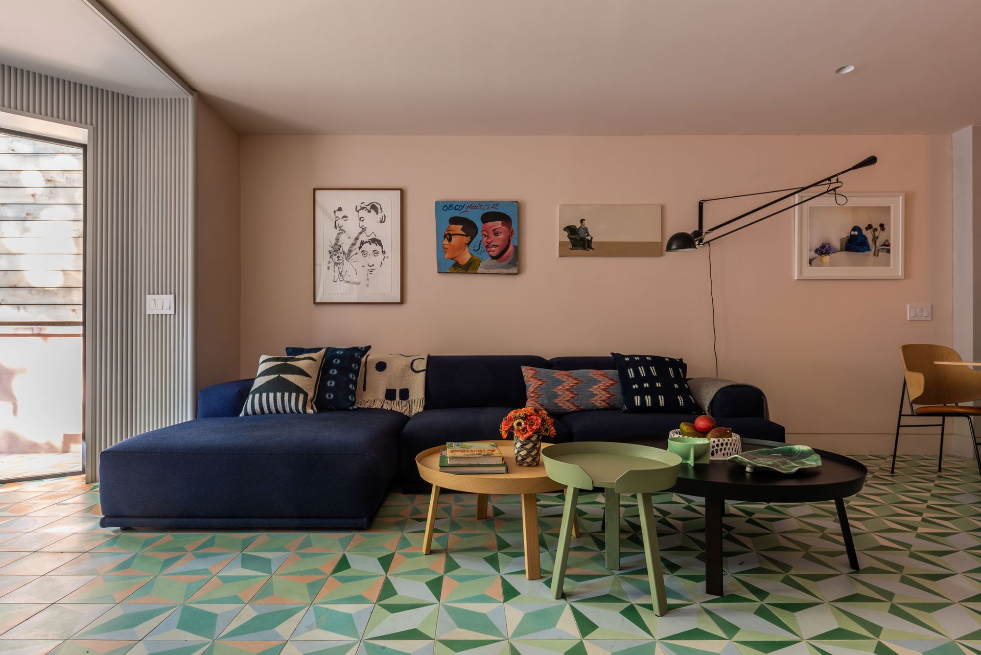
Don't just blindly choose a color because you love it – think of how it will play out in the entire room. When thinking of how to choose color combinations in the room, think about balancing out the floor color by picking up the shade elsewhere in the room. Make sure you prevent an overdose of color, however. If you have a bold floor color, keep at least 60% of the room light, neutral and restrained.
If you are wondering how to make the ideal tonal mix, perhaps look at the color wheel to find out the best analogous hues. This will help create a harmonious vibe, as the colors won't fight with each other the way they would if they were opposites on the wheel.
'Your home should be a reflection of your personality. The warmth, coolness, saturation, and intensity of color, all create different effects, but pop when paired with other hues,' says Lisa Conway of Brintons. 'Consider how each room will be inhabited and experienced and most of all, have fun with color.'
'To create a balanced color scheme, it’s important to consider the composition of colors within the palette, rather than addressing colors individually,' says Jodie. 'For a dramatic look, pair grey with layers of dark, moody tones like aubergine or midnight blue. If you’d like to incorporate a fresh look, infuse the palette with a lighter, softer shade that glows, like golden yellow or bright green.'
7. Go for timeless shades

Just like wall paints, floor colors too can be a difficult decision to make. If you aren't sure of what hues to go for, either jump onto the trends bandwagon, and go for what's hot that season, or choose the safer bet of timeless tones that will last you generations.
'In terms of trending floor colors, more recently warmer tones have been proving more popular,' says Louisa Morgan, creative director at Mandarin Stone. 'Colours with underlying shades of sands and warm beige are desirable, which include real limestone flooring, antique stone effect porcelain as well as more contemporary concrete and terrazzo effect tiles. Whilst grey flooring and off-white shades will always have their place, warmer shades create more of an authentic feel.'
'A neutral color palette is best suited to rooms you spend a lot of time in, such as a bedroom or living room, where relaxing tones are key to creating a happy space,' says Lisa. 'Neutrals are versatile with the ability to provide a platform and set the scene.'
Paints apart, if the natural look of stone flooring or brick flooring attracts you, then choose these materials as the central palette of your color scheme. 'For us, we are very inspired by natural materials, so we usually prefer an authentic look in our projects, either natural wooden flooring in classic tones such as warm oak, light Nordic whitewash, walnut, or even black for the right room,' says Cat. 'If not timber, we have specified poured concrete before which is a gorgeous material in that there are natural imperfections, no grout lines, and great connection to indoor/outdoor spaces.'
8. Complement the painted floor with carpets

Pair your colored flooring with interesting carpets, and create a lovely layering scheme. Whether it's bedroom carpets, living room, or even staircase runners, all overlaid over painted floors create an unforgettable scene.
'The texture of the carpet is key to preventing a neutral flooring scheme from looking dull,' says Lisa. 'An alternative flooring like wood or tiles can make a room feel stark and bare, whereas a soft woven wool carpet, layered with accessories in cashmere, mohair, and linen will work to soften a look and create an inviting scheme.'
'Carpet is often the biggest investment in a room in so many ways; value, longevity, area coverage,' says Jodie. 'This is why we always advise styling from the floor up when completely refurbishing a space. Choosing a patterned carpet provides a great starting point to pair with floor color, and soft furnishings, fabrics can pick up any accent colors to tie the scheme together. The floor is a fantastic canvas to be creative and can lift a room and inject personality.'
What floor color is timeless?

Almost all natural finishes and tones are in demand, although in terms of brighter colors, grey, white and yellow are thought to be timeless.
If you want to make a statement, instead of just solid hues, you could go for interesting patterns such as checkerboard flooring or chevron patterned tiles.
'The trend currently is for hues in natural and timeless tones, and sun-drenched woods with a color palette of warm whites and neutrals,' says Lisa.
'Grey flooring is a wonderful, sophisticated color, constructed of various shades and undertones,' says Jodie. 'Not only is it a wonderful companion to other neutral shades, but it also has the power to balance out bold accent colors. Grey creates a calming backdrop for any pop of color, adding texture and introducing natural, tactile materials to your scheme. Alternatively, the addition of a fabulous pattern can bring together an array of colors.'
Should floors be lighter or darker than walls?
Largely it is advised to have darker flooring and lighter walls as that makes a space seem larger and airier. Muted or softer tones create a sense of infinity and make the walls recede. However, if you have a tiny room, and want to create the illusion of height, lighter floors when contrasted with darker walls can create a sense of depth and height. Also, light flooring makes the ceiling seem taller.
Be The First To Know
The Livingetc newsletter is your shortcut to the now and the next in home design. Subscribe today to receive a stunning free 200-page book of the best homes from around the world.
Aditi Sharma Maheshwari is an architecture and design journalist with over 10 years of experience. She's worked at some of the leading media houses in India such as Elle Decor, Houzz and Architectural Digest (Condé Nast). Till recently, she was a freelance writer for publications such as Architectural Digest US, House Beautiful, Stir World, Beautiful Homes India among others. In her spare time, she volunteers at animal shelters and other rescue organizations.
-
 The 12 Best Table Lamps for Reading —I'm a Certified Bookworm (and Shopping Expert)
When it comes to table lamps for reading, I don't mess around. If you're the same, this edit is for YOU (and your books, or course — and good recommendations?)
By Brigid Kennedy Published
-
 "It's Scandi Meets Californian-Cool" — The New Anthro Collab With Katie Hodges Hits Just the Right Style Note
The LA-based interior designer merges coastal cool with Scandinavian simplicity for a delightfully lived-in collection of elevated home furnishings
By Julia Demer Published
