Horizontal or vertical tiles – which make a small bathroom look bigger? How not to make the wrong choice for your space
Everything you need to know about tile placement for your small bathroom to create the optical illusion that it's bigger than it is

When considering a bathroom remodel there are an incomprehensible amount of design decisions you have to make. While tile placement may not be at the top of your list, there is a big reason why this decision should be given some serious consideration. Your choice of bathroom tile can give the illusion of a larger space, while, conversely, it can also play weird tricks with your room's sense of proportion, making it feel smaller, too.
This is why it is such an important decision to consider when renovating a small bathroom. Using vertical tiles as opposed to horizontal tiles can give very different effects. Not only do they read differently in an aesthetic sense, which you may have preferences regarding, but they can also be used strategically in different types of spaces.
With some expert advice, we will guide you through the complexities of choosing a tile to create a bijou bathroom that doesn’t feel limited by space.
When should I use vertical tiles?
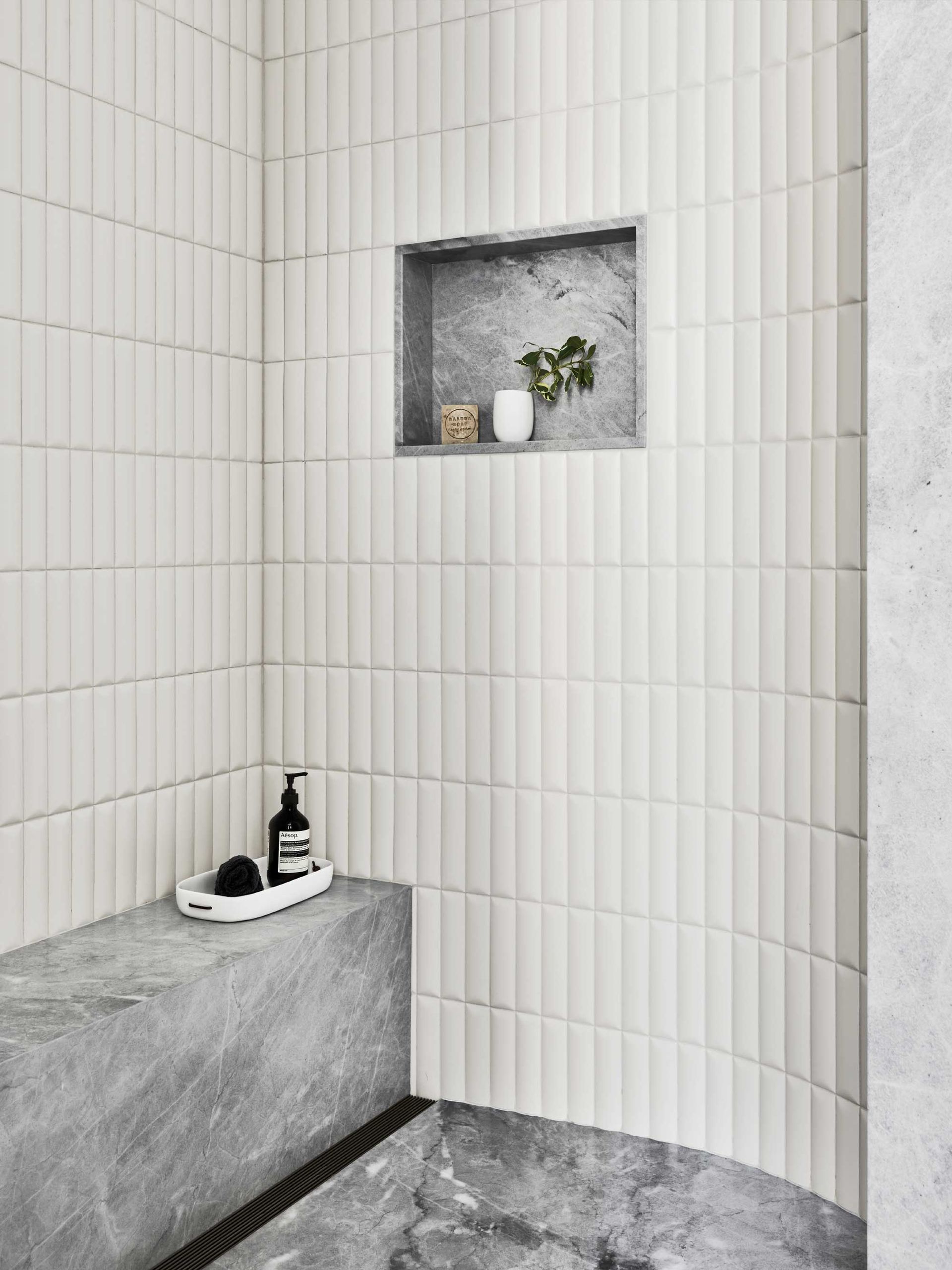
Both vertical and horizontal tiles can trick the eye into thinking there is more space than there is, but they will work to emphasize different proportions.
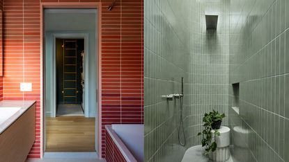
If your bathroom feels small because of low ceilings, a vertical tile layout can help to give the room more height. ‘Running tile vertically will add height to the room,' Sarah Rosenhaus, principal and founder of Sarah Rosenhaus Interior Design, says. 'A vertical pattern will draw the eye up, giving the illusion of height.’
The issue can be that this technique can narrow a room by making the space feel like a column. In this case, Sarah advises shaking it up. ‘One of my favorite things to do is run subway tile horizontally about 42" of the way up the wall and then run the tile vertically up to the ceiling,’ she says. This really helps to break it up without losing the power of the vertical tile, getting the best from both small bathroom tile layouts.
When should I use horizontal tiles?
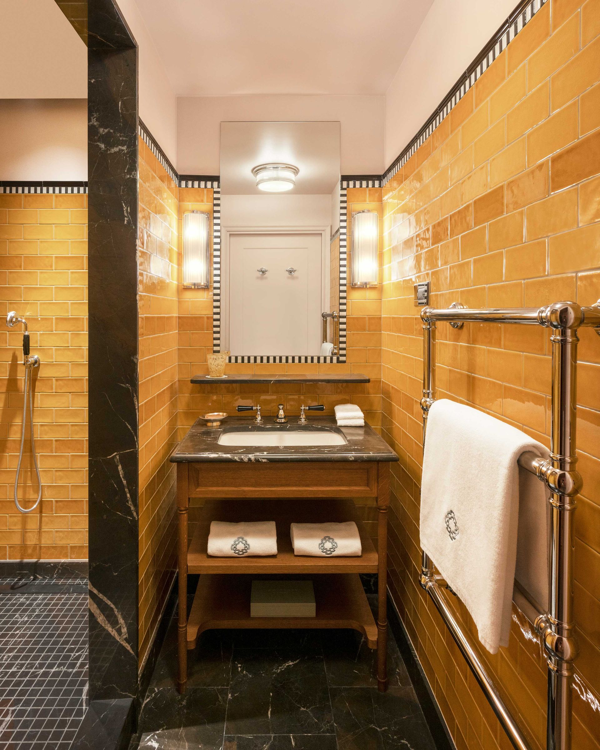
On the other hand, horizontal tiles have the opposite effect. This placement gives the illusion of more width. If your bathroom has limited floor space and feels tight, horizontal tiles are a great way to make a small bathroom look bigger.
It is important to identify the reason your bathroom feels small before committing to either way. Horizontal tiles won't make a room feel taller, but will make it feel wider. Think about it as being stretched, as it gets wider it reduces in height.
Stacking tiles with their long sides together visually opens the space, extending it in both depth and width. This would be perfect for boxy guest bathrooms, combined with a large mirror to further accentuate the open space and small bathroom storage solutions.
Should I use large or small format tiles for a small bathroom?
Another important decision relates to tile size for a small bathroom. Mindy O’Connor, principal and founder of Melinda Kelson O'Connor Architecture & Interiors, argues the tile size poses a more important contributor to the illusion of a larger space.
‘The direction of the tile layout itself can affect the appearance of size in a space, but it is more likely that the amount of tile and how it is being used on the walls will have a greater impact,’ she says.
When electing you tile be meticulous in calculating how many tiles can fit across your space. Both certical and horizontal tiles should accentuate unbroken space in order to appear larger. Mindy advises calculating your tile size precisely to ensure they fit perfectly. 'Rather than fitting tile in every open spot, design millwork carefully to minimize broken spots or awkward leftover areas for tile,’ she explains. This will have a large effect on the feeling of openness and continuity in a room. People are often duped into thinking a small bathroom calls for small tiles. In reality larger tiles expand the illusion as they require fewer grout lines making it appear more streamlined.
Be The First To Know
The Livingetc newsletter is your shortcut to the now and the next in home design. Subscribe today to receive a stunning free 200-page book of the best homes from around the world.

Amy recently completed an MA in Magazine Journalism at City, University of London, with experience writing for Women’s lifestyle publications across arts, culture, and beauty. She has a particular love for the minimalist aesthetic mixed with mid-century furniture, especially combining unique vintage finds with more modern pieces. Her previous work in luxury jewellery has given her a keen eye for beautiful things and clever design, that plays into her love of interiors. As a result, Amy will often be heard justifying homeware purchases as 'an investment', wise words to live by.
-
 "It's Scandi Meets Californian-Cool" — The New Anthro Collab With Katie Hodges Hits Just the Right Style Note
The LA-based interior designer merges coastal cool with Scandinavian simplicity for a delightfully lived-in collection of elevated home furnishings
By Julia Demer Published
-
 "My Apartment Will Feel So Elevatedly Cozy" — Our Edit of the Urban Outfitters' Presidents' Day Sale is Perfection
I'm all about 'bookshelf wealth' at the moment, the cozy and curated decor trend sweeping social media. Luckily, Urban's Presidents' Day Sale is chock-full of goodies
By Brigid Kennedy Published
