How to avoid the biggest entryway decorating mistakes – designers on the lessons they've learned
These are the entryway mistakes to avoid during the design process to welcome family and friends into your home, according to designers


When designing a warm welcome into your home, the entryway is your first impression, but it's also a key space that often gets overlooked during the design process. First and foremost, this is because it is a high traffic area, yet consider it's also used and seen everyday, and by any guests who come to the house. It is therefore crucial that it is a space that is functional, practical and aesthetically beautiful.
'Often entryways are tasked with doing too much - they become the repository of shoes and coats and umbrellas and scarfs,' say say Tal Schori and Rustam Mehta, partners at Brooklyn-based architect and interiors firm, GRT Architects. 'They can quickly become a dumping ground instead of a peaceful transition from the outside world to your home within.'
Combat the problem that so many entryways fall into with these simple design hacks that can elevate this space above and beyond.

Oonagh is an experienced homes writer and editor. For this piece, she used her understanding of the industry and wealth of contacts from the interiors world to find out what different designers thought to be the non-negotiables for entryway design.
Entryway mistakes to avoid
'Often the hallway can be one of the last rooms in the house to be decorated, but it can be one of the best areas to tackle first,' say Jen and Mar of Interior Fox. 'There are so many great ways to make the best first impression, even in the smallest of spaces.' Read on for our favorite ideas for a smart and sophisticated space.
1. Not factoring functional storage space

Think practically, your entryway is a space that leads to the outside world, it's where you need to transition from slippers and loungewear into appropriate attire for the great outdoors. Think functional and design the space to match this need.
This entryway has a mudroom feel, but has simply used some spare space to create a smart storage solution for all those coats, hats and shoes. Toronto-based Hali Interiors kept the space from feeling cluttered with a beautiful calming color scheme featuring dusky light blue, a verdant green, creams and browns. The palette hints at the countryside to give a cozy look, but underneath the aesthetic the design really shines. It's a practical space, with drawers, wardrobe room, a space for wicker baskets, shoes, and a handy pot that has been used here as an umbrella stand. There is also a ladder to help get to those hard-to-reach areas.
2. Forgetting soft finishes

The entrance to your home is the first port of call for your guests, but just because it is a space where people pass through, don't forget those all-important soft furnishings. You want to reassure whoever is entering your home that they are being welcomed into a warming, cozy space. Emphasize this point with soft furnishings underfoot.
'Floors typically tend to get a lot of wear and a hard floor will always meet the demands of busy life much better than a carpet, however acoustics play a large part in a hallway as they can also act as an amphitheater helping noise to travel very easily around the entire home,' explains interior designer, Rachel Usher. 'Applying carpet runners is a great way to soften the acoustics and also gives an element of protection to a timber floor and a way to apply an interesting texture such as sisal.'
Don't go for too high a pile rug because this is a high-traffic area, and it may get worn in quickly, but if you have cold flooring, like stone or wood, a long, low-pile rug can really add character and warmth to the space.
'We love to use rugs in the entryway to ground the entire space,' says Lauren Lerner, founder and principal designer of Living with Lolo., who designed the above entryway. 'It's one of our favorite ways to incorporate color and pattern into entryways. It's always important that you select a rug that is durable like jute or a high-performance fabric that can hold up to traffic. Wool is also a good idea as it can be cleaned easily.'
Also think carefully when it comes to measuring the size of your rug for the entry, and don't forget to take into account any furniture that might be near it so you leave space on all ends. 'Generally, we like at least 12" of space on every side of the rug,' says Lauren.
Be sure to carefully consider rug placement. Move your rug away from the door mat area, and give slightly more space on this side or one end of your rug might become tattered and dirtied by muddy shoes.
3. Not using the space to inject some personality

'Entryways are thresholds; they are the first space to welcome you home,' say Tal Schori and Rustam Mehta of GRT Architects. 'They should reflect something of the character of the home and people that lie beyond.'
In this way, harness this space, even if it is a small entryway, and create a visual moment in your home that shows off who you are. In this example from Shauna Glenn Design, the entryway is a moment to embrace color and pattern and the owner's personality, with small trinkets on the console table and a dash of vibrant color.
'As a design vignette in your home, an entry table provides an opportunity to maybe have a little fun with design and not worry so much if the favorite table you found goes with the rest of the house,' says Shauna.
4. Not maximizing light in smart ways

This is often part of the home that doesn't get much light, so don't forget to make the most of natural light and clever reflective techniques with the addition of a mirror to the space, helping you borrow light from where it springs, not to mention giving you the option of a last-minute inspection before you leave the home.
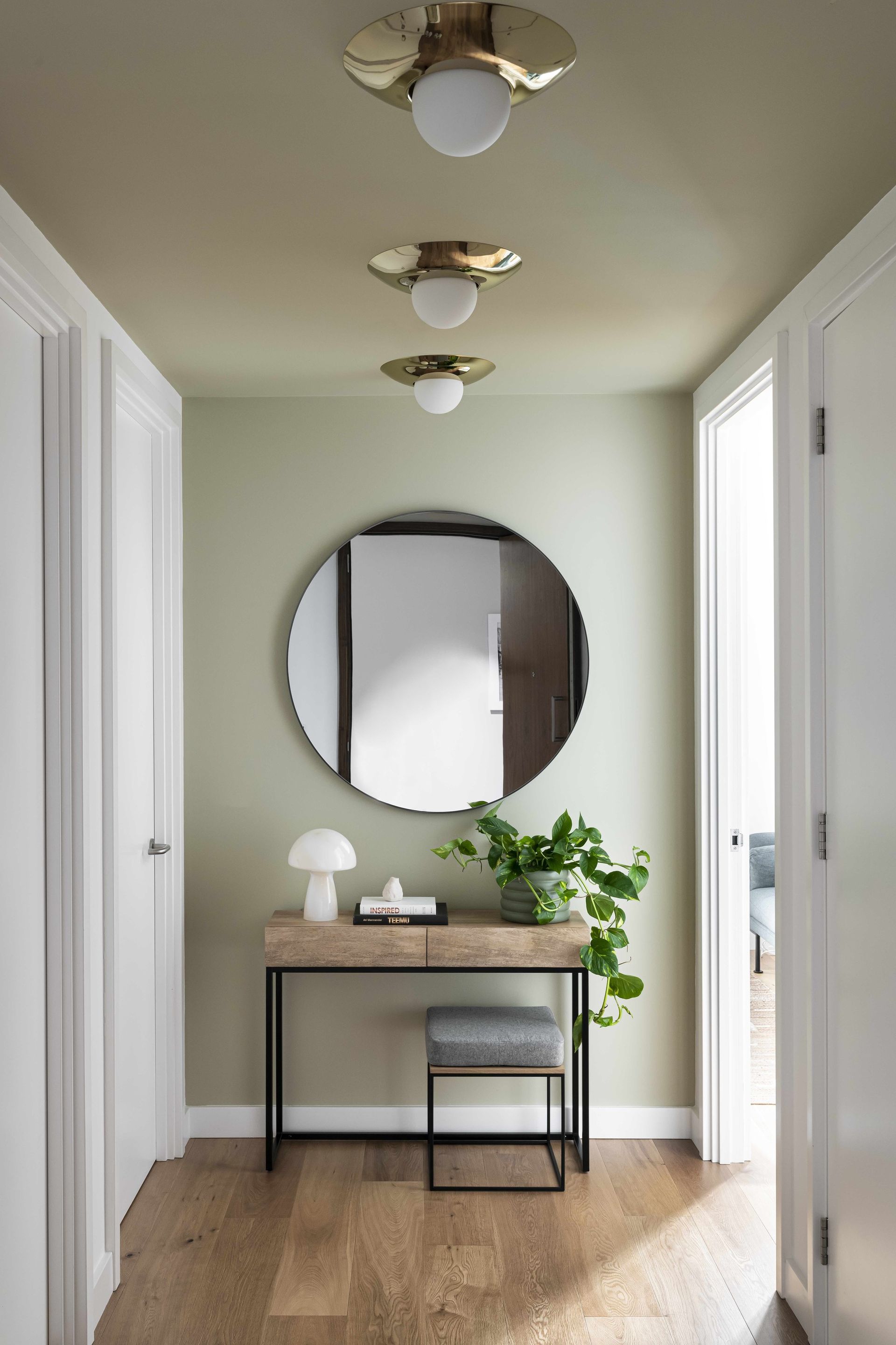
'Maximize the wall space by adding in an oversized mirror that will bounce around the light and make a narrow hallway appear much larger,' say Jen and Mar of interior design company Interior Fox, who designed this scheme with a large round piece. Alternatively, go for something curvy and statement, a popular look in mirror trends at the moment.
'By positioning on the opposing wall above a console table a focal point is instantly created, drawing your eye into the home from the entrance.'
5. Not getting clever with paint

Think carefully about not just the color scheme of your entryway, but the quality of the paint. 'This is a high-traffic area,' points out Emma Bestley, co-founder and creative director of YesColours, so your choice in hallway paint matters.
'The quality and finish of the paint must be a careful consideration and low-quality paint will not stand the test of time. Make sure to use a wipeable high-quality matt finish paint,' advises Emma.
Using a durable eggshell paint on wooden staircases and skirting boards will help keep these frequently used surfaces smarter for longer, and if the paint has a sheen to it, this will add interest to the space and enable natural light to reflect, creating a bright and airy entryway to your home.
Alternatively, Annie Sloan's Satin Paint, pictured here, is great for that wooden banister. This hard-wearing, soft-sheen paint doesn't need the application of wax or lacquer to protect and finish after painting.
6. Or being inventive with color

Many homes have quite muted or pared back color schemes in the hallway, but there is no reason you can't get experimental with color in this part of the home, with either bold paint colors or interesting paint ideas, like this example from Indie & Co, which paints the lower half of the wall in a deep forest green.
'Working closely with our clients, we began with creating a color scheme throughout that would bring a sense of fun and vibrancy in each room,' explains Celine Erlam of Indie & Co. 'Using strong color on the ceilings gave the rooms and expected feel, and creating half-painted walls gave the illusion of paneling that was a nod to what might have been in the buildings previous life.'
'The halfway up color use to be done in older building to hide scuffs and scratched and to protect the walls, so in house with small children we tend to do the same. That way we can use a more matt finish above,' adds Celine.
7. Not factoring space for seating

A hallway bench is a simple addition to an entryway space that can go a long way for a touch of comfort. Your entryway might not normally be a sitting area, but it's a nice piece of furniture that can encourage you to take a seat and regroup before going out into the world each morning. In this example by Indie & Co, the bench doubles up as a seating area and space-saving storage. Above the bench is the perfect place to hang a work of art or mirror.
'Depending on the layout of your hallway a dedicated seating area is a great place to start when designing the space,' say Jen and Mar of Interior Fox. 'Awkward corners that are often found in hallways provide the perfect spot, whether this is for a comfy seat or a hardwearing bench, a place to sit and pop your shoes on is always helpful. It can also double up as a cozy nook, to decompress, make notes or read a book. You’ll be surprised how often a hallway seat is needed and used.'
8. Making it too rectangular

Your entryway is so often a long, rectangular shape that can feel like an unwelcoming tunnel made up of harsh lines, so lean into the architectural features and embrace the trend for sweeping curves. A curved archway is soft and adds a welcoming element to the design, like in this home in Madrid designed by Sierra + de la Higuera.
9. Not considering the lighting

Creating light in an entryway is often a must as many homes lack natural light in these spaces, as they are often tight and lacking in windows. This will help the area feel welcoming and warm. 'Generally low-level ambient lighting such as table lamps or wall lights that can be operated independently of brighter architectural lighting will allow you to establish welcoming light settings that create a sense of home,' says interior designer, Rachel Usher. Automatic lighting schemes are a must for dark winter nights and can be easy and cost-effective to install with smart bulbs that can operate on a schedule or via an app.
The hallway is also a space where you might want to fit a statement lighting idea, pendant or chandelier, creating a statement for guests as they walk into the home.
How do you make an entryway more welcoming?
A welcoming entryway is firstly about practicality and function. 'It is always important that a few key ingredients are present in most entryways, a large mirror, a place to throw keys and mail which won’t look untidy or present a security risk such as a floating drawer/console table, and an essential closet to hang coats and store shoes out of sight. Utilizing space underneath stairs often presents opportunities to create hidden storage solutions that can be seamlessly integrated into the architecture of the space,' says Rachel Usher. These practical solutions will help you feel at home and clear-minded as soon as you step inside the house.
But it's also about those decorative touches that mix practicality with style. A console table is a must, but think about how you accessorize it - plants, trinkets that show off your personality, and what you hang above it - the entryway is a great place for art to be shown off, or all those family photos in beautiful uniform frames. Your entryway is like an introduction to who you are, so put your name on it.
Welcoming first impressions are all about color and texture too. The scheme must feel cozy, so look to muted tones or neutrals for something comforting and welcoming, and remember a carpet runner that will be warm underfoot when guests remove shoes.
Be The First To Know
The Livingetc newsletter is your shortcut to the now and the next in home design. Subscribe today to receive a stunning free 200-page book of the best homes from around the world.

Oonagh is a content editor at Livingetc.com and an expert at spotting the interior trends that are making waves in the design world. Writing a mix of everything and everything from home tours to news, long-form features to design idea pieces on the website, as well as frequently featured in the monthly print magazine, she's the go-to for design advice in the home. Previously, she worked on a London property title, producing long-read interiors features, style pages and conducting interviews with a range of famous faces from the UK interiors scene, from Kit Kemp to Robert Kime. In doing so, she has developed a keen interest in London's historical architecture and the city's distinct tastemakers paving the way in the world of interiors.
-
 These 12 Best Table Lamps for Your Desk — Perfect Glows for a Creative Home Office
The best table lamps for your desk is have a soft, targeted glow. Elevate your WFH set-up with these stylish picks endorsed by Style Editor Brigid Kennedy
By Brigid Kennedy Published
-
 The Nespresso VertuoPlus is 30% Off for President's Day, and it's Kim Kardashian's Coffee Maker of Choice
This sleek and stylish coffee maker was spotted in Kim's home bar, and you can currently save $60 if you buy yours from Amazon
By Lilith Hudson Published

