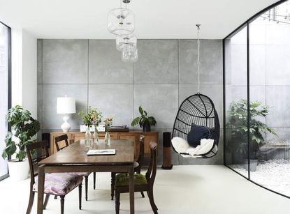
The biggest dining room design mistakes, and how to avoid them according to experts
Make the wrong choices in a dining room and you'll compromise the mood of family meals and social gatherings. Here's the mistakes you need to avoid


Much like kitchens, dining rooms can work as a place that brings friends and family together. An inviting, comfortable, and cozy dining space will encourage gatherings, weeknight dinners, and hours spent catching up around the dinner table, while a cold, cramped and cluttered one will make guests want to leave in a hurry.
The design of this space is an important one to get right, then, and while you're looking for the best dining room ideas to decorate your space, it's also worth getting to know the most common dining room mistakes, too. From a lack of ambiance to disproportionate furniture sizes and more, there are plenty of faux pas you can make while conceptualizing this room.
We asked some interior designers for their dining room design rules, and the most common mistakes they see in homes.

Aditi is a homes writer and editor with several years of experience. Her articles, backed by expert insights, offer suggestions aimed at helping readers make the best home design choices. For this article, she spoke to top interior designers to understand the most common faux pas people make while designing this space.
1. Choosing an oversized dining table

While designing the dining room, you may be tempted to bring in a table you perhaps spotted in a store, a magazine, or on Instagram. It's very easy and common to purchase what you think looks good but it's also important to see if it's the right 'fit' for your home. Generally, most dining tables are made according to standard measurements, which are 36-40 inches while the standard height is 29-31 inches.
In terms of width, you might not want a table that almost touches all four walls, but be sure to at least pick something that covers the dining area itself.
'Pick furniture according to the space available. It is very common for clients to ask for a dining table that is too large,' says Prateek Sabharwal, founder of Escape by Creatomy. 'I prefer to have at least a 900mm circulation space around the table.'
Another important consideration is the purpose of the table.
'When planning a new home people must be realistic about their family’s needs,' says Reena Sotropa, founder of Reena Sotropa In House Design Group. 'A common mistake people make is either overestimating the size of the dining table they require or their need for a formal dining space. It is a nice thought to plan for frequent dinner parties and large family dinners, but the reality is that in most homes the formal dining room is only used a few times a year.'
'Depending on the overall size of the home this might not make a lot of sense and in these cases, we encourage our clients to consider a more flexible dining solution that will serve their family on an everyday basis but also expand to accommodate larger groups,' says Reena.
2. Or including other disproportionate elements

Nothing will give your dining room that off-balance feeling quite like a too-small area rug or too-big storage unit. Disproportionate elements really mess with the sense of scale, whether it's in a large or a small dining room.
'Selecting furniture, area rugs, or light fixtures that are the wrong scale is another common mistake people make in their dining spaces,' says Reena. 'Furniture that is too large makes the space look cramped and the tight clearances make it uncomfortable to use. Undersized furniture is equally problematic because it creates too much circulation space which throws off the scale of the room and does not take the best advantage of the available space.'
'Dining room furniture should have enough space for people to pass comfortably behind someone who is seated at the table. A rule of thumb is no less than 36”- 42” between the table and the wall or sideboard. The size of an area rug should be determined by the size of the table and chairs; you always want to avoid the back legs of a dining chair catching on the edge of the rug as people pull their chairs in and out.'
3. Not including enough storage

No matter how big or small your dining room is, you always need storage. Don't skimp on a console, a cabinet, or in-built shelves to accommodate all the room's chaos. If your space is small, consider designing a window seat for dining, with storage built underneath it.
'Not investing in a good side unit or credenza is another faux pas people make,' says interior architect Sanjyt Syngh. 'No amount of storage is enough. You always need space for those extra glasses or formal dinnerware or your Christmas table decor.'
4. Positioning lighting in the wrong place

Of course, decorative dining room lighting is essential, but knowing how to hang it and at what length is essential. Whether you opt for wall lamps, chandeliers, or pendants, hanging them too low will block your guests from seeing each other, while too high and you'll lose that sense of the light anchoring the space.
'A common mistake people make is not considering the actual size and placement of their dining table relative to the light fixture above,' says Reena. 'This is especially common in open concept dining spaces when the position of the dining table is flexible. When working with clients who are building a new home we add their dining room furniture onto the floorplans at an early stage to ensure proper clearances and lighting placement.'
'The width of the fixture should be approximately a foot less than the table width to ensure around 6” clearance on each side,' says Reena. 'The light height over the dining table should be around 30”-36”, although some fixtures require more space visually.'
5. Matching the table and chairs

An extremely coordinated, symmetrically perfect space can not only be a little dull, it can be jarring too. Our eyes prefer natural, organic layouts and shapes as per biophilic design, rather than schemes perfectly matched.
With that in mind, don't feel forced to match your dining table with the chairs by buying a matching set.
'Traditionally, the practice was to have a matching dining table and chairs, which is not necessary anymore,' say Sachin Gupta & Neha Gupta, founders of Beyond Design. 'They don’t need to match. You can mix different materials, colors and styles for the table and chairs.'
'Even among the chairs, not all chairs have to look the same,' the designers add. 'Different upholstery fabrics and eclectic style combinations work well, as long as you create harmony among the diverse pieces. This gives a carefully curated look, which is visually attractive.'
6. Playing it safe with the color scheme

The dining room is invariably used twice a day; a place as frequented and important as this should not be lacking design. Give it some love with interesting dining room color ideas. Consider an accent wall with eye-catching paint finishes. You can also create a gallery wall or hang an iconic art piece here.
'Dining room design is all about evoking an intimate and inviting atmosphere,' say Sachin and Neha. 'So warmer tones or neutrals are preferred.
'People are often afraid to use bold or bright colors here but our experience shows that if bold colors harmonise with the rest of the elements and are accentuated well, they can look splendid, yet cozy and welcoming.'
'We have used dark shades, even rich red and deep aubergine in our dining rooms. If using cooler tones, layer them well to add depth and richness so that they don’t look too cold.'
7. Not considering window treatments

Speaking of decor, your dining room window treatments are essential to designing this space. Not only do drapes, shades, and shutters contribute to the ever-important ambiance, but they also inject personality and style into your dining room. Plus, since this is a private space for family and friends, window treatment allows you to create privacy during intimate dinners and soirees.
If you're going ahead with curtains, consider not choosing all of the same color and size. Create a scale composition, with curled valances on top or shorter curtains overlapping floor-length curtains.
8. Prioritizing style over comfort

In the pursuit of designing a luxury dining room, do not skimp on practicality, especially when choosing furniture. No matter how smart they may look, uncomfortable dining chairs should be left in the showroom.
'Always prioritize comfort over style,' says Prateek. 'There's nothing worse than an overly upright dining chair or a table that is too high for the chair. Don't be afraid to mix it up. A juxtaposition of benches and chairs or just a series of different chairs can be a statement on its own.'
What makes a dining room comfortable?

For a comfortable, efficient, and design-savvy dining room, ensure that the main staples are well-chosen. The dining table should be selected based on the scale of the room. Ideally, the standard height is between 28 and 30 inches and should be used with 18 to 23-inch chairs, stools, or benches. Make sure there is enough circulation room around the seating for people to move around.
Lighting plays an equally important role in establishing a comfortable dining room, so make sure you choose fixtures that create a good mood without being overly bright. You can illuminate your dining table with yellow light by hanging pendant lights above it. Perhaps choose ones in interesting shapes.
Bring in a sideboard, and a cabinet, or even go in for built-in shelves to tame all the crockery and accessory chaos in the room.
Don't skimp on the decor. Give some thought to your dining room walls and add artwork, murals, or even paints here. Give the room personality and make it a convivial one to spend time in.
Be The First To Know
The Livingetc newsletter is your shortcut to the now and the next in home design. Subscribe today to receive a stunning free 200-page book of the best homes from around the world.
Aditi Sharma Maheshwari is an architecture and design journalist with over 10 years of experience. She's worked at some of the leading media houses in India such as Elle Decor, Houzz and Architectural Digest (Condé Nast). Till recently, she was a freelance writer for publications such as Architectural Digest US, House Beautiful, Stir World, Beautiful Homes India among others. In her spare time, she volunteers at animal shelters and other rescue organizations.
-
 How to Organize your Bathroom for a Better Morning Routine — 6 Steps for a Seamless Start to the Day
The ease of your morning routine can have a huge influence over the rest of the day, so make sure you optimize you space for a stress-free start to the day
By Lilith Hudson Published
-
 5 Trees You Should Prune in Your Backyard in February — 'It Makes Much Sense to Cut These Ones Back Now'
If you think pruning trees is best left to spring, think again. These trees all could use some cutting back now for several very important reasons
By Hugh Metcalf Published

