5 colors you should never paint a dark room - and what experts would choose instead
These fail-safe ideas will help you find the perfect shades of paint for light-deprived spaces
If you're wondering what paint colors are best avoided in dark rooms, read on. We know how tricky choosing paint can be, especially when you're working with a light-deprived space or a windowless room, such as a bathroom with no external walls. Often, the dilemma is whether to work with what you have and choose a dark shade to add atmosphere, or fight against it and opt for something bright and airy to counteract the lack of natural light.
The success of either approach when it comes to your paint ideas can depend on exactly how much light the room gets throughout the day, and the direction that light is coming from. 'The quality of the light will change how you perceive the color, so you need to think about what time of day you will use the space, as well as the aspect of the room,' advises color consultant Siobhan Doherty of Studio Homestead. 'Color is so deceptive and the effect depends on the amount of natural light the room receives. Ask yourself what's happening outside your window. Is the light affected in any way? Do the light conditions change at different times of year?'
Here's how to decide what colors to use in a room that's lacking in natural light.
1. SWAP HARSH WHITE FOR WARMER SHADES

When Siobhan Doherty set about decorating her townhouse, she was faced with the challenge of how to make her north-facing kitchen feel cozy. Fortunately, as a color consultant, she was well-placed to make the right call, choosing Farrow & Ball's Wimborne White for the walls and ceiling, and the brand's Shadow White for the woodwork
'Our kitchen cabinets are a warm creamy white. The trio work well together and create a very light, bright and airy space that still feels warm,' says Siobhan. 'Painting the trim a shade or two darker than the walls creates the illusion of a brighter room, this can also make a space feel bigger as it highlights the wall area.'
2. CHOOSE BURNT ORANGE OVER RICH REDS
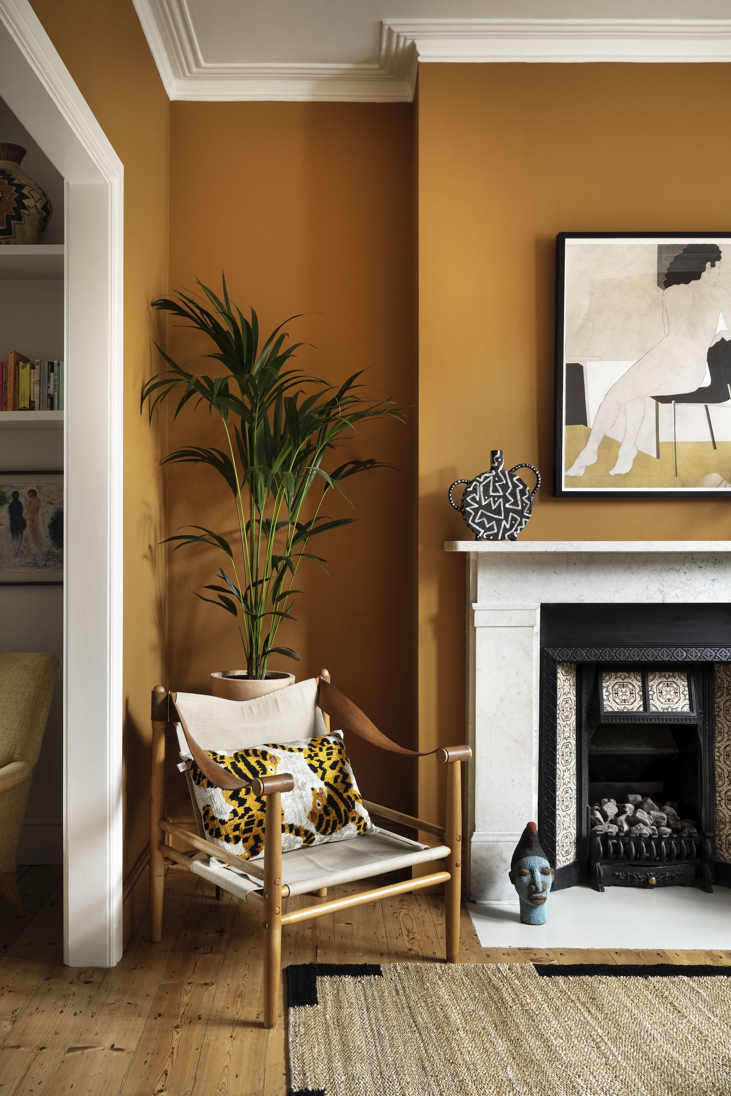
While strong reds are having a real resurgence, there's a good chance that using red in dark room will feel oppressive rather than inviting. For a color that's equally warm but a little more livable, try a brown paint with burnt-orange tones such as Little Greene's striking Middle Buff.
Leo Wood of Kinder Design used the shade to transform this living room, and is another advocate for choosing colors with warm undertones in dingy rooms. 'Depending on what the room is being used for, you might choose to embrace the lack of light and go for a dark paint on the wall, or opt for a softer color and really work on getting the lighting and furniture layout right,' she adds. 'It's all quite nuanced.'

Price: $27.48
Size: 1 gallon
3. TRY DARK BLUES IN PLACE OF PALE HUES
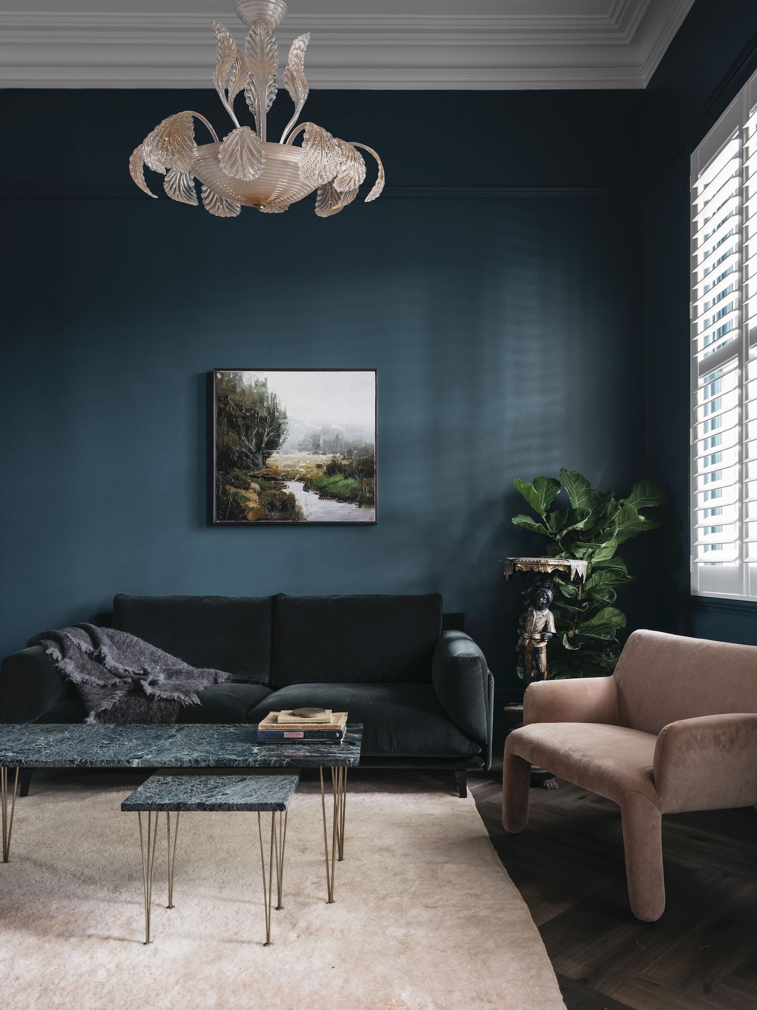
If you love the idea of decorating with blue, you might be tempted to choose a pale shade with the aim of brightening up your dark space. Unfortunately, cool colors in lighter tones can feel decidedly cold in a room that doesn't get much light, meaning it's not the best color for North-facing rooms. So if you're set on blue, it's best to make a statement with a more saturated hue.
Australian interior designer Georgina Jeffries chose a dark-teal paint for the walls of this Victorian home in Melbourne, reinterpreting the home's air of grandeur in a contemporary way. 'Dark greens and blues are colors found in nature that evoke a certain level of comfort,' explains Georgina. 'When layered with materiality and texture in darker spaces, they can create volumes that are rich and full of drama.'

Price: From $52.99
Size: 1 gallon
4. TRADE GREY-GREEN FOR A VIBRANT SWAP
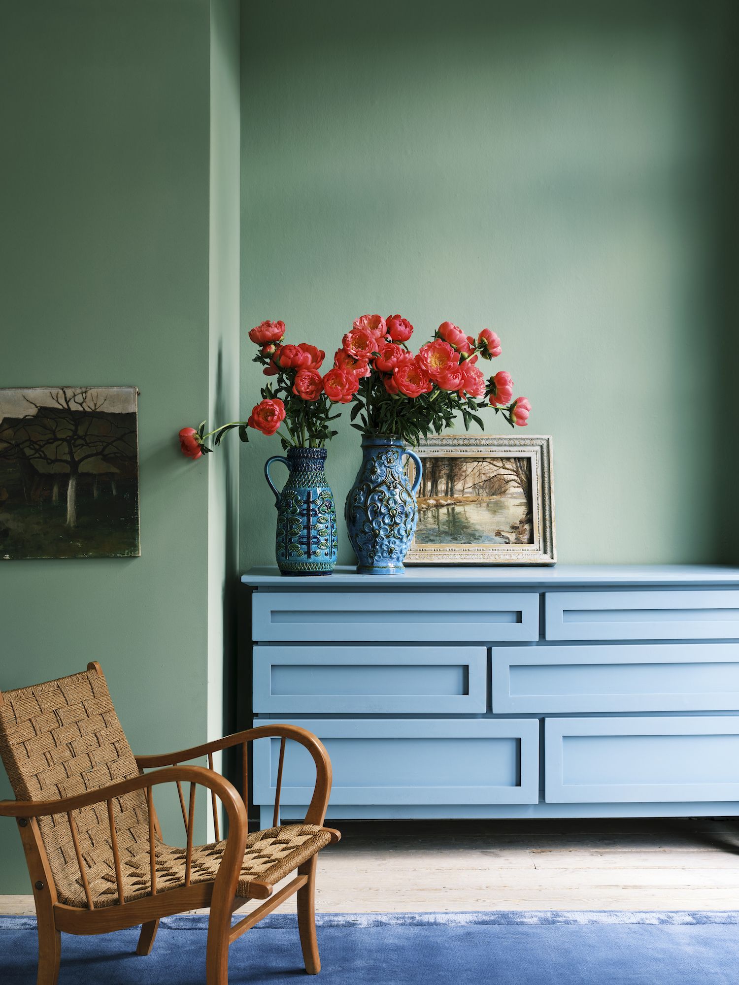
While soft grey-greens understandably feel like a safe and approachable way of decorating with color outside of the neutral spectrum, be warned that they can have a tendency to feel a little drab in a dark space. You could opt instead for forest green, or an olive shade that combines green with earthy undertones.
Alternatively, go for a verdant color like Farrow & Ball's Breakfast Room Green to lift and energize your space. 'Green offers people a sense of calm and optimism, and has always been a very popular choice on our color chart,' shares the brand's creative director Charlotte Cosby. 'Using a vibrant green in a light-deprived area will joyfully elevate the space. A shade such as this works well here as it remains lively as the light changes throughout the day.'
5. CONSIDER WARM CLAY INSTEAD OF GREY
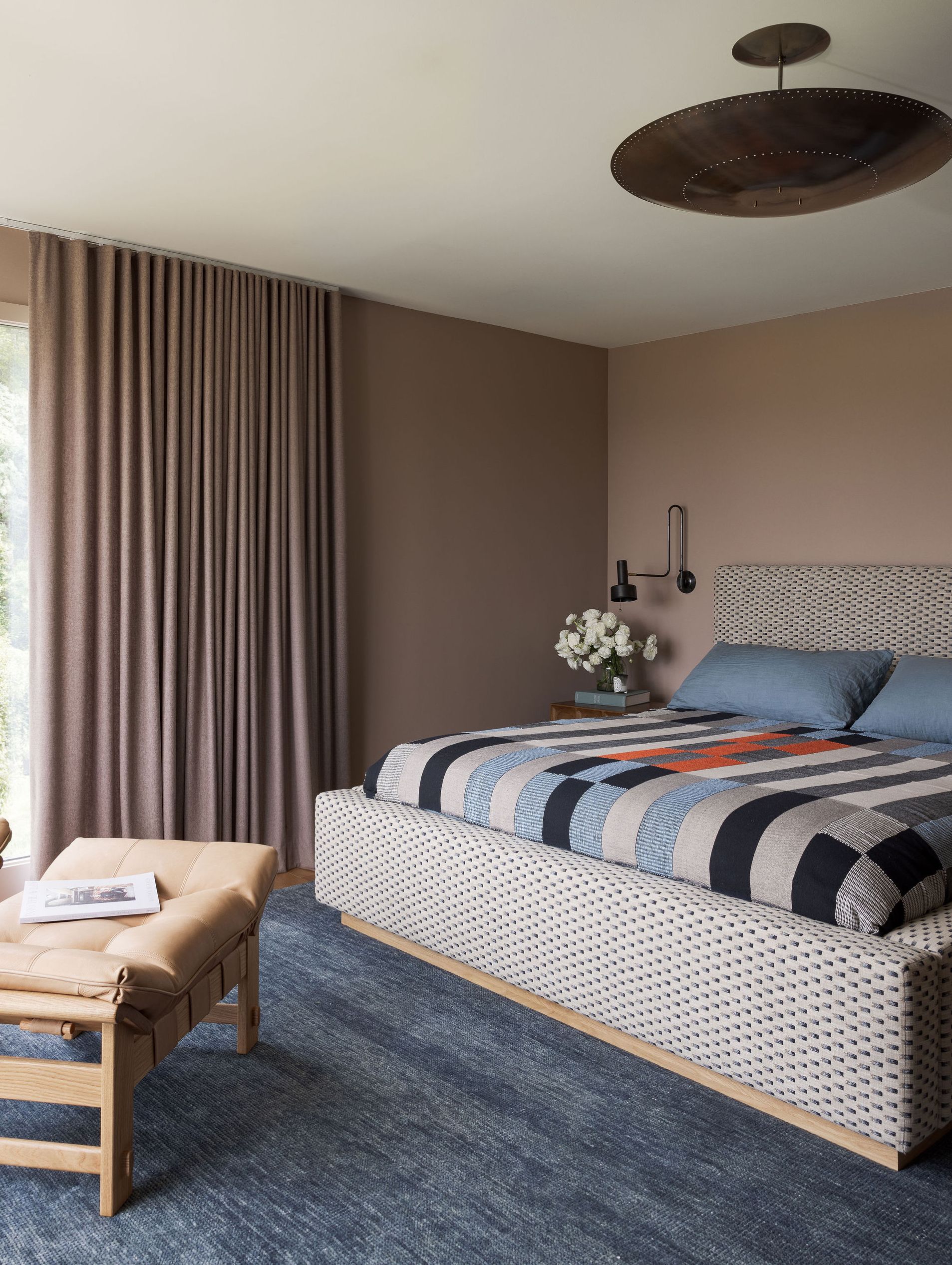
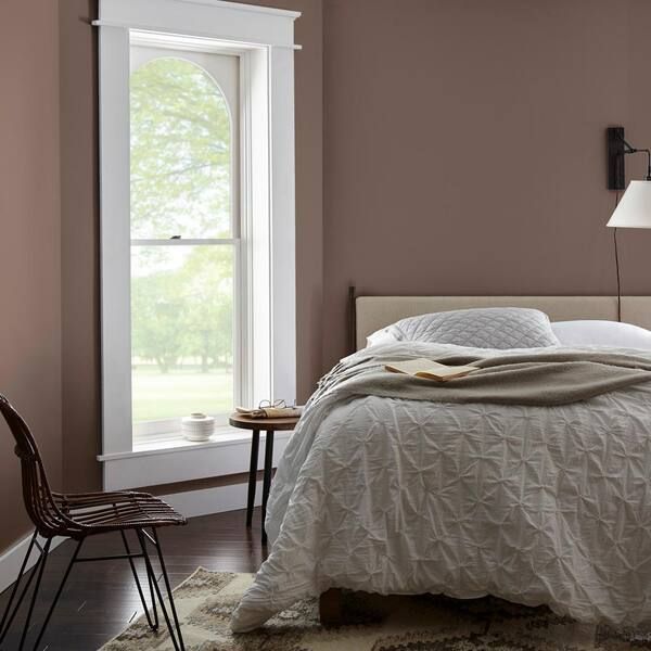
Grey might be classic but it can also seem cold, particularly in light or mid-toned shades and when used in spaces that are short on natural light. If you're looking for a warmer and more impactful alternative to cheer up a dark room, consider paint ideas in a warm, neutral tone, such as taupe or clay.
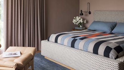
When Californian interior designer Katie Monkhouse revised the interior for this mid-century home, she chose a strong pinkish-brown for the bedroom walls, which offers warmth and personality in spades. 'The brief for this family home was individuality,' she says. 'Our clients were keen to create something different, memorable, and reflective of who they are. We composed a home that feels both rooted in original features and updated for modern living.'
Price: $26.98
Size: 1 quart
Be The First To Know
The Livingetc newsletter is your shortcut to the now and the next in home design. Subscribe today to receive a stunning free 200-page book of the best homes from around the world.
Tessa Pearson is an interiors and architecture journalist, formerly Homes Director at ELLE Decoration and Editor of ELLE Decoration Country. When she's not covering design and decorative trends for Livingetc, Tessa contributes to publications such as The Observer and Table Magazine, and has recently written a book on forest architecture. Based in Sussex, Tessa has a keen interest in rural and coastal life, and spends as much time as possible by the sea.
-
 The 12 Best Table Lamps for Reading —I'm a Certified Bookworm (and Shopping Expert)
When it comes to table lamps for reading, I don't mess around. If you're the same, this edit is for YOU (and your books, or course — and good recommendations?)
By Brigid Kennedy Published
-
 "It's Scandi Meets Californian-Cool" — The New Anthro Collab With Katie Hodges Hits Just the Right Style Note
The LA-based interior designer merges coastal cool with Scandinavian simplicity for a delightfully lived-in collection of elevated home furnishings
By Julia Demer Published
