The 10 biggest bedroom furniture mistakes that interior designers always notice – and how to fix them
These bedroom furniture mistakes might be the reason why your room feels cluttered or not put-together
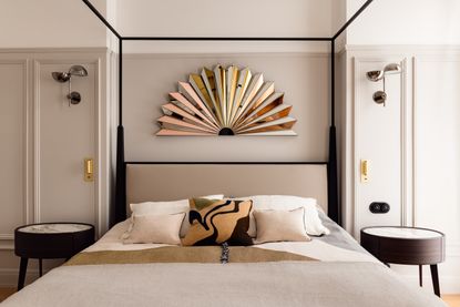

More than in any room, furniture is the most space-consuming feature of a bedroom, so getting it wrong isn't an option. When pieces are brought in without careful thought or consideration, they can make your space feel cluttered, less-than-practical and strangely proportioned.
From uncoordinated furniture colors, and disproportionate sizes, to wrong placements, zoning, and more, several factors could be affecting your bedroom layout. To help you understand the mistakes you might be making with your bedroom furniture, we sought the help of top interior designers.
1. Neglecting functional zoning with furniture
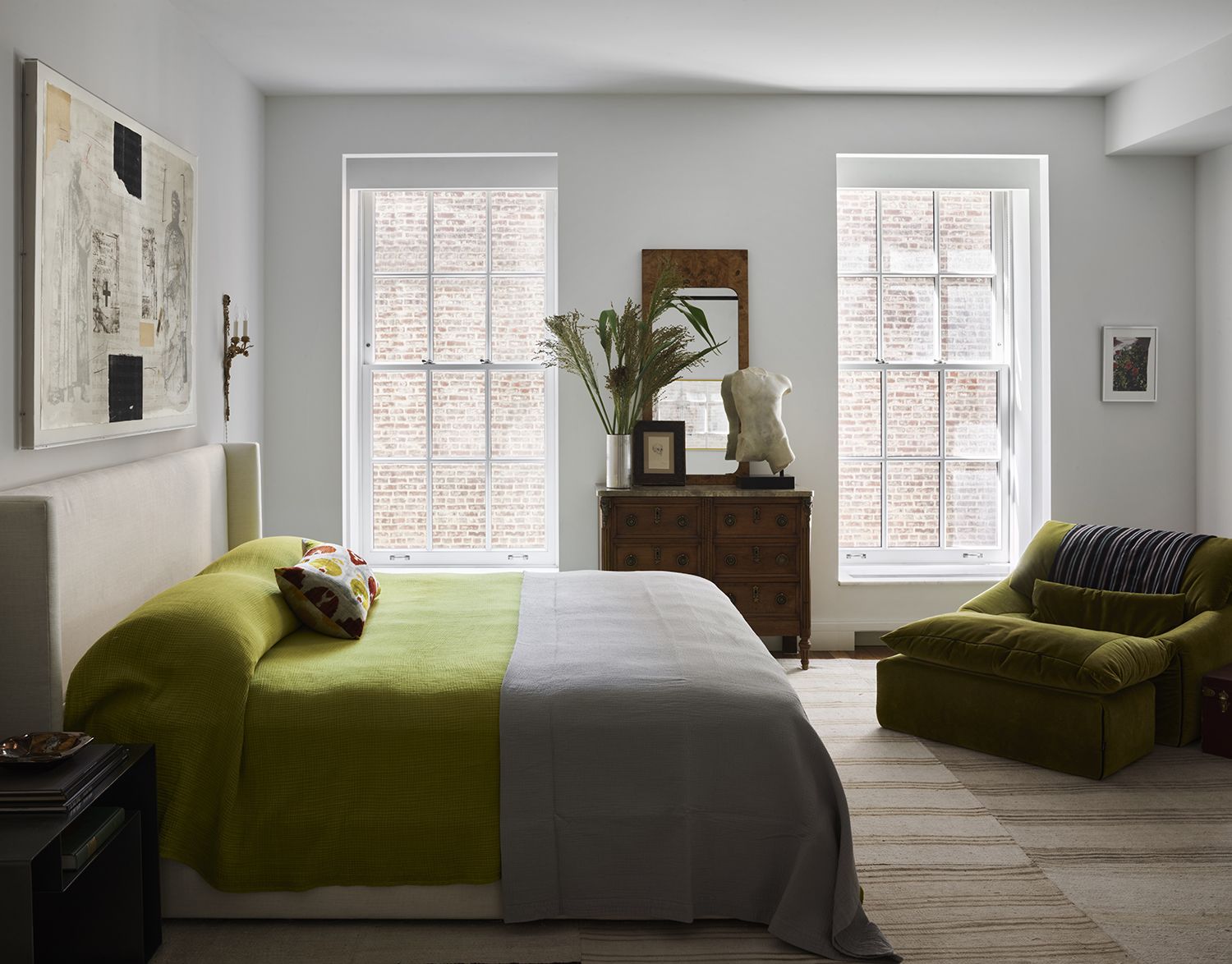
Whether it's the master bedroom or the kid's space, being able to zone and create separate functional areas is a task you need to be able to master. Zone the sleeping area from the working space, or the play and storage space. When the layout is not done in the right manner, the whole room can seem cluttered and chaotic.
'When it comes to bedroom furniture layout, one common mistake people make is neglecting to create distinct functional zones which can lead to a lack of practicality,' says Saba Kapoor, co-founder and designer at Nivasa. 'Bedrooms are not just for sleeping; they often serve as multi-purpose spaces for relaxation, work, or leisure activities. It's essential to consider how you intend to use the room and incorporate dedicated areas for activities like reading, dressing, or work. This helps to maximize the room's functionality and enhance your daily experience.'
2. Ignoring the spacing between furniture
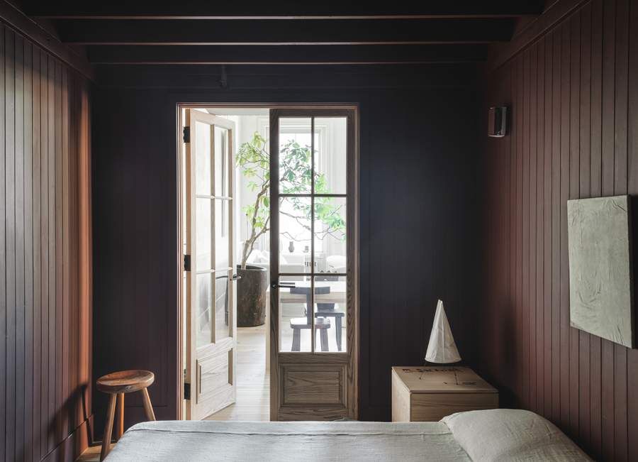
Another common bedroom layout mistake is not considering the circulation area in the room. There needs to be enough space for you to walk around the room, and even in between the big, bulky pieces such as the bed, the room's sofa, and the table. Consider a distance of about 30 inches between furniture, in a standard-sized bedroom.
'Placements play a key role in the layout, and spacing between the walls and furniture pieces play an important role,' says Ajay Arya, founder, and interior designer at A Square Design. 'There should be ample amount of walking space which enhances the look further. Also, the placement of the TV should be always opposite to the bed maintaining the center.'
3. Overlooking adequate storage
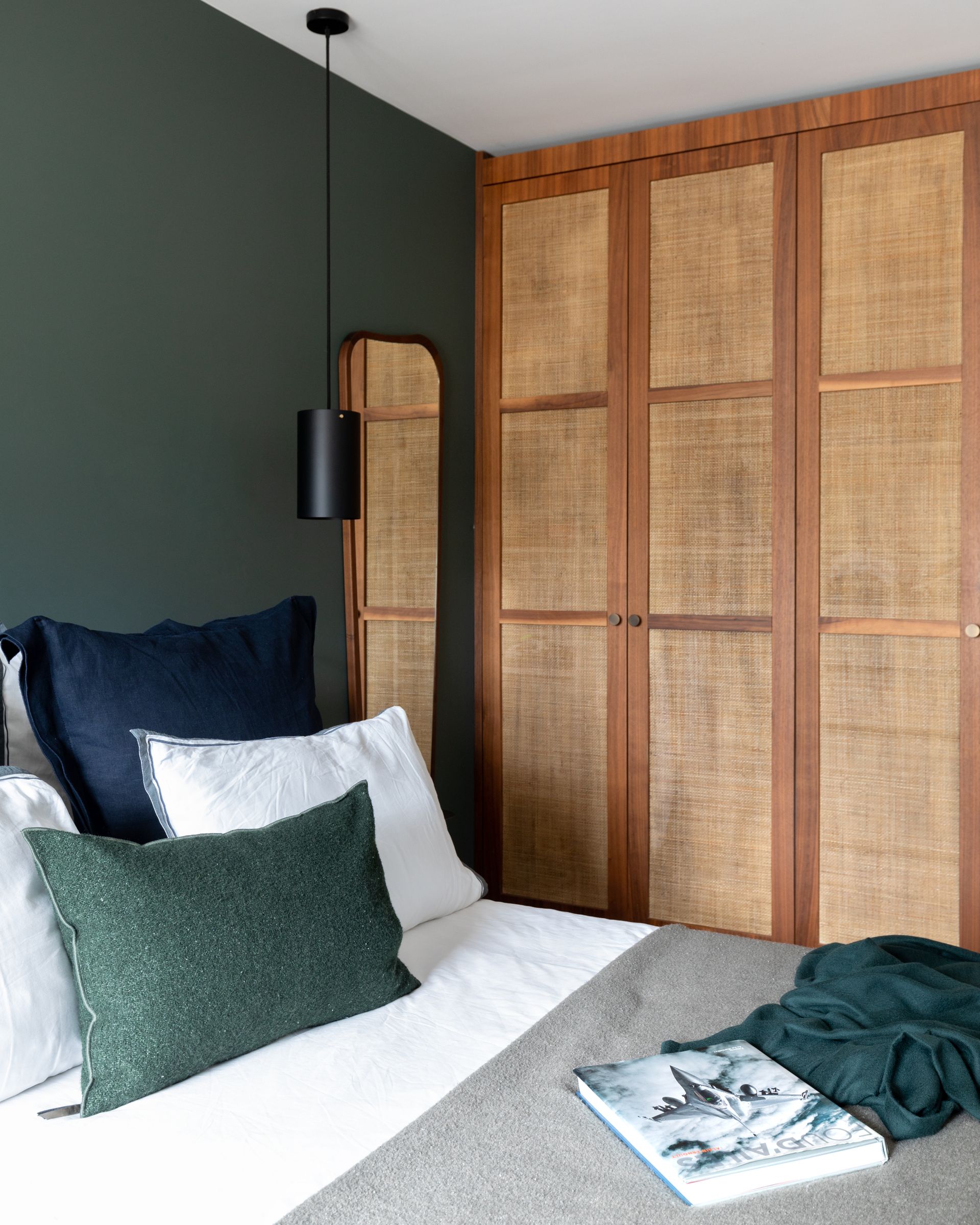
Bedroom storage is one of the most essential elements in the space, as it not only helps keep the room organized and clean but also multiplies the functionality of the space. Many-a-times while doing up this space, in the need for either more decorative items or to keep the room minimalistic, people tend to overlook how much storage they need.
'Overlooking the importance of adequate storage in the bedroom is a big mistake,' says Saba. 'Cluttered spaces can disrupt serenity and hinder relaxation. It's crucial to incorporate smart storage solutions, such as dressers, wardrobes, or built-in shelving, to keep personal belongings organized and out of sight.'
4. Wrong placement of bed
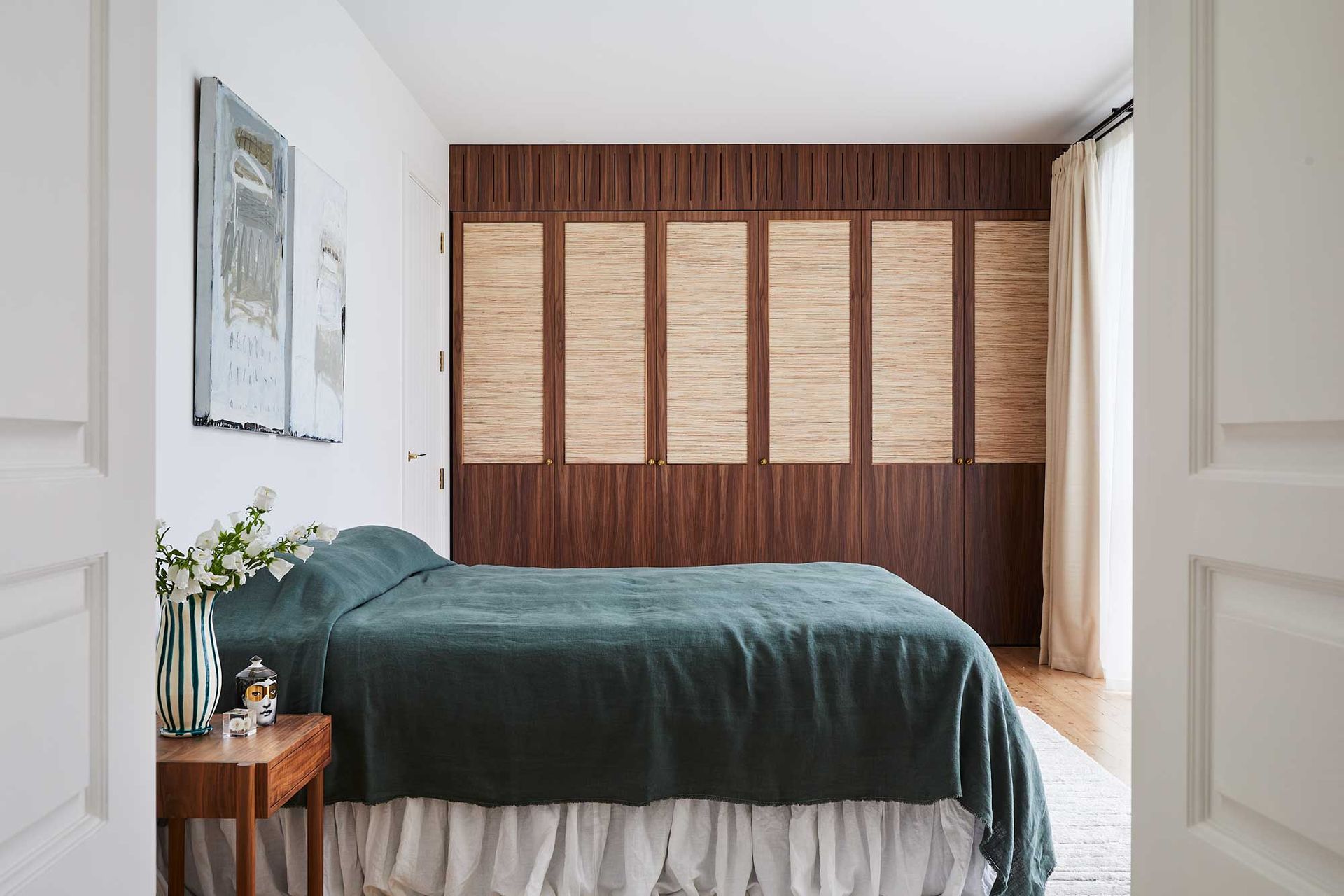
The best modern bedrooms have the most eye-catching beds, designer pieces, and ones that can last generations. While picking the right style and make of this piece is crucial, where you place it is important too.
'Your bed is the focal point of the bedroom, and its placement sets the tone for the entire space,' says Saba. 'Placing the bed against a wall that lacks visual interest or blocking windows can disrupt the overall aesthetic and natural light flow.'
In small bedrooms, it is a mistake to float the bed in the middle of the room, as it blocks the central circulation space and makes all the corners too tiny or narrow to be used for other functions. Similarly, do not place the bed in front of a window or just by the entrance of the room, so the opening of the door becomes an issue.
5. Overcrowding the room
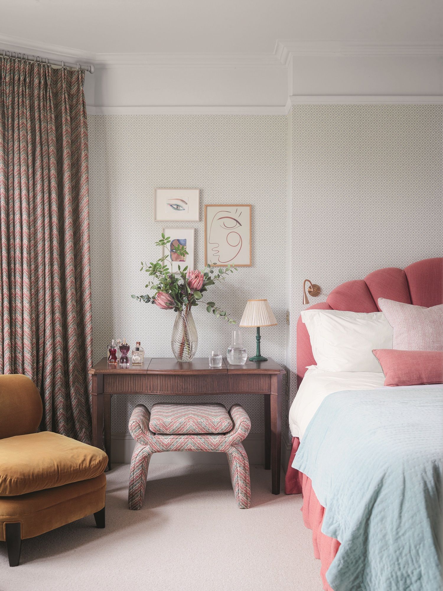
'One common mistake people make with bedroom furniture is overcrowding the room with unnecessary items,' says Saba. 'Adding too many furniture pieces, such as extra dressers, make-up vanity, chairs, or nightstands, can overwhelm the space and create a cluttered look.'
'Nobody likes a crowded and chaotic bedroom so try not to add big and overstuffed pieces to your space, as size and proportion matter,' says Julia Mack, founder of Julia Mack Design. 'Measure the size of your bed and select a wall that fits both the bed and one or two night tables keeping in mind that a small night table can attach to your wall if your space is limited. Add a modern bedroom furniture piece such as a vertical dresser instead of a long, low horizontal version to maximize open floor space and include a chair of any size. A well-scaled chair is important because it can serve many functions in a bedroom: a cozy spot for reading or just a place to toss your clothing at the end of a long day.'
'Opt for multi-functional pieces that offer storage solutions or prioritize essential items that serve a specific purpose,' says Saba. 'By selecting furniture thoughtfully, you can create a well-curated space that promotes relaxation and a sense of spaciousness.'
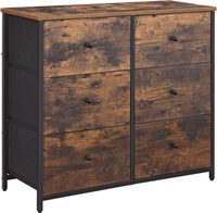
Dresser chest, Amazon
Keep the furniture elements to a minimum with a bed, a wardrobe, and a dresser chest. Choose this piece that will add an earthy charm to the room.
6. Uncoordinated bedroom furniture colors
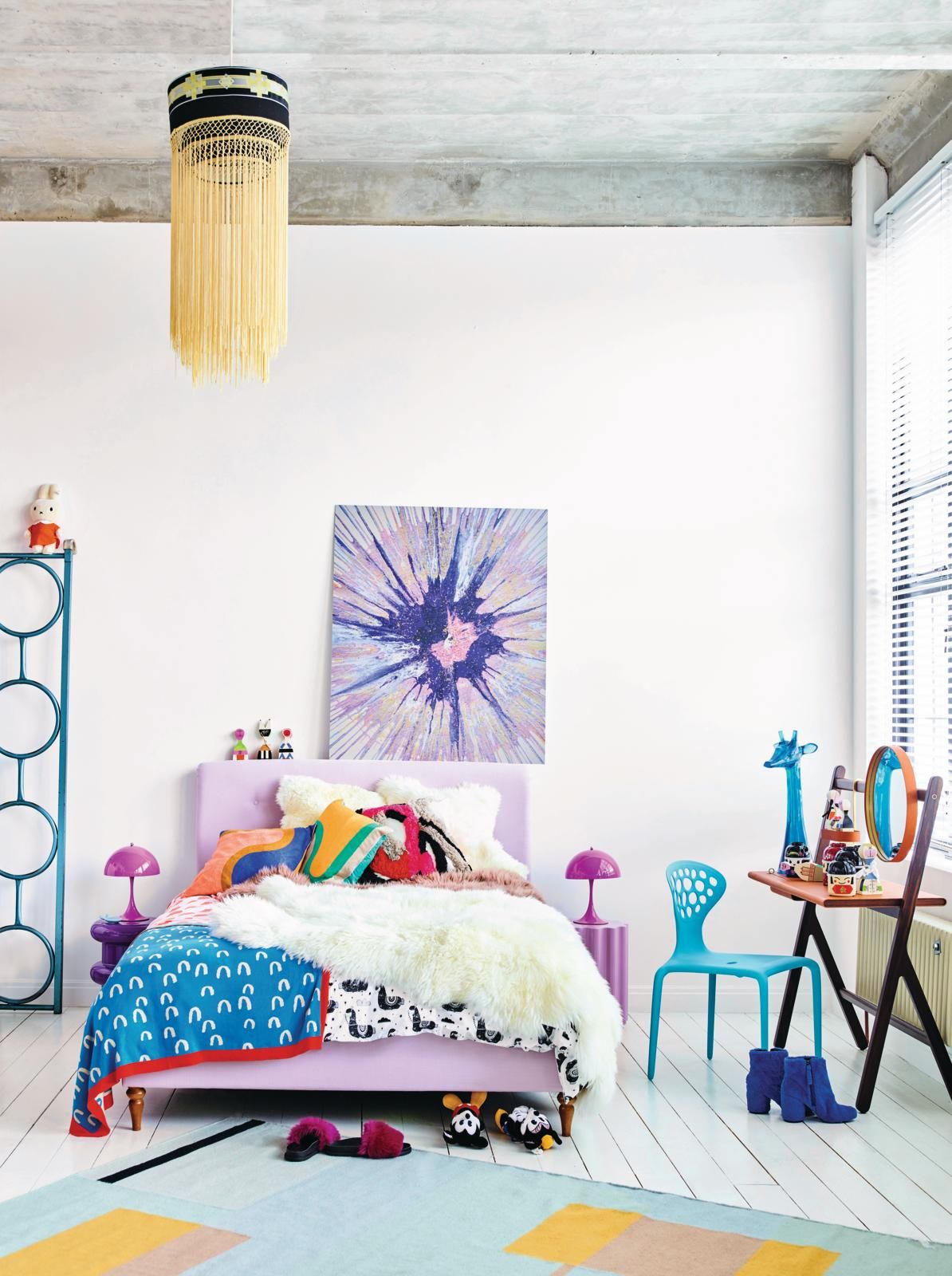
Selecting the right bedroom colors along with the right tones of the furniture can be hard. You want a scheme that looks appealing but not too vanilla and staid.
'Here is a guideline for color selections for a bedroom,' says Julia. 'First, consider who is using the space. If it is a child, bright colors are the norm but if you are designing for adults, keep the palette confined to a tight tonal range of textural neutrals with strategic pops of color for all furniture. Keep the bedding and window treatment neutral and the dressers all in a similar wood tone. Your space will become an interesting yet serene oasis and a lovely spot to retire to at the end of each day.'
'The bedroom furniture should be color coordinated with the room to give a soothing effect,' says Ajay. 'Some loose furniture pieces or artifacts can be in a contrast.'
7. Choosing the wrong bed size
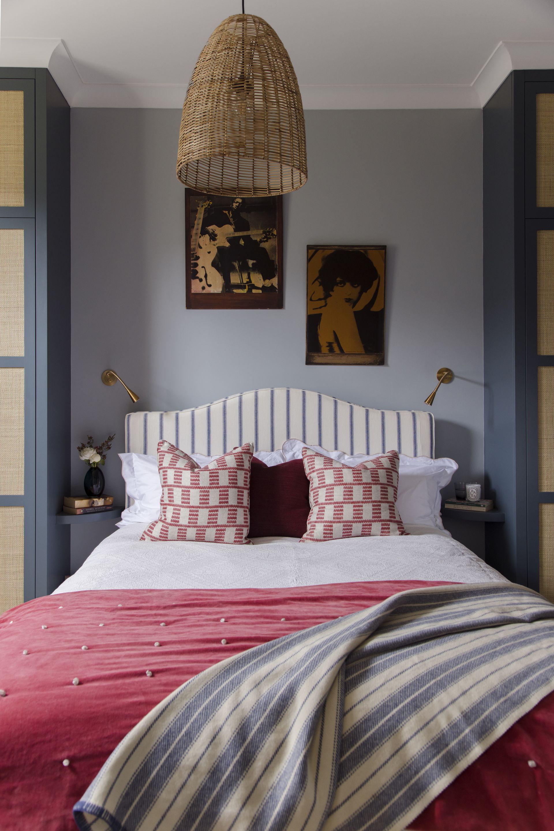
'Bed size can be tricky,' says interior designer Julia Haney Montanez. 'For smaller spaces, the difference between a queen and double bed is not so significant while you're sleeping, but can make a big difference in a smaller room, and choosing a smaller bed can be helpful. In a larger room, a king may be the better option than a queen, and no one regrets having a big bed in a big room.'
Before picking the bed though, get the actual dimensions of your bedroom, and measure the size of a king, queen, or a single bed in the space to get an idea of how the room will look. For a clean, minimalist bedroom, it's good to choose a size that doesn't overwhelm the area and allows more furniture pieces to take up space in the room. It is a decision between deciding which is more important: a bigger bed or more living space.
Make sure that while choosing the bed size is important, it is also important to know how to choose a mattress. You want its size to perfectly, snugly fit the bed. If you are getting a bed custom designed, it may be prudent to get a mattress custom-made as well.
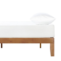
Wood platform bed, Wayfair
Consider this bed made in solid wood, with a super sturdy frame and available in different finishes.
8. Opting for matchy-matchy furniture
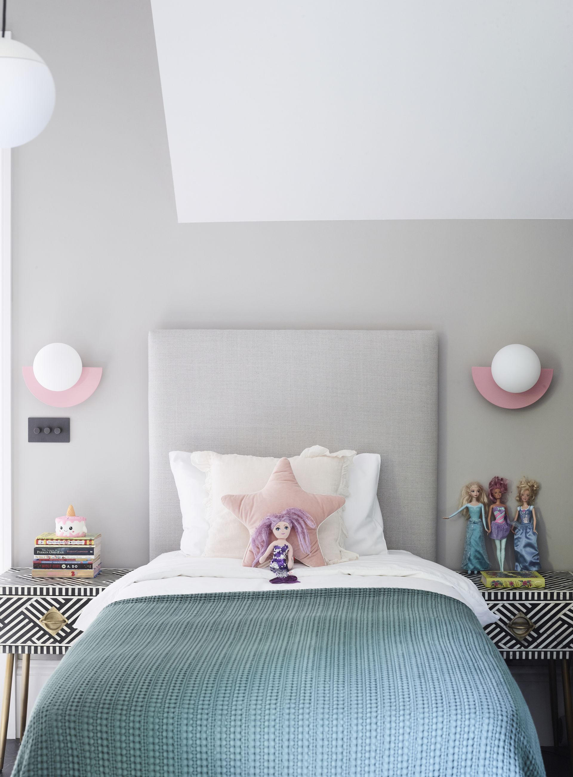
While it is a good idea to coordinate the colors of the bedroom and the furniture, you want to make sure you don't match the pieces to the T. This means, an overly matchy decor can make the bedroom feel like one out of a catalog – overly symmetrical, matching and cold.
For a cozy bedroom, you want to make the tones similar but not exact. You can even coordinate the same material tones, weaving, and carving on the furniture pieces but choose varying colors.
'I love an upholstered bed,' says Julia Haney. 'It allows you to invite more color and texture to the room and then you don't have to worry about getting matching nightstands. It can look a little too much like a boring showroom when the nightstands and bed are from the same collection. Good nightstands are notoriously hard to find, but my favorites are either vintage teak nesting tables for a lovely simple look, or USM's nightstand, in white or beige, which adds that cool office-y dimension to a more traditional bedroom, with a nice shelf to display your favorite books.'
9. Not furnishing the bed
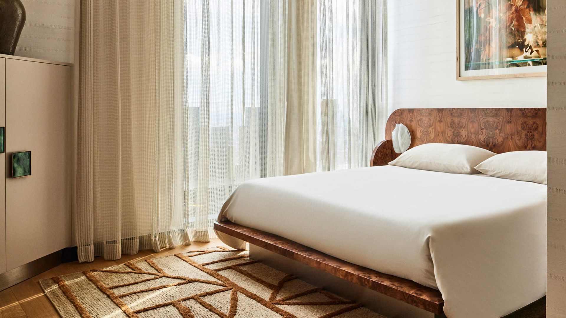
While having a clean, minimal, or Scandinavian bedroom is a matter of choice, while creating a look such as this, don't forget to give the bed some love. After all, this is the space that spells relaxation and tranquility. You want its design and decor to put you to sleep and rest your mind.
One great way is by plumping up the bed with furnishings. You don't need to go overboard but a throw, a few pillows, and a cozy blanket can help make the bed a more welcoming spot. If you want to make it more snug, add three layers of pillows (which can be kept away when you're sleeping). Choose fur blankets and soft, high-thread count sheets.
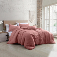
Comforter set, Walmart
Add soft texture and pleasing hues to your bed with this comforter set. The microfiber material is easy to clean.
10. Blocking natural light with tall furniture pieces
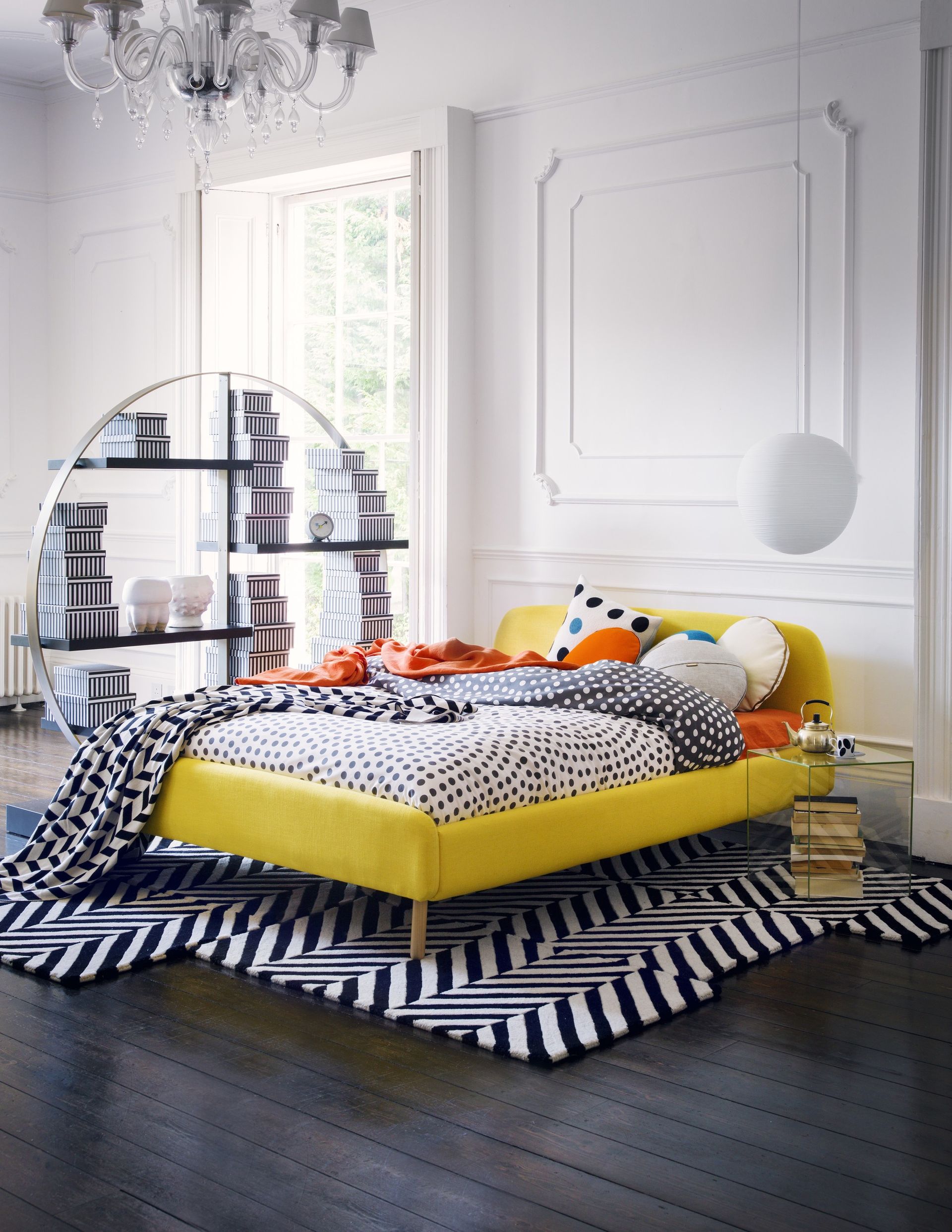
A big no-no in bedroom feng shui is blocking the source of natural light. Even in design, this is a big faux pas and can be detrimental to not just the look and feel of the space but also to the comfort and well-being of the dweller. Don't block the window or any light source with a tall furniture piece like a dresser or a bookshelf. Allow natural light into a bedroom as it can make you feel happier, and create a breezy atmosphere in the room.
If your room is small and you need to place a piece of furniture by a window, choose one with a low height. Or place a mirror opposite the window so it reflects the natural light around the room.
Be The First To Know
The Livingetc newsletter is your shortcut to the now and the next in home design. Subscribe today to receive a stunning free 200-page book of the best homes from around the world.
Aditi Sharma Maheshwari is an architecture and design journalist with over 10 years of experience. She's worked at some of the leading media houses in India such as Elle Decor, Houzz and Architectural Digest (Condé Nast). Till recently, she was a freelance writer for publications such as Architectural Digest US, House Beautiful, Stir World, Beautiful Homes India among others. In her spare time, she volunteers at animal shelters and other rescue organizations.
-
 How to Thaw a Frozen Pipe — Learn Everything You Need to Know in 5 Minutes With This Guide
Winter storm caught you off guard? We asked an expert — just how do you thaw a frozen pipe?
By Hugh Metcalf Published
-
 The 12 Very Best Silk Bedding Pieces — As Our Style Editor Says: 'It's What Dreams Are Made Of!'
Slumber in lustrous luxury with the very best silk bedding sheets, duvets, pillowcases, and more — your sleep score will thank us later
By Julia Demer Published

