This architect's trick for positioning a bed in the middle of a room makes me want to be braver with my bedroom layout
Putting a bed in the middle of a room is a shortcut to emulating luxurious hotel-like designs, but it's a tricky layout to get right. Here, an architect explains how it's done best


The placement of the bed in a bedroom is often looked at as a limiting factor rather than an opportunity. It has to face the door or the window, for example, or it has to be positioned in a particular way to suit the shape of the room. However, when interior designers start to look beyond what the position of the bed has to do, to what it can do, you start to find some amazing layouts that bring a high-end, expensive feel to a space.
The big trick, often seen in luxury hotels, is positioning the bed in the middle of the room. It's a shortcut to creating a feeling of luxury, making clever layouts for storage, and emphasizing the proportions of your bedroom. But, surely, it's only an option for huge spaces? And doesn't it eat up valuable floor space?
It's true, it's not an easy layout to make work, but with a little expert guidance, you might find it's the solution to your bedroom design dilemmas you'd have never considered before, even for smaller spaces. I asked an architect for the secret to making it work.
What are the benefits of positioning a bed in the middle of a room?
So, why bother trying to make a bed in the middle of the room work as a layout, anyway? 'Having the bed in the middle of the room mostly comes from the fact that we decompartmentalized our homes in general,' says architect Christophe Delcourt, 'so why not go all the way, and decompartmentalize the bedroom to add an office or a bathroom to it?'
Putting the bed in the center of the room can act as a room divider, which helps you zone different areas for different purposes in a way that a standard position doesn't. The back of the bed can be used, as suggested, as a divide between an open or ensuite bathroom, to create a walk-in closet or make a dedicated bedroom office space.
'It also is a great way to let natural light circulate to end up with more light and more space,' Christophe adds, and to add to that, it's also an idea that lets you take back some control over the positioning of your bed. It means you're not so reliant on the position of existing walls, giving you the freedom to arrange the bedroom in a way that benefits you better.
What's the secret to making this layout work?

Creating a bedroom layout with a bed at the center is more challenging, if not for the fact that it's not as common to see and search for inspiration, but there are two main tricks to make your design work, according to Christophe.
From a 'big picture' perspective, 'what is important is to work on the sensation of space,' Christophe says. 'The idea is to work in a quite cinematographic way, with a foreground and a background. In the foreground, we have the bed, achieving the comfort function. And in the back of the room, another function that can be less bedroom related.' It's worth asking yourself what you're hoping to achieve by moving the bed into the middle of the room - that will be your guiding principle in how the space comes together.
In the case of Christophe's design of this Parisian apartment, it was the client's brief for creating a dressing room within the space. 'We wanted to this bedroom to host a dressing room as well, and for that dressing room to benefit from natural light,' Christophe explains. 'It was also one of our client's wishes to have a very open layout, with a very easy-to-access dressing room, as she has a lot of things she wanted to be able to store. So the bed is in fact inside the dressing room.'
The second trick is more concrete advice. 'Have an imposing headboard,' Christophe advises. 'This will allow propping both bedding and comfort to avoid getting the feeling that one's going to fall off the bed. Nothing is worst than having the impression things are not framed and that the pillow is going to fall. The headboard brings a very comfortable level of support, which is a bit higher so that one can really lean on it.'
'You must also integrate the nightstands to the headboard,' he adds, 'nightstands to which light can be added and even items to hang or store things.'
How to position a bed in the middle of a room
To show exactly how a bedroom layout with a bed in the middle can work, here are five of our favorite examples.
1. Put the bed in front of a partition wall

Aside from an imposing headboard, you could also turn to your home's architecture to create a take on the bed in the middle of the room. Using a partition wall behind the bed is an excellent way to approach the design, while still ensuring the bed feels properly anchored in the room.
In this design by Greg Natale, the room divider creates space for a walk-in closet behind the bed.

The Layered Interior, by Greg Natale
You can see this project in full, as well as more of Greg Natale's designs in this new coffee table book.
2. Put it in front of a window

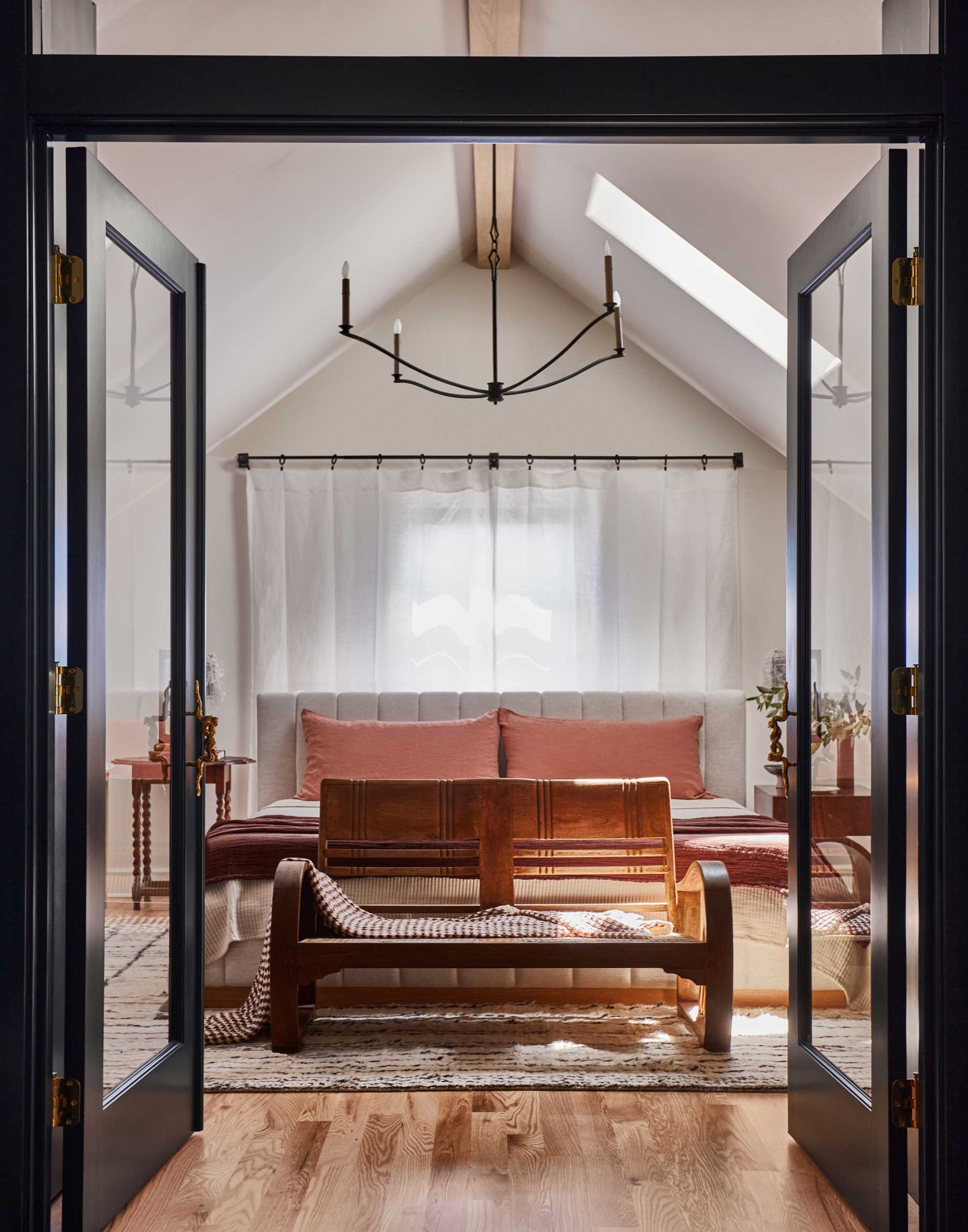
Sometimes positioning a bed in the middle of the room is the best option for tricky layouts. 'This bedroom connects directly to a generous bathroom suite and sits in the eaves in the attic, and because of that it was the only place the bed could go,' designer Lisa Staton explains of this attic bedroom.
To make this layout, with the bed in front of the window, work with a standard headboard, the designer used two freestanding nightstands, paired with wall sconces over table lamps. Positioning a sofa at the end of the bed also helps to create the sense of another function being created for the room.
3. Create flow

This modern bedroom might not be as large as you'd expect you'd need to float a bed in the middle of the room, but it goes to prove it's an option for small bedrooms, too.
By locating the bed in the center, architect Greg Howe creates space for built-in closets behind, while keeping movement around the space open.
'The room wraps around the bed and its headboard which conceals additional storage,' Greg, co-founder of architecture studio Searl Lamaster Howe, explains. 'By floating the bed in the middle of the room, free space around gives access to the terrace doors and the hall leading to the bathroom as well as the wall of closets.'
4. Make it multifunctional

In most bedrooms, space is a valuable commodity, so doubling up the function of a headboard of a bed in the middle of the room is a clever way to make the best use of the space you have available.
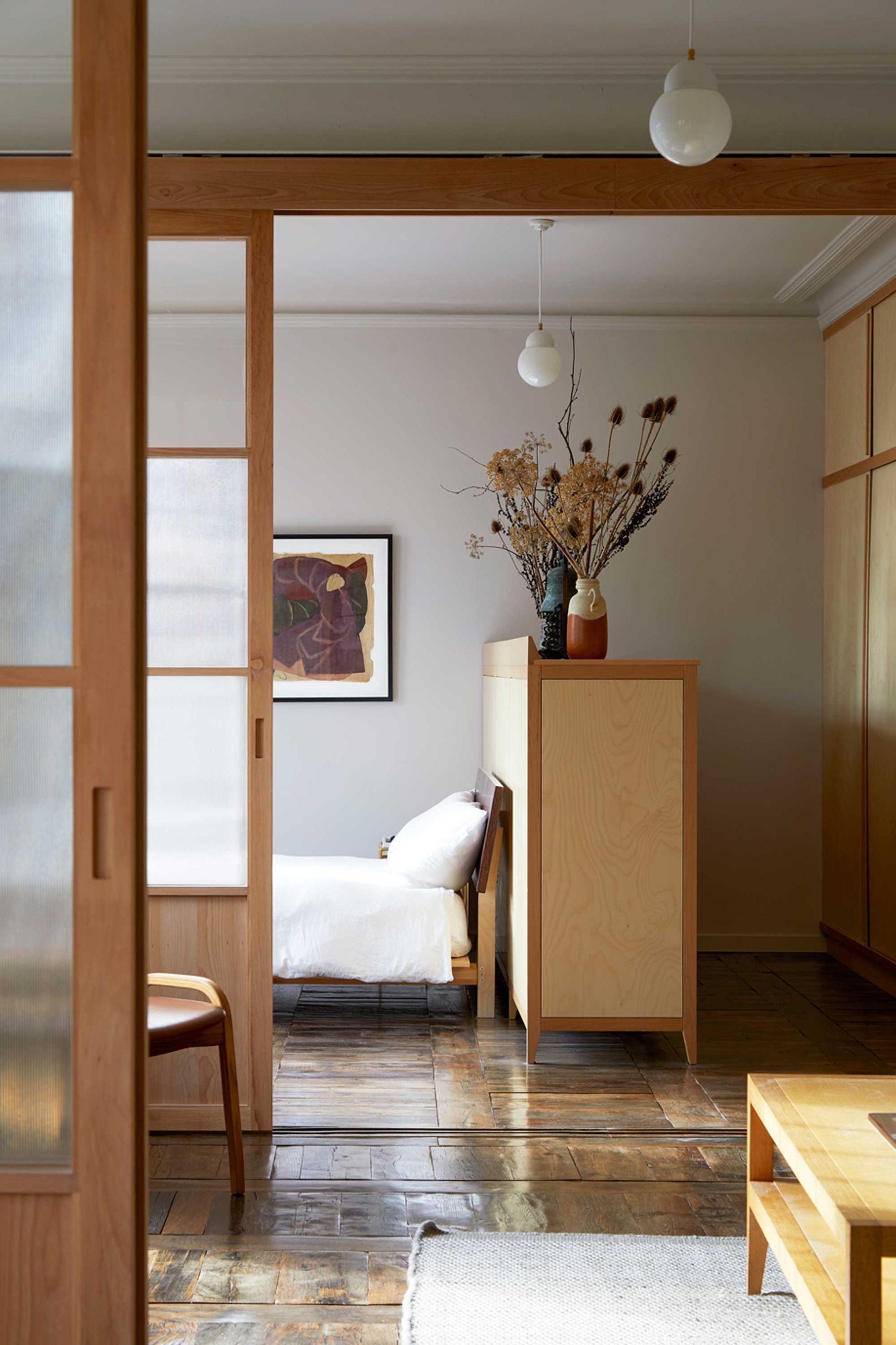
In this design by Hayatsu Architects, featured in House London, a large dresser becomes a fixed headboard for the bed, splitting the bedroom into a sleeping space and a small closet.

House London, Ellie and Anna Stathaki
This book, captured by interior photographer Anna Stathaki, showcases the scope of modern design in innovative London homes.
5. Consider the view

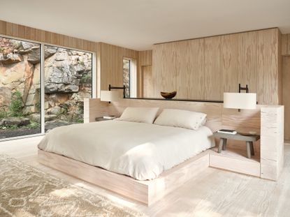
Flexibility on where you position the bed can be used to ensure you wake up to the best view of the home, as was the case for this beautiful modern home in Canada.
'The idea of the bedroom was to orient to the view,' explains architect Paolo Ferrari, who designed the bedroom. 'You’re surrounded by nature and it’s a very special space.'
This design called for a generously-sized bed, built into a platform with nightstands, made from the same materials as the rest of the room, to keep an overall minimalist bedroom aesthetic.
Be The First To Know
The Livingetc newsletter is your shortcut to the now and the next in home design. Subscribe today to receive a stunning free 200-page book of the best homes from around the world.

Luke Arthur Wells is a freelance design writer, award-winning interiors blogger and stylist, known for neutral, textural spaces with a luxury twist. He's worked with some of the UK's top design brands, counting the likes of Tom Dixon Studio as regular collaborators and his work has been featured in print and online in publications ranging from Domino Magazine to The Sunday Times. He's a hands-on type of interiors expert too, contributing practical renovation advice and DIY tutorials to a number of magazines, as well as to his own readers and followers via his blog and social media. He might currently be renovating a small Victorian house in England, but he dreams of light, spacious, neutral homes on the West Coast.
-
 5 Trees You Should Prune in Your Backyard in February — 'It Makes Much Sense to Cut These Ones Back Now'
If you think pruning trees is best left to spring, think again. These trees all could use some cutting back now for several very important reasons
By Hugh Metcalf Published
-
 The 4 Things People With Really Organized Kitchen Drawers Always Have
Level up your ‘drawer decor’ and keep things tidy and organized with these 4 essential ideas for uncluttered storage
By Becca Cullum-Green Published

