6 colors to never use in a bathroom – and the shades that will turn it into a soothing sanctuary instead
For a bathroom that feels fresh, clean, and restorative, these are the colors you'll want to steer clear of
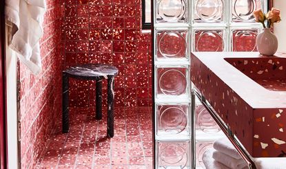

Choosing the perfect shade for your bathroom is easier said than done. As one of the smallest and most functional spaces in the home, color is an enormous contributor, and it carries even more weight than it does throughout the rest of your rooms. The question is, which hues are the best fit for the job?
When it comes to creating the perfect bathroom, shower, or powder room, most of us want a space that feels fresh, clean, and restorative. In recent years, these self-care spaces have also become more of a zen zone, with relaxing spa-like bathrooms taking center stage. That means that, in order to achieve an on-trend space, there are certain colors you'll want to steer clear of.
There's also practicality to keep in mind, too. In these steamier spots, it's important to choose shades that are easy to maintain and withstand the many pressures of daily use. So, to help you choose the ideal color to set your paint ideas loose, we asked some experts for their insights into those we should avoid and what to choose instead for a stylish bathroom you'll never tire of.
1. Stark white
White may seem like an obvious choice for a bathroom, but with it being the default, it's now so ubiquitous it can look a bit, well, boring. Yes, white can help make a space look clean and bright (as long as you stay on top of your cleaning routine, that is), but a stark white space can also look clinical and impersonal.
Helen Shaw, color expert and director of marketing at Benjamin Moore, agrees. 'Although white is a safe and easy option in bathrooms that have less natural light, there is the risk of it becoming a very bland and sterile room, particularly when working with a pure brilliant white,' she says.

Use instead: If you still want a neutral, light modern bathroom without the harshness of a dazzling all-over-white look, it's best to go for a white with a strong warm undertone, or even a taupe or light pink. 'Opting for a warm white with red or yellow undertones is a great choice for those looking to avoid the clinical feel, while still creating a clean and understated look,' Helen notes.
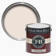
'Tailor Tack', Farrow & Ball
Farrow & Ball's lightest and most delicate pink is a great substitute for white. Full of warmth, it will make your bathroom feel like it's forever flooded in golden hour sunlight.
2. Dark brown
Nothing looks more dated than a bathroom saturated with brown tones. Dark wooden cabinetry and tiling dominated the 70s and 80s, and, unsurprisingly, it's a color that seriously dims a space, resulting in a closed-in feel.
'While brown can introduce an earthy, grounded feel to a space, in a bathroom it can make the space feel smaller, enclosed, and a bit dreary,' explains Artem Kropovinsky, an interior design expert and founder of New York-based studio, Arsight. 'This is especially true for small bathrooms or those without a lot of natural light.'

Use instead: As an alternative, he suggests choosing delicate beiges and mushrooms instead. 'Opt for a taupe or light beige which maintains that earthy feel without swallowing up the space,' he advises. 'These tones can also enhance the warmth and coziness of your bathroom.' You can also introduce natural brown tones through the use of wooden accents, but be careful to not overwhelm the space.
3. Loud brights
For the most part, bathrooms are relaxing self-care spaces so, as such, the shade you paint on the walls should be conducive to that. Bright, primary colors, then, can be too energizing for a space you want to pamper yourself in.
'It's important to not choose a paint color that recasts light in an artificial or unflattering way,' Helen notes. 'Colors such as bright blues, greens and yellows have the most impact and can cause problems when applying make-up or grooming.'
The same goes for neon shades. 'They may seem like a fun, unique choice, but they can feel harsh in a bathroom setting,' says Artem. 'The vibrant, electric quality of these colors might be jarring against the serene backdrop that a bathroom ideally provides.'

Use instead: For a more soothing spa bathroom that still makes use of color, Artem recommends muted hues like a pastel mint green or lavender instead. 'These colors bring a touch of personality without being overly intense,' he adds. Helen also notes that bright color needn't be out of the question entirely. 'Just opt for pops of color on bathroom cabinets or accessories to lift the space,' she suggests.
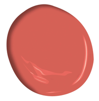
'Raspberry Blush' Benjamin Moore
The color of the year from Benjamin Moore, Raspberry Blush, is perfect for adding a pop of color to cabinets or a bathroom accent wall. The coral shade is tinged with pink and pairs beautifully with bright whites.
4. Bold blues
Blue is another common choice for bathrooms and showers due to its connotations with the ocean but, soothing though it may be, bolder blues can look too jarring in these spaces.
'Bathrooms are full of hard surfaces from tiles and mirrors to fixtures, therefore offset this by picking a hue that allows the walls to bring a sense of softness to the space rather than opting for a strong shade with cold undertones,' Helen says. Blue bathrooms also make your space feel cool during the winter, especially if the room is north-facing, another reason why blues like cerulean or cobalt should be avoided.

Use instead: Instead, Helen recommends softer pastels like powder blue, or more gentle cool tones such as sage. 'These will create a sanctuary-like feel, perfect for relaxing in the bath after a long day,' she says.
5. Intense Reds

You might think a bright red bathroom would do wonders to energize and uplift you as you brush your teeth in the morning, but crimson-red bathrooms are just too intense for these sanctuary-like spaces.
'While red is often seen as an invigorating and energizing color, it can be a bit too bold for a bathroom setting, potentially creating a sense of agitation rather than relaxation,' says Artem. 'Red is a color that can generate a lot of emotional intensity, but the bathroom is typically a space we want to keep calm and serene.'
Use instead: For the same warmth but more subtly, tone down your walls with a pink bathroom instead. 'Consider a softer shade such as dusty rose or salmon which maintains the warmth of red without being overpowering,' Artem suggests. 'They infuse the space with a subtle vibrancy while still promoting a tranquil environment.'
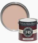
'Setting Plaster', Farrow & Ball
Arguably Farrow & Ball's most popular color, this dusty pink is named after the walls of newly plastered houses. We love the warmth it adds to a bathroom, bringing just enough pink without being over the top.
6. Jet Black
Dark bathrooms are rising in popularity right now, but they're not easy to get right. All-over black can easily feel too oppressive if not broken up with different tones or textures.
'An all-black bathroom can make a strong design statement, but it can make the room feel tight and unwelcoming, especially if the space is small or lacks sufficient lighting,' Artem explains.

Use instead: 'If you're drawn to dark, consider slate grey or deep navy blue instead. These colors can create a similar sense of sophistication and drama, but they're typically easier to balance and don't feel as heavy,' Artem says.
If you do want to incorporate jet black, dedicate it to one area such as the flooring instead of using it all over, and contrast it with grey lime wash on the walls or matt black plumbing fixtures for a little bit of relief. 'However, you should be cautious with the shade of grey you pick as, depending on the undertones, it can feel quite cold and make everything - and everyone - look a little pale,' warns Helen. 'Instead, a brown-grey commonly known as "greige" has warmer undertones and will help to counterbalance this.'
Be The First To Know
The Livingetc newsletter is your shortcut to the now and the next in home design. Subscribe today to receive a stunning free 200-page book of the best homes from around the world.

Lilith Hudson is the News Editor at Livingetc, and an expert at decoding trends and reporting on them as they happen. Writing news, features, and explainers for our digital platform, she's the go-to person for all the latest micro-trends, interior hacks, and color inspiration you need in your home. Lilith discovered a love for lifestyle journalism during her BA in English and Philosophy at the University of Nottingham where she spent more time writing for her student magazine than she did studying. After graduating, she decided to take things a step further and now holds an MA in Magazine Journalism from City, University of London, with previous experience at the Saturday Times Magazine, Evening Standard, DJ Mag, and The Simple Things Magazine. At weekends you'll find her renovating a tiny one-up, one-down annex next to her Dad's holiday cottage in the Derbyshire dales where she applies all the latest design ideas she's picked up through the week.
-
 How to Thaw a Frozen Pipe — Learn Everything You Need to Know in 5 Minutes With This Guide
Winter storm caught you off guard? We asked an expert — just how do you thaw a frozen pipe?
By Hugh Metcalf Published
-
 The 12 Very Best Silk Bedding Pieces — As Our Style Editor Says: 'It's What Dreams Are Made Of!'
Slumber in lustrous luxury with the very best silk bedding sheets, duvets, pillowcases, and more — your sleep score will thank us later
By Julia Demer Published

